


![]()
The Olympics is one place where many dreams turn into reality, even for the designers who design everything from the tickets to the logo, medals to mascots.
To complete all the tasks simultaneously, the Design Committee of Olympics outsources various jobs to various firms. Such projects can have two firms to inadvertently work on the same project. The logo design for the 2016 Rio Olympics was designed by Tatil Design de Ideias from Brazil and the Olympic font was developed by Dalton Maag which is a British typeface firm. Here is how they created it.
The Logo
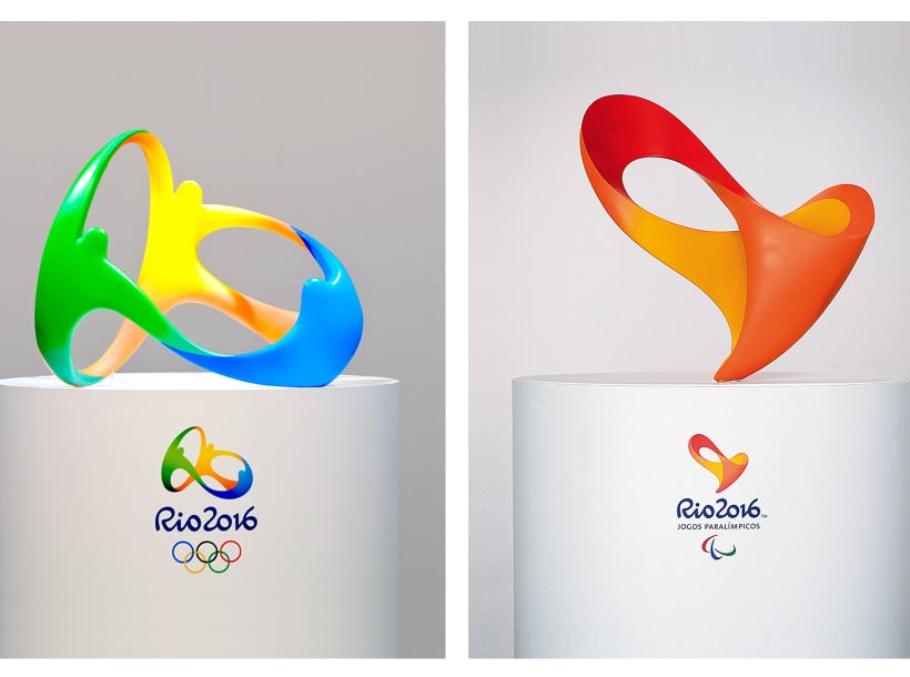
When Frederico Gelli, the creative director of Tatil Design learnt that there were about 138 agencies contending to get the bid to develop the Olympic logo, he first thought of giving up. Because the Olympic committee needed an almost completed logo for submission, which is as tough to do without even getting the client feedback for once. But he went on to take a chance and over the period of next couple of months, each employee at the agency was encouraged to pour in their ideas and thoughts, and the end result is what we see as the Rio Olympics 2016 logo. Gelli says that the logo wasn’t designed just for the designers but for each person in the world, and also says the logo represents the energy of Brazil and how they receive other people.
The hardest part, for him, was to keep their idea a secret during those four months when it was selected and when the design committee officially announced it. Only ten of them in the firm knew and others were convinced upon a fake project.
The inspiration for the logo comes from the mountains in Rio Del Janeiro. Every curve in the logo represents a mountain curve in Rio. Gelli wanted a 3D representation of the logo in its 2D format and that is how the 3D graphical representation got into the picture. Even the color patterns had relevance to nature, beaches and warm temperature that Rio has got.
The Font
About 18 months after the logo was designed by Tatil Design, Dalton Maag was prompted to design the entire font.
Their meeting was conducted with Spy style secrecy. Fabio Haag, the Company’s creative director that he was talking about a project of some corporate design, only to learn at the table about the actual project for the upcoming Olympics. Their prompt was to have a precise replica of those letters designed in the logo. It was a challenge for them since it was a reverse process. Usually, it is the font first and then the logo. Dalton Maag only had three letters from the logo, RIO, and four numerical figures, 2016, to begin with. After that, they moved onto design alphabets and special characters which were about 500 in total.
And that is the brief on how the successful logo and font of the Rio Olympics 2016 were created.
