


2013 was widely deemed as the “Year of Responsive Web Design”And indeed, 2013 saw a massive rise in the popularity of responsive design with even major sites like those of Mashable and Times Magazine, not to mention thousands of others, adopting the responsive design philosophy. In 2013, responsive design clearly went mainstream and it has now reached a point, where it has become the thing that consumers and designers expect to see.

Image source: infocux Technologies – https://www.flickr.com/photos/infocux/8240904818
2013 was also a great year for responsive design tools with the coming out of Foundation 4 in February, followed by Bootstrap 3 in August and Foundation 5 shortly after that. Yahoo released their Pure in May, entering the big game, while Thoughtbot has been continuously developing their Bourbon Neat. We saw the rise of new polyfills, plugins and practices. With such powerful tools, building responsive websites has become much easier.
With such rapid development in 2013, we can’t help but wonder what 2014 will bring for responsive web design.
Responsive Design Will Get Smarter
In 2014, our knowledge and understanding about building and optimizing websites for any type of device will become much deeper and more comprehensive. Responsive sites have been the victims of a number of optimization issues of different complexity, but with the improvement of the tools available, the developers are now starting to form a system of good practices and standards. Elements such as the off-canvass panels and the “hamburger” navigation icon that has now become ubiquitous are gaining popularity and now work pretty responsively.
With the new plugins and tools, elements such as the selective loading of media and assets, the device capability detection and the optimization for hardware and speed will all become more easily understandable and much less difficult to implement.
Improved Device Recognition
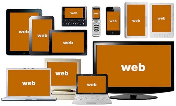
It has always been hard to pin down the device classes, but the common separation of mobiles, tablets and desktop computers will be totally shattered in 2014. There are already devices on the market that fall somewhere between the common definition of a tablet and a phone, or a tablet and a desktop computer. Furthermore, now there is also a whole new range of devices added to all those like smartwatches, the Google Glass and the like and who knows, perhaps we will finally see the Apple iWatch this year, too. Add to that the smart TVs and all the other home media devices with web connection capabilities and you will end up with a huge number of device types and categories, which often overlap and intertwine.
With all that in mind, responsive design is already taking the first steps towards true device agnosticism. By the end of the year, we will see significant development in this direction. This trend means that designers can make plans even for devices that are not invented yet and they can accommodate a range of specific device constraints and capabilities.
More Advanced Frameworks
Our predictions will be incomplete if we don’t examine what 2014 holds in store for the responsive design frameworks, like Bootstrap and Foundation, for instance. The area that will have the greatest opportunities for development in 2014 will be the complex tools that include a lot of components and input means and also trickier to display data models. Up till now, responsive web design has been implemented predominantly in content and marketing sites, while complex apps have taken a backseat.
However, many designers are already working in that direction and rebuilding their apps (product apps etc.) on responsive frameworks in order to be more flexible and responsive. The developers of the major responsive design frameworks are also recognizing this trend and incorporating numerous web app centered components into their products. This will surely make the building of complex apps a lot easier and more straightforward.
If 2013 was a great year for responsive web design, 2014 will be even bigger. With all the ongoing development and improvement in the device recognition capabilities, the flexibility, and the available framework and with the constant enhancements in the knowledge about responsive design, we are eagerly waiting to see what more 2014 has in store for us all!


