Blog Overall rating: ★★★★★ 5 based on 23 reviews
5 1

BlogSimplio Labs Blog

Once we accept our limits, we go beyond them.
Albert Einstein

6 Indispensable Web Design Tips for 2014

Web Design Tips No Comment

So, you have a business website and you haven’t made changes to its design and content for quite a while. However, you should know that even if you own a medium or small business, your website should be kept up with the times and relevant; otherwise, you will soon find that your brand is no longer visible in the online world and you are losing your grasp on your market share. In 2014, online visibility will be more important than ever. So, here are a few essential web design tips for 2014 that will help you keep up with the trend and attract the interest of your potential clients.

1. Use WordPress to build your website


wordpress-logo-simplified-rgb

There is a reason for WordPress to be the most popular and widely used CMS recently. It allows you a lot of flexibility – you may choose to use a premium theme with a very high quality or go for a tailor-made design. It also gives you an easy way to edit and update all the pages of your site. You could even do it on your own. However, if you decide to take a more professional approach and engage a web designer to build your WordPress website for you, the professionals can come up with a completely custom-made design tailored to your needs and content, which will also have a user-friendly admin panel, so that you can easily make all the updates to your site even on your own.

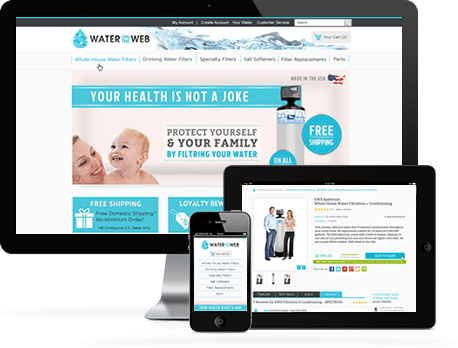
2. Responsive design

You may have heard this term in relation with web design a lot of times but what does “responsive design” mean exactly? With so many people now using their mobile devices to go online, this means that your site should have a full-fledged mobile version to address the needs of these users. It is much more inconvenient for the users to see the information when they open links and they stack in tabs one over the other on their mobile devices. Instead, a separate mobile version of your site should display it in a single text and column where the content and images can be easily read. It should also be compatible with multiple screen resolutions, as not all mobile devices have the same display sizes and ratios.

3. Keep your site fresh and in line with the trends

Even 1-year-old design can look extremely outdated today. The trends are changing with a very fast pace. And in order not to lose traffic, you have to go with the flow. The trends in 2014 are all about flat design, typography, simple color combinations, longer pages that have visual anchors throughout, white space optimization and making good use of video content. A skillful web designer can combine these elements perfectly and make the difference between just another mediocre design and a fresh site with a great quality web design.

4. Include a blog into your site

It is not just enough to have a blog on your website; you have to update it regularly, too. Granted, updating your blog on a regular basis is a large commitment. However, the drawbacks cannot overshadow the immense advantages of a well managed blog. Through your blog, you can improve your brand awareness, educate your viewers and demonstrate your expertise. This allows you to attract traffic that is relevant to your niche and improve your marketing strategy. However, make sure the blog has been integrated into the site itself and it can be seen in the main navigation. This is a more professional approach and can lead people to your other pages, too.

5. Content marketing adoption

In some cases embracing content marketing may mean that you have to change your entire website and marketing strategy and go back to the basics of marketing – you have to define your target audience and the relevant info to communicate to the viewers, and determine what you want the people’s perception about your brand to be.
You have to get the suitable tools, too – a blog, a detailed content marketing plan, the suitable social media channels where your target audience lies. And then you have to draw a plan for a balanced mix of stories, educational and shareable content that you will distribute across these channels regularly. The content you create should be consistent, show personality and be varied, too. It may be hard in the beginning, but with time you will get better at it, and there is always professional help available as well.

6. Social media integration

It’s not enough to just stick a Twitter or Facebook icon on your home page. The icons should be properly linked to the pages of your brand on the respective social media; that goes without saying. But you should also check what first impression your social media pages make. This includes examining your latest updates, the design of the social channel, the engagement of the public, the relevance and shareability of the updates, etc.
The social media forms a large part of your brand recognition and development. Thus, you should use it responsibly and optimally. If your content is interesting and your social channels are very active, you can do more on your blog and site than just linking to social media through icons. You can add Instagram, Pinterest and Twitter feeds, comment and “like” options for Facebook and social sharing buttons to your blog. You can employ many more tools for managing your social media activities as well.

All these elements may sound overwhelming to you, if you haven’t dealt with web design and content management before. If yours is a small business, you may even be tempted to ignore these tips and stick to the age-old designs and strategies. However, this could be detrimental to your online visibility and your entire business. If you want to survive in the era of the online generation, you need to stay up to date in every aspect.

Web Design and SEO: Why is Responsive Design the Best for SEO?

Web Design Tips No Comment

With web browsing through mobile devices showing a steady upward trend, responsive web design has proven to be the best solution that combines the benefits of desktop and mobile dedicated sites. When your website incorporates responsive design elements that means that all the content on it can be displayed to all the users, regardless of whether they are using a mobile device or a desktop computer for viewing it. Furthermore, a responsive site can still tailor the data for easier viewing through mobiles through a few changes in the navigation and the order of showing content.

Responsive Web Design

That being said, the benefits of responsive web design do not end here. Responsive design has the upper hand on building separate desktop and mobile dedicated sites when examined from an SEO perspective, too. Let’s see why.

A Responsive Site Ranks for More Searches than a Mobile One

Often, the website developed for the mobile platforms has different content from the desktop version of the main website. This can be observed in a few common scenarios.

The mobile site has fewer pages than the desktop one

Since the mobile version of the site is almost every time built after the main site, the owners of the site often choose to add to the mobile site only the “important” web pages of the primary site. However, though the “less important” pages that are left out may receive smaller traffic, they have at least some traffic. If you exclude those pages, you will lose the mobile users who would have reached your site by finding those pages through the search engines.

The mobile site has different pages from the desktop one

If our mobile site features content that is not found on the desktop version, you may face two issues.

  • First, the mobile-only content may take longer to get indexed. Your desktop website is likely to be stronger as compared to the mobile version, thus Googlebot will visit it more often. So, the content that is only available on the mobile version will be a lot harder to find.
  • The other issue you may run into is that your desktop visitors will be deprived of that content. Even if you think that the desktop users won’t be interested in a certain page, do not exclude it from the desktop version; just don’t prioritize it in the site navigation. In the worst case, some pages of your site won’t have any mobile traffic and others won’t have any desktop traffic, but you won’t be losing visitors due to missing content.

There are the same pages on the desktop and mobile site, but the mobile version has less content

This can mean one of the following two things:

  • The mobile visitors have access to less information compared to the desktop viewers. – In that case, it will be harder for your mobile site to rank for the same amount of search terms the desktop version would rank for. It may be tempting to have less content because of the smaller screen, but do not forget that mobile users are used to scrolling and expect it.
  • The desktop visitors receive redundant or superfluous information and the mobile viewers get streamlined content. – In this scenario, the excessive information on the desktop version may be unnecessary anyway and it only creates clutter.

A responsive site has all the pages included

Responsive web design can resolve all the above issues as the content added to a responsive website is aimed at all visitors and not mobile or desktop users in particular. The site will have all the pages and the flexible navigation will allow the users to access the data they are interested in most. Thus, the rankings of the website won’t suffer due to missing or unmatching pages in the mobile and desktop versions.

There Are No Redirect Issues with Responsive Sites

In case you use different HTML in the mobile version of your website, you will need to bind the separate versions of every web page together. There are two options for that.

Dynamically served pages

In dynamically served mobile sites, the same URLs are used but depending on the user agent that is requesting the pages, the servers will send a different code. However, to the search engines this may appear like “cloaking” – sending different data to mask the real content of your site, and this attracts penalties. To prevent that, you must add a Vary HTTP Header.

Different URL for the mobile site

The URL is a unique ID for the search engines so your content should never be duplicated on two URLs. In case you choose to have a separate URL for the mobile version of the site, you have to select one of the sites as your “original” content source and use the rel=”canonical” tag for the other page, the “copied” one. Usually, you will have a canonical tag placed on the mobile site and it will be pointing to the desktop site. Google’s recommendation is to place a rel=”alternate” tag on the desktop pages too, so that the search engine will know that there is a mobile version of the site as well.

A responsive site is just the same site

In case you do the tagging of the mobile and desktop versions properly, the mobile site will most likely rank equally as well as a responsive site, but the scope for errors with tags and redirects is very big. On the other hand, a responsive site won’t face this issue in the first place as it is the same site you will be serving every time.

Responsive Design Yields Better Mobile Websites

This is important mainly for businesses. Here’s why:

If you choose to have separate mobile and desktop versions of your website, the tasks of updating, changing and maintaining the two versions will also be separated. In some cases, there are even separate teams dealing with these tasks. Often, the changes to the mobile site are usually made after updating the desktop version, which means that the mobile version may lag behind the desktop one. When adding new pages, that can pose issues with redirects, and when making changes to the content, the mobile visitors will receive inferior content compared to the desktop ones. This makes the job of your mobile team even harder.

Desktop and mobile updates and changes are integrated in responsive sites

On the other hand, when you use responsive web design for your site, all the changes and updates made to the site will be enacted onto the mobile and desktop versions simultaneously and instantaneously. This eliminates the need for a separate mobile team and the worries about inconsistencies, wrong redirects and lagging behind in content.

In Conclusion

A separately designed mobile version of your site may not always be inferior to a responsive site. It may be just as good if it is built really professionally, but that requires a lot of ongoing effort. Also, there are some cases when you might want to have different content on your mobile site and in such instances, a separate mobile site may be a better decision.

However, in the majority of cases, responsive web design is a much better strategy for displaying your site on different platforms, as it can save you a lot of time, effort and money and spare you from a host of issues. And as we were able to see, responsive sites have better prospects for ranking well with the search engines. We can safely say that responsive design is your best bet in terms of SEO.


The 5 Web Design Trends that Will Dominate 2014

Web Design Tips No Comment

With the online space expanding so rapidly, the significance of web design is growing, too. And with this fast-pace development, keeping up to date with the trends is essential in order to be able to stand out from the crowd. 2014 is shaping up to be a year of many changes in web design – changes that you too can and should adopt. Let’s take a look at the five most boldly pronounced web design trends for 2014.

Continue reading

The 10 Most Expensive Logo Designs and Rebranding Campaigns of All Times… And A Few That Cost Surprisingly Little

Web Design Tips 6Comment
Branding and logo design are the most vital part of a company’s corporate identity. A company’s logo should incorporate its essence, what it is and does. It is a symbol, an idea, and a bundle of information. The importance of the logo design has been recognized long ago and it has turned into an industry, and some may even say an art form. Companies are willing to spend a lot of effort and money in order to come up with a memorable logo that will represent their business perfectly.

most expensive logos

You will be surprised to find out how much money exactly some of the most prominent companies in the world have paid for their logo design or rebranding throughout the years. And maybe you will be even more surprised when you see the big brand names that spent close to nothing for their logos.

Continue reading

The Optimal Site Navigation for the Best SEO Results: Drop-Down Menus, Navigation Pages, Filters and Product Pages

SEO Tips, Web Design Tips No Comment

In one of our previous posts we discussed the steps you should take and the elements you should factor in, in order to build universal navigation for your site that will be both search engine and user friendly. In this post, we will continue the theme of internal linking and we will examine a few other components of the site navigation, and namely the drop-down menus, the navigation pages, the filters and the internal linking of the product pages.

Continue reading

The Optimal Site Navigation for the Best SEO Results: Universal Site Navigation and How to Build It

SEO Tips, Web Design Tips No Comment

When SEO professionals discuss universal site navigation, they tend to pay more attention to the technical side of the matter. You may hear from them advice such as: “Ensure that there are internal links to each of your website’s pages”, or “Make sure you don’t have too many navigation links on a single page because you’ll end up with too many internal links” etc.

Continue reading

Prestashop Quick Checkout is Almost Here

Developers, E-Commerce No Comment

Prestashop Quick CheckoutFor us, 2014 starts with this: Proud to present our new star product! Register to Get notified when it is released: PSquickcheckout.com

PrestaShop Quick Checkout is literally a one-page checkout for PrestaShop users. When I say users, I am not talking only about online shop owners, but also about every online customer that want to purchase something online, from a PrestaShop site.

No matter how great the sales and offers you have, a delayed checkout may lead a client to find another place to shop. Customers appreciate businesses that offer great service and fast checkouts, and usually reward them with return visits. Sometimes they even refer others to your site.
Continue reading

The Most Important Web Design Trend of 2013

Web Design Tips No Comment

packageThe art of making predictions is another way of setting oneself up for a fall, but I am so certain of the prediction that this article will make that I am sure that there is no chance of setting myself up for anything. The reason predictions are so difficult – particularly in the technological arena – is because things move so quickly. Fashion trends (and web design is influenced by fashion trends) are particularly fast-moving creatures. Bearing in mind the speed at which technology races past, this is a combination that causes these types of predictions to be notoriously difficult. But, without further hesitation, here is the prediction in question: broad background with limitless scrolling will be the most called for web design trend in 2013.


It will happen. It has started happening already. The article will now take some time to detail the varied reasons behind the current and predicted further success of this compelling design feature.

Continue reading

Effective WordPress Plugins that Facilitate Design

Wordpress No Comment

A web designer, regardless of their competence and natural intuitiveness, will rely on a number of effectively designed WordPress plugins to ensure they achieve the required functionality to obtain the best results possible. A website run on WordPress allows a designer to streamline their work process to a far greater extent than other designers can. However, the plugins must be researched and well chosen in order to achieve real functionality. The reason for this is that there are a large number of them to choose from, each with its own driven and exact purpose. This article will highlight some of the more popular plugins and detail their created purpose.

Continue reading

Good experience

★★★★★
5 5 1
SimplioWebStudio did a great job

Project accomplished

★★★★★
5 5 1
Project accomplished

Plugin developed successfully

★★★★★
5 5 1
Plugin developed successfully

ANOTHER SUCCESSFUL PROJECT

★★★★★
5 5 1
ANOTHER SUCCESSFUL PROJECT

Thank you Simplio team

★★★★★
5 5 1
Great experience

Working with Simplio Web Studio was a fantastic experience.

★★★★★
5 5 1
Working with Simplio Web Studio was a fantastic experience. The service provided was amazing and professional. It was a delight to work with Nir, who went the extra mile to meet our demands in a timely manner. He really made our vision a reality by creating us a classic site, but moreover the relationship we formed is something our company really appreciates. It was a pleasure working with Nir and the team at Simplio Web Studio. We highly recommend them to all and we look forward to working and doing more business with them in the future.

a great project

★★★★★
5 5 1
a great project

All the best

★★★★★
5 5 1
All the best to Simplio

My website is Live

★★★★★
5 5 1
My website is Live , thank you Simplio

From beginning to end, the team at Simplio provided top of the line customer service.

★★★★★
5 5 1
From beginning to end, the team at Simplio provided top of the line customer service. The web developers are incredible and made sure we got exactly what we were looking for! They truly went above and beyond to make us happy and we couldn’t have been more pleased with their talents. We would highly recommend them. Thanks so much Nir!

After over two years of research we chose Simplio.

★★★★★
5 5 1
After over two years of research we chose Simplio. We are so far very satisfied. These people answered the phone on a Sunday and fixed a problem that was not even their fault. It was the host company which I had chosen that had caused our site to go down.

Outstanding in both knowledge and professionalism.

★★★★★
5 5 1
Outstanding in both knowledge and professionalism. Nir and the staff at Simplio are Excellent in branding, web design and overall web presence. Definitely recommended!

I cannot even imagine having another company managing my Presta shopping cart.

★★★★★
5 5 1
They are now part of the Diastasis Rehab business team after working with them almost a year now. I cannot even imagine having another company managing my Presta shopping cart. After a bad experience with a programmer, I needed a new programmer (one that knew prestashop shopping cart) and most important one that I could trust. Finding all three was a difficult process! Lucky for me I found them. I cannot say enough about the diversity of services that this company provides. Every step of the way they make amazing suggestions to increase my sales and they get back to be right away either by email or phone. They have even created a simple and easy check out program for Presta Shop. They are actually a one stop shop! They updated my SSL, are setting up and changing my server to a dedicated one, setting up streaming of my DVD, website design, creating a specific program for address verification on Presta cart and handled the integration of Presta cart with my fulfillment house. I am now working on developing an APP with them

Simplio really helped me out of a jam.

★★★★★
5 5 1
Simplio really helped me out of a jam. They did exactly what I needed on a very tight time frame (with little notice too!!!!) They are my new go-to guys for any Prestashop needs! Thanks Simplio!

Excellent service!

★★★★★
5 5 1
Excellent service! Nir was exceptionally helpful in solving a lot of issues with our website and making the user experience more smooth. He understood the needs of our school and helped improve the website tremendously.

impressed

★★★★★
5 5 1
What impressed me most about working with Simplio was their attention to detail and excellent communication. Not only are they talented developers, but, they are also pleasant to work with and highly professional. Highly recommended!

professional service

★★★★★
5 5 1
What a profissional service Simplio offers.I hired them to rebuild my website for my business and they were creative and professional. Nir was on top of the whole project from day one, until he delivered the project on time. I will defiantly recommend Simplio to anyone who is looking for website services. From creating, designing to maintaining your image online. Good Job Nir and the rest of your group.

Great Logo

★★★★★
5 5 1
Great Logo, Very happy

fantastic to work with

★★★★★
5 5 1
Simplio was fantastic to work with. They were fast, communicative and incredibly helpful to me. I highly recommend them to anyone who needs help with their digital needs!

Awesome experience

★★★★★
5 5 1
All details and requests were met in prompt an friendly manner. Would recommend on any day to anyone who wants to feel their business is in great hands.