Clever Logos with Hidden Meanings (Part 3) Overall rating: ★★★★★ 5 based on 23 reviews
5 1

BlogSimplio Labs Blog

“Once we accept our limits, we go beyond them.”

Albert Einstein

Things People Absolutely Hate about Your Website

Business Advice, Web Design Tips No Comment

hate-your-website-01

In the 21st century, putting up a website is not that big a deal but making it likable and maintaining a steady flow of traffic is the hard part. The important thing to remember here is that the likability of the website is what is going to determine the fate of the website; so getting rid of things people don’t like about our website should be your topmost priority. It is, for this reason, we will look at the things that people usually hate about a website.

  1. One dimensional website

When we are talking about one dimension here, we are not talking about graphics or style of the website. If your website is such that it can only be accessed via a desktop then be ready to get a substantial amount of online glaring because that is being one dimensional. Almost everyone now has a smartphone and if your website is not optimized for people visiting it through their phones, then you will observe a prominent dip in your overall traffic which is something you wouldn’t want to see. You have to understand that people don’t really have time to zoom into your pictures to understand their meaning or note your number from the site to call you; so making sure that the user experience of mobile users is amicable.

  1. Too many pop ups

Another thing that can really annoy people is pop ups. No one would like to see an advertisement pop up right when they are reading something important on your website.  You have to make sure that there is a degree of moderation when it comes to pop-ups. You can introduce ideas like a slide in CTAs which are considered far less annoying than your standard pop-up page.

  1. Loading speed

Ever wondered how you felt when you wanted to see a video and it took ages to load? This is exactly how your visitors feel when your website takes too long to load. Remember, people online have the attention span of a baby and they can decide whether your website is good enough in as less as 10 seconds. So you have to understand that if you make them wait a little too long, then will find another website which is sure to dent your conversion rate. Here, optimizing your websites is the need of the hour, so try avoiding complicated codes, large images, videos, to get a better loading speed.

  1. Navigational issues

Patience is key but that doesn’t apply to your visitors as they want to know all that is to know about your website in no time. It is for this reason that you have to make it absolutely clear of where they need to go to get what they need. It is a fact that that they are not patient enough to dig through all your web pages to find out what they want. In layman’s terms, they need to be spoon-fed, so guiding them as far as navigation is concerned is something that can bring you good results.

10 Social Media Tactics to Drive Traffic to Your eCommerce Site

Business Advice No Comment

social-media-tactics-01

Increasing traffic to your eCommerce Site is something that everyone is looking forward to these days. Increase of traffic means more leads to your business, but social media is not that easy. Listed below are 10 social media techniques to drive traffic to any eCommerce site.

A good landing page

The landing page of any site is the first thing that comes into view when a person visits the site. As a result, it is necessary that your landing page is very attractive and the user interface is huge. The landing page should be simple and concise so that the person visiting your eCommerce site can get an immediate idea of almost everything you are about to provide them.

Social Contest Technique

Organizing a social contest on the site and promoting it online and creating a buzz about it is something that is very useful as a technique. The social contest techniques work really well with these eCommerce sites and more and more followers and visitors can be obtained within a very short period of time.

Being keyword specific to optimize media posts

Use some basic, relevant and user specific keywords for your site which will make your site easily visible by the audience and they will be able to follow it.

Use hashtags

Hashtags are very popular trends of the society. This will help you stand out and get discovered as an individual site.

Use the right content

Too much or too less information is dangerous. You need to know exactly how you want to present yourself. Give away the right kind of information in the right order to ensure that the general public gets the maximum out of it. Make your content concise and sweet as well as interesting.

Live chats and interaction with followers

The provision for interaction with followers and live chat facilities with them should be arranged. This will make the visitors realize the genuine character of your website and the services you provide.

Paid Advertisements

Paid advertisements have also proved to be really helpful in the recent past. These Facebook and LinkedIn ads will help you boost the traffic to your website as well to a considerable extent.

User-friendly and attractive

Make sure to make your user interface friendly and approachable. You can make your page look attractive by adding images of high quality and this will help you attract a huge number of visitors to your page or eCommerce site in general

Prepare a blog

Blogs are another very good way of increasing traffic on your eCommerce site. Find suitable bloggers who are ready to work with you and promote your content in exactly the way you want it to be.

Pay attention to reviews

The reviews of genuine customers are very beneficial in this case. Make sure you let your customer speak their minds about your site and then make changes and improvements wherever necessary to increase the traffic to your site altogether.

All these and many other marketing strategies will help to get a consistent flow of traffic on your site follow them to see the difference.

5 Critical Errors of E-Commerce Websites

Business Advice, E-Commerce No Comment

5-critical-errors-of-e-commerce-websites

Wondering why so many of the e-commerce websites fail to veer the maximum search engine traffic towards itself?

The designers of the e-commerce websites may think that only listing the products or services rendered by the website would do the job. That’s all? Is that enough to bait the users to check the websites?

To all the online shoppers out there, how many times have you been disheartened to find no reviews of the products sold online? How often do we fail to understand a service or new-launched product due to no proper description?

Among all the prominent errors made in the e-commerce websites, five of the most critical ones have been listed below :

  1. PRODUCTS OR SERVICES ARE NOT DESCRIBED PROPERLY

E-commerce websites are pretty popular for missing product information. It is high time they realize that only putting the names of the products or services and setting their pictures won’t do any good. The product needs to be described thoroughly so that the consumers have enough information that is required for their satisfaction and decision.

When products are listed in the websites without the requisite description, it becomes inconvenient for the users to avail those items or services and do transactions. In order to make your e-commerce website popular and lift them up in the Google search engine, make sure you include information for each product and insert keywords in the description for search engine optimization. Make it a point not to stretch the description too long.

  1. PRODUCTS ARE NOT REVIEWED

When the reviews for any product or services are not found in any e-commerce website, it becomes very difficult for the consumers to stay updated about the authenticity of the products delivered or the services rendered by that particular site.

The lack of reviews leads the users to be in a state of confusion which in turn hinders the popularity of the e-commerce website and users tend to divert to other user-friendly websites.

  1. USING COPIED CONTENT

Using copied content for your e-commerce website will not take seconds for Google search engine to shun your site. In this case of copying content, your e-commerce site will be demarked as plagiarized. The content of the website should be original and should contain proper amount of keywords so that it is SEO oriented. This would help swerve online traffic to your e-commerce website.

  1. NOT USING EYE-CATCHING URLs

This is another critical error made in e-commerce websites. They do not use interesting, eye-catching URLs which would attract numerous users to surf through your website. URLs say a lot about the websites. So using an intriguing URL for your e-commerce website is a good strategy of marketing.

  1. DULL, BORING TITLES

Using dull title tags in your e-commerce website is a critical error made by many. Title tags should be interesting so that it pulls the crowd and makes the website popular.

When the e-commerce websites rectify these critical errors, the user experience will automatically improve. Hence, to become a crowd puller, your e-commerce website should be free of such blatant errors and should be very user-friendly.

What Is Quality Content?

Business Advice, E-Commerce No Comment


what-is-quality-content-01The savvy marketers achieve with the users and Google’s goals to obtain good ranks for their sites on search engines. With this, they attract inbound links and create trust, credibility and authority. Thus, the quality of the content determines the rank of the site, which is why it is essential to write quality content.

How to write quality content?

1. Adhere to Google Webmaster Quality Guidelines

User-centric pages should be of primary concern without deceiving the users. Make sure the website is catchy and innovative. Tricks to improve search engine ranking should be avoided. Follow practices that aim to prevent and remove user-generated spam. Make sure that you remove the hacked content as soon as it appears

2. Creation of valuable content

The below are to be followed to create valuable content as per the guidelines received from Google’s Webmaster Academy course in making a website quantitatively valuable.

  • Innovative and informative content
  • Credibility
  • Whacky and attractive
  • Unique and good quality
  • Appropriate length and formatting
  • Readability score and social media share
  • User-friendly method for dealing with queries

content-is-king-01

3. Quality Rating of Google’s Search Guidelines

A well- written and a high-quality page have the following characteristics:

  • Good level of expertise in authoritativeness and trustworthiness(E-A-T)
  • Adequate amount of main content
  • Reviews or service information is of utmost importance
  • A good reputation for the main content on the page

The purpose of content should be clearly understood; also marketing pages exhibit such gimmicks that the core content is overshadowed.

4. Intentions of User

Understanding queries of the user, website, and visit –in-person query and make suitable action plans.

Why need a user-friendly web page? What is the purpose?

  • Sharing of relevant information (personal, social or theme)
  • Expressing  views and opinions, post queries and allow downloads
  • Market  the product and multimedia

Wow! Jackpot. Isn’t the matching of relevant user content and purpose of web page the expected outcome?

A prudent thought from the views of semantic search!

5. Build high-quality website with Google

The following need to be eliminated for building a high-quality website.

  • Factual and grammatical errors
  • Invalid information and bad reading level
  • Unnecessary adds and load speed of page

How to determine the content quality?

The following are the characteristics that help in determining high-quality content:

  • Concepts and entities- use of Alchemy API for search queries will help in identifying overlap indicating useful data that can be included.
  • Co-occurrence of keywords/phrases- Ultimate Keyword Hunter or Keyword Explorer would help in finding the most used words/phrases sorted by co-occurrence by websites.
  • Topical completeness- Keyword Planner (Adwords) helps group the main ideas of the topic and provide their content.

The concluding thoughts would rather seem like drawing a match between the information on the website with the query intent. With the levels of expertise and views on the content, it ought to be comprehensive, distinct and relevant. It is imperative to provide good reading content to the readers.

Enough said! Gear up to write you quality content.


4 New Web Design Trends for the Year 2016

Business Advice, Web Design Tips No Comment

web-design-trends-01

Trends are always changing and this is true even in the case of web designs. Designs ensure that your website looks good. The designing could enhance or spoil the user experience. Web users would certainly leave a website which is hard to navigate, hard to use or just irritating to their eyes. Homepage design could be very crucial.

Though users may land upon your website through other pages, your homepage is where they first land up. Not only will this design create a tone for your whole site but is also a great chance of establishing your identity and your brand identity. So check out what is new this year when it comes to web design trends.

  • Photos are great!

Professionals, photographers and artists in the industry of beauty have always had photo stacked websites. But amid the new quick rise in the resolution quality of the screen in basest of the devices, the hike in internet speeds, and popularity of picture apps like Aviary and Instagram, large images are omnipresent now. Websites across all businesses now make use of big images at the top of the site’s home screen. It would flaunt the product, set a perfect mood, and introduce those behind the products. All in all, such images only serve a single purpose which is to grab the user’s attraction and have them involved.

  • Subtle movements

Tech advances in broadband speeds and impulses like maintaining the user’s attention intact have turned it into a possibility for sites to use scrolling, animation and many other effects to instill interest. Elements which are given animation while the user hovers above them could actually enhance the call to action. This is because it will make it sure that something would happen when clicked on it. It is vital that you know how to use them sparingly relatively; you wouldn’t want the whole site jiggling and wiggling. For instance, parallax scrolling which is an effect that creates impression of layers and depth looks great but would also make a few feel nauseated with it. Hence include animations wisely

  • Simplified style

All elements like glossy buttons, gradient colors, and beveled edges are getting old. Sites are now moving to more flat designs. This look is cleaner, simpler and highly minimalist that websites have appeared earlier. Google is being such aesthetic along with design guidelines which they have created known as material design. The search engines provide elaborate tutorials about everything from typography to color theory to aid designers in understanding better how to create effective websites. Use of such icons is another domain where flat designs have actually made a great impact.

  • Fancy fonts for enhanced creativity

Typography on websites has come a really long way. You have many fonts to use than just courier or arial font. The largest difference maker is the extensive fonts that are web based. Though fonts like arial and courier are good in their own way, new web fonts are really booming and are used to enhance creativity in the websites.

So which web design trend are you going to follow? Let us know in comments.

Clever Logos with Hidden Meanings (Part 2)

Business Advice, Web Design Tips No Comment

Logos are designed keeping in mind various factors and considerations. A lot goes behind the scenes when a logo is developed. Last time, we posted the first part of these logos with hidden meanings. Here we bring to you the second part of our list. Check them out below!

google-01

Google

The logo of Google has got 4 primary colors that are arranged in a row which is later fragmented through secondary colors. This idea was totally intentional. Google wanted to make it evident that they don’t follow the rules. Besides, they also want to show they are playful as they haven’t made the symbol look bulky. For that, they just made use of simple colors and letters.

ibm-01

IBM

The logo of IBM, too, has got hidden message that is there for the world to see. Those white lines which pass through the logo present the appearance that an equal sign has, which is at the right corner to the bottom. This represents equality.

Pepsi-02

Pepsi

The old logo of the Pepsi is a circle with red and blue color and has got a white curved line passing through the diameter. However, they new logo of the Pepsi is also quite famous now and has cost the company one million dollars. They teamed with Arnell Associates to make the logo. Pepsi has to spend millions rebranding everything. It was called a spectacular design strategy. The new logo is a kind of a Day Vinci Code. The logo is inspired from the Renaissance, Feng Shui, Geodynamo of earth, the Theory of Relativity and a lot of other stuff.

tostitos

Tostitos

Tositos is too much popular. The two Ts in the middle depict two friends who are sharing few tortilla chips along with salsa.

elefont-01

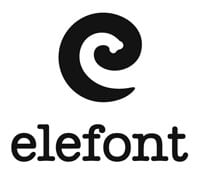
Elefont

The blank space that is in the logo which is an E in the lower case is nothing but an elephant trunk!

Hope for African Children Initiative logo

Hope for African Children Initiative

The moment you look at the logo, it just looks like an African map. But when you look at it closely, you will see that a child and an adult are facing one another.

toblerone-logo-01

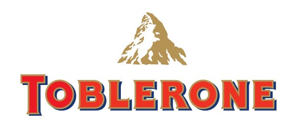
Toblerone

We all love these chocolates don’t we? And we never actually took time to observe the awesomeness of the logo. The logo is of a mountain which has got snow over it, which is shown by the white space. But take a closer look and you will find a polar bear on it. This is because Toblerone originated in Bern, Switzerland that is popularly known as the city of bears.

Goodwill-01

Goodwill

The G in the Goodwill is nothing but a smiling face. Awesome! Isn’t it?

spartan-golf-club

Spartan Golf Club

This logo is totally genius. If you look at the logo in a way, it looks like a helmet of a Spartan. If you view it in another way, it is a Golfer who has taken a swing.

unilever

Unilever

The products of Unilever are so versatile that at times it is difficult to maintain a track of all their products. To our fortune, all the symbols in the logo stands for all products they produce.

Tips for Better Facebook Lead Ads

Business Advice No Comment

Tips for Better Facebook Lead Ads

With the latest development in Facebook in the form of lead ads, the wave of market and marketing had taken a sharp bend upwards. Why are they more favorable and preferred, one might ask?

In the time of lead ads that ask to fill lengthy forms and details, the lead ads that only ask for your email or log in through Facebook make the user feel more approachable. With Facebook incorporating lead ads, everyone is high and happy with the new development but make a wrong move in the right place and you are out of the equation.

Lead ads on FB are already a great promotion so make it right and a lead is a customer right away.

  1. Start with accepting Facebook’s terms and conditions. Not accepting these conditions means not being able to put up your lead ads on Facebook. Lead Ad’s terms of Service for each FB page is different and accepting them is a go for all kind of advertisers.
  2. Having your advertisement in Facebook is a bonus because many form filling details can be directly transported from Facebook if you make your sign up form right. Users like it to be quick and easy so try keeping it as short as possible. As for newsletters and subscription, only asking for email ids is enough.
  3. It was revealed that including offers tend to seek more attention from viewers and searchers than the general quotations. If the viewers benefit from the offers, they immediately become your lead. It hikes their interest and makes them convert to your site; even it is only for more information.
  4. Include text in the ads but try keeping them short. Limited text ensures that you say exactly what you want to say and how you want to say it in minimum words. What do you want to include in that precise text is also very important. Letting the viewer know about the offer isn’t enough. They need to know what to do next. Where do they go? Make sure to include a call-to-action feature. The viewer will simply pass by if they do not know what to do next to seeing something they want to look up. Add a button to be clicked or let the viewer know if they ought to click on the image or something similar.
  5. Once led to your site or the landing page, it’s a lead and you must want to keep tabs on all your leads. Talk to your website developer and see if you can have a notification every time you get a lead or every time you get a comment. Keeping in touch with the users in real time has a huge impact and makes for a good lead to customer conversion.
  6. Auto-responders are also a good way to go. One cannot always be in touch with all their customers and leads personally especially in a large scale organisers.
  7. Each lead and customer counts to CRM (Customer Relationship Management) to make it so that each lead that comes in get accepted into the CRM software and the necessary response thereon from your side helps in the conversion of that lead into a customer.

3 Steps to Improve Your Website Conversion Rates

Business Advice No Comment


3 STEPS TOIMPROVE

If you wish to create more sales through your digital marketing strategies, there are only two ways of doing it. Firstly, the usual option is to spend money on obtaining more traffic for your site. If the number of people visiting your site is doubled, your sales are likely to double too. This makes complete sense and most people concentrate on this as it is a logical solution.

However, driving traffic is the toughest and also the most expensive option. But the second option is easier. It is increasing the conversion rates of your website sales. By concentrating on conversion rates, the sales can be doubled without having to incest extra money. This is the reason conversion rates are both cheaper and an easier option to hike your sales through digital marketing.

You need to concentrate on these three steps to improve your website conversion rates.

Step 1) Identify the choke point

Finding the choke point in the funnel of your sales is the first step you must take. Every sales funnel is likely to have a region wherein prospects are finding themselves stuck and exit before purchasing the product. This could either be on the very first page or something else that’s not even on your focus. To identify the choke point, you should make a flow chart which lists every step in the sales funnel. This takes a lot of work, but is worth it at the end. Until you are able to visually view all steps, you’ll have troubles optimizing the conversion rates. Later you need to measure your conversion rates from every step to the next to observe how well every step performs. Once you are done through this, choke point is easy to find. It will be the step where you get to see a big drop off.

Step 2) Fix the incongruent copy

One among the major mistakes that happen in sales funnel is the incongruent copy. For instance, the sales page may mention about free shipping but there would be no free shipping mentioned anywhere else as one goes down the sales funnel. Or the design of the web page might differ from black to green once another page is clicked on. Though this doesn’t seem like a great deal, you must know that the prospects are highly skeptical. If there’s a glitch in the offer you are making, prospects may quickly leave your site and find some other site.

Step 3) Simplify all the webpages

At this step, you must have a message that is congruent throughout the funnel that is vital but not enough. A lot of webpages are too complicated to an average visitor visiting your site. You must know that you may use your site every day and you know precisely where you must click to know where you have to go. But a lot of people will be visiting your site for the first time.  Hence, you need to make websites that are really effortless to use, be it the interface or the navigation.

9 Productivity Tools for Small Business Owners

Business Advice No Comment

There are certain ways through which information technology reprises vital roles in the success of small businesses. We have already come to knowledge that in this technological era, the business owners must be making use of productivity tools in order to run their ventures smoothly. We have a list of 9 productivity tools that are just the best for business owners!

1) Teamgate CRM

It is a software for managing customer relations. You would need it if you wish to maintain a track of the information of your customers than just making sticky notes that stays on your bulletin board. There are plenty of software’s for customer relationship management but Teamgate is the best!

2) Asana

Asana is undoubtedly one among the best task management tools available and luckily, it is for free. With the dashboard that is easily able to be navigated, you could create fresh tasks, assign those tasks to particular teammates and mentor the development of such projects.

3) DropBox

This is the easiest means of sharing large number of files than sending them in a lot of emails. DropBox has also got Microsoft integration with office 365 and Hotmail for user convenience and is definitely a great choice.

4) Hootsuite

Than just spending time on Facebook to make sure your business is visible to people at peak times, you must make an account on Hootsuite. The fundamental package is free and you can use it to post on Twitter, LinkedIn, Instagram and Facebook as well. You could share the content using one single dashboard and monitor the posts to their schedules on all social networks at a time.

5) FreshBooks

There can be no better platform for invoicing when compared to FreshBooks. You will be able to send out bills seamlessly and also can collect payments through credit cards and PayPal in one single step.

6) MailChimp

With a growing list of emails, you might want to quickly move on from the usual email platforms. This tool could be labeled as the leader of email marketing. You can send about 12000 emails every month to over 2000 subscribers. With growing needs, you can also upgrade to better plans.

7) TextMagic

Many people spend hours together on their phones every day and this is the reason small businesses need SMS services that can send bulk messages at a time. TextMagic is one of the best in this regard.

8) Google calendar

This is a great way for efficiently keeping a note on events among all the devices of yours so that you can do proper time management and scheduling. You can view the calendar using a PC, tablet or a smartphone and is compatible with iOS, Android and Windows.

9) Google Adwords Keyword Planner

Sign up to for an account on Google AdWords and look for keyword planner that is in the tool menu. You can make use of this tool to research keywords that you can include in your SEO and content marketing.

Good experience

★★★★★
5 5 1
SimplioWebStudio did a great job

Project accomplished

★★★★★
5 5 1
Project accomplished

Plugin developed successfully

★★★★★
5 5 1
Plugin developed successfully

ANOTHER SUCCESSFUL PROJECT

★★★★★
5 5 1
ANOTHER SUCCESSFUL PROJECT

Thank you Simplio team

★★★★★
5 5 1
Great experience

Working with Simplio Web Studio was a fantastic experience.

★★★★★
5 5 1
Working with Simplio Web Studio was a fantastic experience. The service provided was amazing and professional. It was a delight to work with Nir, who went the extra mile to meet our demands in a timely manner. He really made our vision a reality by creating us a classic site, but moreover the relationship we formed is something our company really appreciates. It was a pleasure working with Nir and the team at Simplio Web Studio. We highly recommend them to all and we look forward to working and doing more business with them in the future.

a great project

★★★★★
5 5 1
a great project

All the best

★★★★★
5 5 1
All the best to Simplio

My website is Live

★★★★★
5 5 1
My website is Live , thank you Simplio

From beginning to end, the team at Simplio provided top of the line customer service.

★★★★★
5 5 1
From beginning to end, the team at Simplio provided top of the line customer service. The web developers are incredible and made sure we got exactly what we were looking for! They truly went above and beyond to make us happy and we couldn’t have been more pleased with their talents. We would highly recommend them. Thanks so much Nir!

After over two years of research we chose Simplio.

★★★★★
5 5 1
After over two years of research we chose Simplio. We are so far very satisfied. These people answered the phone on a Sunday and fixed a problem that was not even their fault. It was the host company which I had chosen that had caused our site to go down.

Outstanding in both knowledge and professionalism.

★★★★★
5 5 1
Outstanding in both knowledge and professionalism. Nir and the staff at Simplio are Excellent in branding, web design and overall web presence. Definitely recommended!

I cannot even imagine having another company managing my Presta shopping cart.

★★★★★
5 5 1
They are now part of the Diastasis Rehab business team after working with them almost a year now. I cannot even imagine having another company managing my Presta shopping cart. After a bad experience with a programmer, I needed a new programmer (one that knew prestashop shopping cart) and most important one that I could trust. Finding all three was a difficult process! Lucky for me I found them. I cannot say enough about the diversity of services that this company provides. Every step of the way they make amazing suggestions to increase my sales and they get back to be right away either by email or phone. They have even created a simple and easy check out program for Presta Shop. They are actually a one stop shop! They updated my SSL, are setting up and changing my server to a dedicated one, setting up streaming of my DVD, website design, creating a specific program for address verification on Presta cart and handled the integration of Presta cart with my fulfillment house. I am now working on developing an APP with them

Simplio really helped me out of a jam.

★★★★★
5 5 1
Simplio really helped me out of a jam. They did exactly what I needed on a very tight time frame (with little notice too!!!!) They are my new go-to guys for any Prestashop needs! Thanks Simplio!

Excellent service!

★★★★★
5 5 1
Excellent service! Nir was exceptionally helpful in solving a lot of issues with our website and making the user experience more smooth. He understood the needs of our school and helped improve the website tremendously.

impressed

★★★★★
5 5 1
What impressed me most about working with Simplio was their attention to detail and excellent communication. Not only are they talented developers, but, they are also pleasant to work with and highly professional. Highly recommended!

professional service

★★★★★
5 5 1
What a profissional service Simplio offers.I hired them to rebuild my website for my business and they were creative and professional. Nir was on top of the whole project from day one, until he delivered the project on time. I will defiantly recommend Simplio to anyone who is looking for website services. From creating, designing to maintaining your image online. Good Job Nir and the rest of your group.

Great Logo

★★★★★
5 5 1
Great Logo, Very happy

fantastic to work with

★★★★★
5 5 1
Simplio was fantastic to work with. They were fast, communicative and incredibly helpful to me. I highly recommend them to anyone who needs help with their digital needs!

Awesome experience

★★★★★
5 5 1
All details and requests were met in prompt an friendly manner. Would recommend on any day to anyone who wants to feel their business is in great hands.