Clever Logos with Hidden Meanings (Part 2) Overall rating: ★★★★★ 5 based on 23 reviews
5 1

BlogSimplio Labs Blog

“Once we accept our limits, we go beyond them.”

Albert Einstein

Clever Logos with Hidden Meanings (Part 2)

Business Advice, Web Design Tips No Comment

Logos are designed keeping in mind various factors and considerations. A lot goes behind the scenes when a logo is developed. Last time, we posted the first part of these logos with hidden meanings. Here we bring to you the second part of our list. Check them out below!

google-01

Google

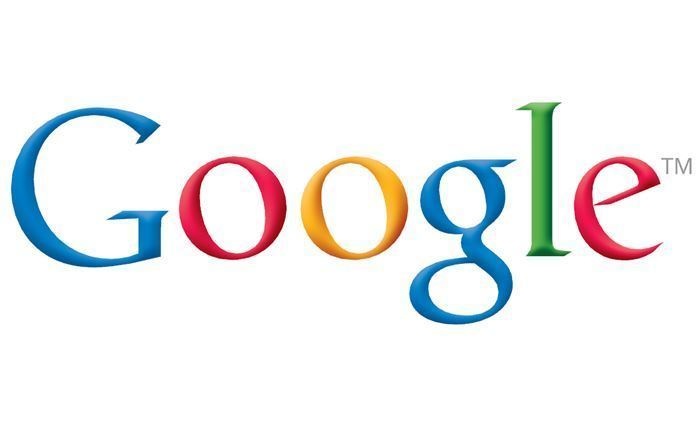
The logo of Google has got 4 primary colors that are arranged in a row which is later fragmented through secondary colors. This idea was totally intentional. Google wanted to make it evident that they don’t follow the rules. Besides, they also want to show they are playful as they haven’t made the symbol look bulky. For that, they just made use of simple colors and letters.
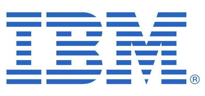
ibm-01

IBM

The logo of IBM, too, has got hidden message that is there for the world to see. Those white lines which pass through the logo present the appearance that an equal sign has, which is at the right corner to the bottom. This represents equality.
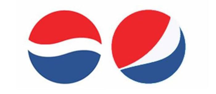
Pepsi-02

Pepsi

The old logo of the Pepsi is a circle with red and blue color and has got a white curved line passing through the diameter. However, they new logo of the Pepsi is also quite famous now and has cost the company one million dollars. They teamed with Arnell Associates to make the logo. Pepsi has to spend millions rebranding everything. It was called a spectacular design strategy. The new logo is a kind of a Day Vinci Code. The logo is inspired from the Renaissance, Feng Shui, Geodynamo of earth, the Theory of Relativity and a lot of other stuff.
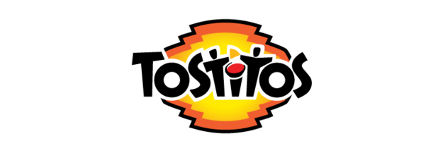
tostitos

Tostitos

Tositos is too much popular. The two Ts in the middle depict two friends who are sharing few tortilla chips along with salsa.
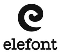
elefont-01

Elefont

The blank space that is in the logo which is an E in the lower case is nothing but an elephant trunk!

Hope for African Children Initiative logo

Hope for African Children Initiative

The moment you look at the logo, it just looks like an African map. But when you look at it closely, you will see that a child and an adult are facing one another.

toblerone-logo-01

Toblerone

We all love these chocolates don’t we? And we never actually took time to observe the awesomeness of the logo. The logo is of a mountain which has got snow over it, which is shown by the white space. But take a closer look and you will find a polar bear on it. This is because Toblerone originated in Bern, Switzerland that is popularly known as the city of bears.
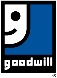
Goodwill-01

Goodwill

The G in the Goodwill is nothing but a smiling face. Awesome! Isn’t it?
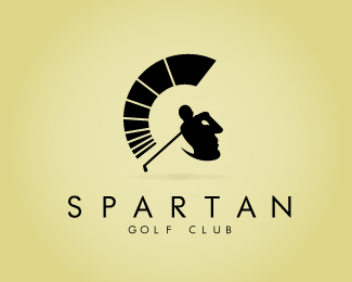
spartan-golf-club

Spartan Golf Club

This logo is totally genius. If you look at the logo in a way, it looks like a helmet of a Spartan. If you view it in another way, it is a Golfer who has taken a swing.
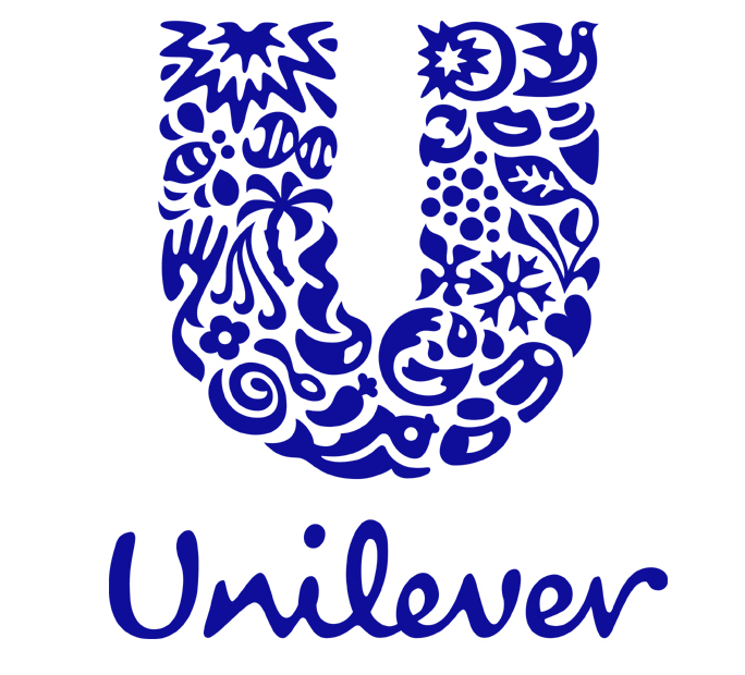
unilever

Unilever

The products of Unilever are so versatile that at times it is difficult to maintain a track of all their products. To our fortune, all the symbols in the logo stands for all products they produce.

8 Web Design Trends to Watch In 2016

Web Design Tips No Comment

8-web-design-trends-to-watch-in-2016

If there is anything true about web designs, it is that these web designs are always evolving. Web designs are dynamic. Due to this ever changing characteristic, it could be a challenge to stay updated with latest design trends. User experience has been the core focus of many of the web design trends that are relevant. Creating a content which is accessible, responsive and easy to use will increase the user satisfaction. The web design trends that are going to emerge this year are going to perfect the user experience. We listed down a few!

1) Hero images

One of the prominent ways of grabbing the attention of the user is an appealing image. A high-quality image along with a call to action which compels the users to involve in sales increases conversions. Hence, having an image that acts as a protagonist to your website will only help you in getting more and more customers. An good example of this design technique is the portfolio of Andrew Elsass.

andrew-elsass-homepage

2) Material design

The style language of the material design of the Google is the next step towards the craze for flat designs. Material design provides more depth to those flat designs by including shadows and lights, while also featuring layouts that are grid based, and also having responsive animations.

Photo credit: Angular

Photo credit: Angular

3) Typography

Minimal as well streamlined designs let typefaces turn dramatic and thereby have a powerful impact. Calligraphic fonts that are artistic are emerging popular as they feel personal as well as tangible.

Photo Credit: worldchess.com

Photo Credit: worldchess.com

Continue reading

Which Presidential Candidate has the Best Campaign Website?

Web Design Tips No Comment

When the Presidential elections are around the corner, there are a number of aspects we have to focus on and compare: which candidate has the best economic policies, healthcare policies and the likes. But there is one really interesting point to note here. Which presidential candidate has the best campaign website? The quality of the candidate’s website speaks volumes about the candidate in question. This is, basically, the hub of online campaigning and everyone has to get this absolutely right.

However, presidential campaign websites are not a new thing. They have been doing the rounds for the last 20 years ever since their inception by Bob Dole. Let us now see what the different presidential campaign websites offer us.

Marco Rubio

rubio-campaign-website-01

Website URL: https://marcorubio.com/
Tagline: A New American Century
At first glance, the website for Marco seems impressive and pretty much well balanced. So, this gives a good first impression. However, a little into the website, we encounter a series of pictures and videos that overcrowd the space, mainly because of their irregular shapes and sizes. There are also different caption bars varying in colors between red and blue. So, the best thing to do here is to organize the content in a more regular and eye pleasing manner with a much more simplified visual design.

marc-rubio-campaign-website-01
Continue reading

6 Dreadful Design Mistakes to Avoid in Website Design

Business Advice, Web Design Tips No Comment

web-design-01

SEO restricts the creativity of the designers, and thus web designers ignore SEO while web designing! But if SEO is ignored, your beautiful web design will just go to waste when you don’t have visitors to your site at all. Do not hope for free traffic from search engines if you have not followed the standard guidelines of a webmaster to make sure the visitor gets a good user experience.

We list 6 dreadful design mistakes to avoid in web designing, so that your website isn’t lost in rankings of the search.

1) Putting valuable information on images

information-in0image-01

It is quite obvious that search engines understand the text content. Though serving images, podcasts or videos to the audience engages them, your main motive must be drawing audience to them first. Search engines look for keywords in important locations. The most vital content of your website might be ignored if you have put them in images or flash files. Try and use text to display essential names, links or contents. Do not make the mistake of replacing the text headers with pictures. The best way to practice using images is to include the keywords in the images’ alt texts.

2) Ignoring the visitors on mobile

mobile-visitor-blog-image

Consumers spend around 69% of the time on smart phones. Hence, you must ensure that your website is responsive to the mobile audience as well. Though the responsive design of the website isn’t mainly a ranking factor, it is recommended by Google to the webmasters to turn their sites into a mobile friendly one. A design that is responsive will provide a consistent experience to the users on all devices. It will also increase the engagement of the audience in your website.

3) 404 page

joomla-404-error-page

You would not wish to lose the audience who would have entered a wrong URL or have opened a broken link given on your website. You might want to give a good experience even to such audience hoping they will reminisce your brand later. You would have also designed a good looking 404 page. However, you would have forgotten to provide a link back to your page. This might seem a tiny issue and web masters tend to miss it quite often. This can lead to loss of rankings on the search engine.

4) Unwanted pop up ads

pop-up-ads-01

These ads will not be indexed by the search engines. They aren’t even actually a portion of work plate of the designer. Such intrusive ads might compel the users to hit the close button the moment they pop up. That is the reason Google chrome blocks them by default. However, they still make it to the mainstream usage because of extraordinary results they get.

5) Using too many frames or flash

seo-images-01

Flash can be attractive visually, but search engines do not index them. A home page designed on flash can be one of the biggest blunders in SEO. 78% of users say that they dislike flash. You should not be using flash even in vital aspects of your website as it can affect usability of the website.

6) Filling up the webpage

crowded-webdesign

All those visually attractive animations, graphics, widgets and redundant codes will result in slower loading of the page. Besides being a bad experience for users, they are also one of the essential factors in deciding search engine rankings. Avoid stacking your web page with such images.


11 Resources for Logo Designers

Web Design Tips No Comment

logo-designers-01

Getting help from online resources is a good way to improve your logo designing skills. Check out the following top logo designers resources. These resources will provide you with advice and inspiration that will be helpful in designing logos.

  1. Logoed

Logoed hosts a collection of logo designs. It is a single page site. It contains a huge number of logo designs in its archives. The beautiful logos are arranged in an easy to view manner.

  1. Logospire

Logospire is a great site with an intuitive UI. It is easy to navigate. It displays many brilliant designs that can form your inspiration. It shows 12 projects per page. There are 14 such pages available in Logospire.

  1. Brand new

Brand new is actually more than just a logo resource. It is an upcoming graphic design enterprise. It gives advice for the brand identity development. It provides information on the latest design trends and gives valuable opinions. It also has archives of good logo designs. Continue reading

The Importance of Typography in Graphic Design

Web Design Tips No Comment

simplio-web-studio-logo-04

Graphic designs are meant to show your brand in a visually engaging manner.  They need to be extremely reader friendly. This makes the purpose of typography indispensable for a design. Typography is an art. It makes the letters come to life in your design. It has a great impact on how your design is received by people. It is as important or sometimes more important than the color and graphics used. It solidifies your brand image. It combines the both art and science to give the best effect to your designs. Here are some reasons why you should never overlook on the goodness of typography.

Speak to the viewer

A good typography accentuates your graphic designs. It gives them the ability to evoke the right emotion. It has been proved that typographical choices have a great influence on the audience. A good typography is legible and affects reader’s emotions as if you are talking to them. Good typography has been proven to create a positive emotion on people. It makes them perform better and sparks creativity.

Typography in Graphic Design - Cotton Natural

Reduces visual fatigue

The most desirable outcome you expect from your design is to make people impressed with it. Typography helps you achieve that. Appropriate font selection and mastery in typography will make your message more legible and easy to grasp. The line length, font size, character rendering and other typographical elements must be proper. Otherwise, users will feel distracted and annoyed. Following best practices in typography will reduce eye strain and fatigue. It will encourage the user to read more and pay attention to your design.

Continue reading

5 Online Tools for Visual Content Creation

Web Design Tips No Comment

visual-content-creation-01

Visual content is vital to the success of businesses. Creating an effective visual content requires creativity. It also needs an apt tool to represent it. Visual content can be of many forms. Videos, presentations, infographics, and memes are the usual types created. Videos are powerful tools for preparing promos for your businesses. Presentations are slide packs used to convey the thoughts. Infographics are a blend of images and graphics to present the creative mind. It also helps to brainstorm, plot charts. It helps analyze the data to arrive at decisions.

As many businesses move into the cloud, online tools have become widely available. An online visual content creation tool lets you prepare your marketing idea anytime and anywhere. There are many tools available on the web for creating remarkable visual contents. Here in this article, we will have a glimpse of a few of the online tools for visual content creation.

Piktochart

Piktochart is one of the most brilliant tools. It can be used to create presentations and infographics content. It is easy to use. It has ready to use themes to get started quickly. The themes can be previewed and picked up to suit the needs. Its intuitive editing tools let you edit everything. It has a vast library of images to add life with visualization tools. It allows uploading your own images to its library. Unleash your work by sharing your infographics to the world. You can share them online or get them printed in high quality. These can be furtherincluded in brochures. Its shareable feature allows to embed, email or share on other social platforms. It is integrated with Slideshare and Evernote to let you share to a wider audience.

Piktochart is available as a free trial version online. So you can try before you decide to buy it. Its features include a resizable canvas, categorized icons, design driven charts and interactive maps laid on an easy to use and intuitive interface. Its editor consists of a point and click interface, making it easy for non-designers.

Continue reading

5 Things You Should Avoid In Email Design

Web Design Tips No Comment

What Is Email Design?
People who have email accounts receive messages everyday. So the major challenge you have is making sure that the person receiving the message reads it despite the many messages he receives everyday.

email-design-01

An example of a good e-mail design

You have less than five seconds to convince the person receiving the message to consider reading it. Thus, it is very important for the message to have the right message, tone, and look. That is why good email design is important.

The Email Design Process
Although there is no standard way of making an email message, a number of issues apply for email design. First, keep the subject line as relevant, interesting, and short as possible. When it comes to the content, consider using shorter paragraphs instead of longer ones. In addition, remember to add links to the content so that people can take action. Finally, apply the 80/20 rule when dealing with text and images respectively.

Complicated Design
There is an old adage that “less is more”. This concept applies when you are designing an email. Images should not be your priority in the email. Actually, you should design the email as if there will be no images. This is because many platforms leave out images unless the images allows. Many recipients of your message may not see the beautifully done images because of this. You need to persuade the recipients enough to open the images. Therefore, consider using a simple design for your email.

Using Loud Colors
Many people are tempted to use loud colors when they are desperate for attention from the online audience. Yes, you can get attention this way, but a different one. If you are too bright and loud, the audience will not listen to what you are saying. Here, the problem is overwhelming the visitor with colors and design. Eventually, you end up drowning your sales message and losing and perfect opportunity to sell your business. Consider using colors such as blue, grey, and white for your email. Red and orange are completely out of question.

Using Too Many Fonts
People usually make the mistake of using multiple fonts in different sections of the text. The reason for this is to attract attention. This can result into a busy and confusing design. The rule of the thumb is not to use more than two fonts. One font should be for the heading, and the other for the body.
If you must separate different sections of the message, alter the color and weight. Furthermore, italics are available if you need more sub-headings. Consider being more cautious about this and your brand strategy will be stronger.

Being Too Wordy

wordy-email-01
You do not want to bore your audience with superfluous stuff. Unfortunately, some people do this all the time. Instead of going directly to the point to explain the core issue to the recipient, you may be tempted to tire the audience with irrelevant details. You can avoid this mistake by identifying your valuable information and going directly to it.
A point to note is that emails should be a pointer to something else. This means that emails are a teaser to the main course. Give your audience a teaser of the main thing in the mail. For the rest, give links and encourage people to follow them.

Not Making the Message Mobile-Friendly

mobile_newsletter
As of May 2014, 65 percent of email opens were on mobile devices. Going by earlier records, this trend is likely to continue for several more years. Gadgets that are more complicated are likely to continue entering the market as people move further from stationary devices. Therefore, you need to design your emails for mobile devices such as Smartphone and Tablet. Your designer can make sure that the email fits for a smaller screen apart from the conventional desktop. You should even be more committed on this because most of your competitors are already creating mobile-friendly emails.

The Ball Is In Your Court
There you have it. Setting an email campaign demands a certain degree of professionalism. While designing your email, you will need to make corrections and improvements. You can correct some of the errors by always doing a test email.

A professional yet easy-to-read design is critical for the success of any email campaign. If you make a good email, recipients will have an easier time reading it and using click-throughs. This is the basis of any email campaign.

Email campaign is an addition to the many forms of marketing available. None of these options has a one-size-fits-all solution. Therefore, make sure you try a number of layouts to see which one works best.

You may have been doing the shown by this article until today. Remember that it will take some time to make major improvements. If you follow the tips given here, your email campaign in 2015 and beyond will be exemplary.

What you need to know about Webmaker – Mozilla’s latest project

Web Design Tips, What's New No Comment

Mozilla is known as a large community of builders, thinkers and technologists from around the world. Its projects have always been user-oriented. Mozilla is best-known for its extremely popular Firefox, Thunderbird and FireZilla projects. However, it is also developing other project such as Persona which provides users with a much better and easier way to sign in to various websites.

Webmaker

Mozilla has also launched a new project recently, called Webmaker. This seems like a very promising thing with a big future ahead of it. Webmaker is again made with users in mind and it aims to help people create cool things on the web regardless of their coding knowledge. According to their own words, the idea is to help people understand how the web works and use that knowledge to make a web with no limits.

But what does Webmaker offer?

The things that people can take advantage of with Webmaker are divided into three sections:

  1. Tools

This is one of the best things about Webmaker. For now it only offers 4 tools that people can use, but we can expect the list to grow very soon. Each tool gives people the option to create something from scratch or remake something that someone else has published. Here are the 4 tools you can play with:

  • X-Ray Goggles

Have you even clicked the right button and then “Inspect Element”? This tool is similar, except it shows you the elements of any web page in real time when you hover over them with your mouse. Needless to say, you can edit each of those elements to your liking and even publish the page that you have edited.

  • Thimble

Thimble lets you create your own HTML web pages and work on the CSS right from the browser in a quick and easy way. It shows you the results of the code you are writing in real time and you can host and share all of your projects with a couple of clicks.

  • Popcorn Maker

With Popcorn Maker, everyone can edit web videos, images and audio and embed the end product anywhere they like. You can use this tool to drag and drop all kinds of content from around the web, combine, cut and skip parts of videos, add different layers of audio and much more from your browser.

  • Appmaker

Perhaps the best of the 4 tools, Appmaker allows you to create your own mobile apps with simple drag and drop actions. This is extremely easy to use even if you have absolutely no coding knowledge at all. With this tool you just drag different “bricks” from simple headers and buttons to more advanced chat rooms and media players and drop them on the screen of a mobile device. It’s as easy as that.

Webmaker

  1. Resources

Webmaker offers much more than just 4 tools. People who want to learn or learn how to teach can use the many available resources which include useful and easy to understand information about web mechanics, security, design and accessibility, coding/scripting, collaborating, sharing and more.

Webmaker Event

  1. Events

On the Events page of the Webmaker website people can find out about different events around the world and how they can join. Currently there are 2,098 events and you can either search for one or create one of your own. These events are also known as Maker Parties and they are all about celebrating the web. People who join such Parties will be able to learn anything from making a video on the web to why privacy matters.

Overall, Mozilla has started another great project and we can only imagine what it has in store for us. Webmaker is already a lot of fun and offers people with minimal or no coding knowledge at all to learn something new and basically to understand the web.

Good experience

★★★★★
5 5 1
SimplioWebStudio did a great job

Project accomplished

★★★★★
5 5 1
Project accomplished

Plugin developed successfully

★★★★★
5 5 1
Plugin developed successfully

ANOTHER SUCCESSFUL PROJECT

★★★★★
5 5 1
ANOTHER SUCCESSFUL PROJECT

Thank you Simplio team

★★★★★
5 5 1
Great experience

Working with Simplio Web Studio was a fantastic experience.

★★★★★
5 5 1
Working with Simplio Web Studio was a fantastic experience. The service provided was amazing and professional. It was a delight to work with Nir, who went the extra mile to meet our demands in a timely manner. He really made our vision a reality by creating us a classic site, but moreover the relationship we formed is something our company really appreciates. It was a pleasure working with Nir and the team at Simplio Web Studio. We highly recommend them to all and we look forward to working and doing more business with them in the future.

a great project

★★★★★
5 5 1
a great project

All the best

★★★★★
5 5 1
All the best to Simplio

My website is Live

★★★★★
5 5 1
My website is Live , thank you Simplio

From beginning to end, the team at Simplio provided top of the line customer service.

★★★★★
5 5 1
From beginning to end, the team at Simplio provided top of the line customer service. The web developers are incredible and made sure we got exactly what we were looking for! They truly went above and beyond to make us happy and we couldn’t have been more pleased with their talents. We would highly recommend them. Thanks so much Nir!

After over two years of research we chose Simplio.

★★★★★
5 5 1
After over two years of research we chose Simplio. We are so far very satisfied. These people answered the phone on a Sunday and fixed a problem that was not even their fault. It was the host company which I had chosen that had caused our site to go down.

Outstanding in both knowledge and professionalism.

★★★★★
5 5 1
Outstanding in both knowledge and professionalism. Nir and the staff at Simplio are Excellent in branding, web design and overall web presence. Definitely recommended!

I cannot even imagine having another company managing my Presta shopping cart.

★★★★★
5 5 1
They are now part of the Diastasis Rehab business team after working with them almost a year now. I cannot even imagine having another company managing my Presta shopping cart. After a bad experience with a programmer, I needed a new programmer (one that knew prestashop shopping cart) and most important one that I could trust. Finding all three was a difficult process! Lucky for me I found them. I cannot say enough about the diversity of services that this company provides. Every step of the way they make amazing suggestions to increase my sales and they get back to be right away either by email or phone. They have even created a simple and easy check out program for Presta Shop. They are actually a one stop shop! They updated my SSL, are setting up and changing my server to a dedicated one, setting up streaming of my DVD, website design, creating a specific program for address verification on Presta cart and handled the integration of Presta cart with my fulfillment house. I am now working on developing an APP with them

Simplio really helped me out of a jam.

★★★★★
5 5 1
Simplio really helped me out of a jam. They did exactly what I needed on a very tight time frame (with little notice too!!!!) They are my new go-to guys for any Prestashop needs! Thanks Simplio!

Excellent service!

★★★★★
5 5 1
Excellent service! Nir was exceptionally helpful in solving a lot of issues with our website and making the user experience more smooth. He understood the needs of our school and helped improve the website tremendously.

impressed

★★★★★
5 5 1
What impressed me most about working with Simplio was their attention to detail and excellent communication. Not only are they talented developers, but, they are also pleasant to work with and highly professional. Highly recommended!

professional service

★★★★★
5 5 1
What a profissional service Simplio offers.I hired them to rebuild my website for my business and they were creative and professional. Nir was on top of the whole project from day one, until he delivered the project on time. I will defiantly recommend Simplio to anyone who is looking for website services. From creating, designing to maintaining your image online. Good Job Nir and the rest of your group.

Great Logo

★★★★★
5 5 1
Great Logo, Very happy

fantastic to work with

★★★★★
5 5 1
Simplio was fantastic to work with. They were fast, communicative and incredibly helpful to me. I highly recommend them to anyone who needs help with their digital needs!

Awesome experience

★★★★★
5 5 1
All details and requests were met in prompt an friendly manner. Would recommend on any day to anyone who wants to feel their business is in great hands.