How to create a logo that works Overall rating: ★★★★★ 5 based on 23 reviews
5 1

BlogSimplio Labs Blog

“Once we accept our limits, we go beyond them.”

Albert Einstein

How to create a logo that works

Business Advice, Web Design Tips No Comment

Starting a new company is always a challenging task and somewhere in the chaos of things you will have to find some time to create a logo. Of course, you are not a designer, but you will have to tell the person who will be creating your logo exactly what you want. And even the best designer won’t be able to save you if you want something that’s just not nice.

What it Takes to Create a Good Logo?

One of the most important things for your logo is that it should work on all kinds of platforms. In order to create that, you should be able to work with your designer. Here are some tips that will help you to make the right requests for the best result:
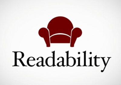
Create a logo that is readable

  1. Readability

Creating a custom font for your logo nowadays is easy. However, sometimes these custom fonts are extremely hard to read and that’s a big mistake when it comes to creating logos. Your custom font might be beautiful to look at, but your slogan or brand name should be readable. Otherwise, the text will just take space and you might as well not write anything at all.
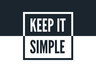
keep-it-simple

  1. Simplicity

Simplicity is at the core of modern day design and more specifically logo design. Creating a logo with intricate patterns might indeed look good, but your logo is not a painting. It has to do a certain type of job – tell people who you are at a glance. A simple logo that is clear, crisp and easy to understand is what you should aim for. If you can’t describe your logo in a sentence, it is probably too complicated and you should think of another design. Keep in mind that vector graphics usually work best for logo design.

Scalability

  1. Scalability

The size of a logo can be a tricky subject. Many logos look great when they are being viewed as big illustrations, but when you scale them down they become unreadable and unrecognizable. Your logo should be designed in such a way that it looks as great on billboards as it does as a favicon.
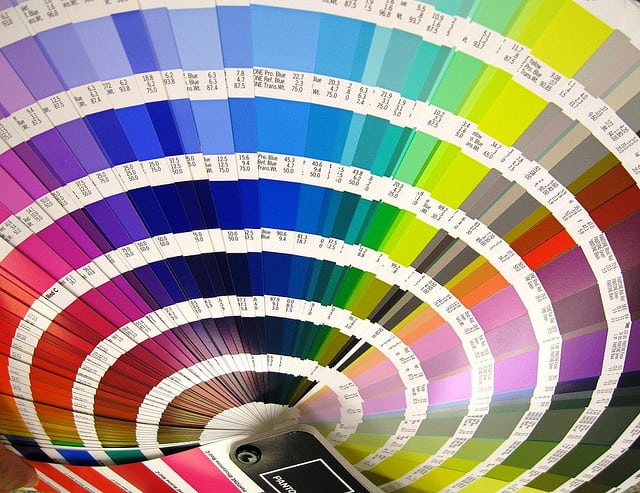
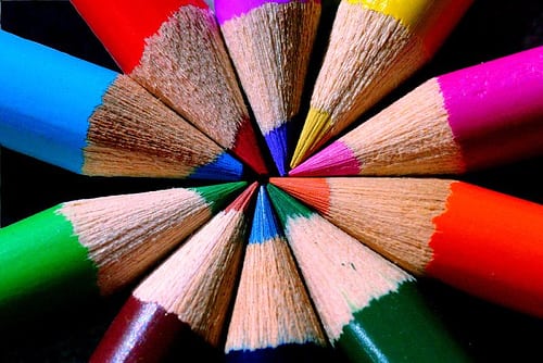
Color wheel to create a logo

  1. Colors

Choosing the colors for your logo is a very important process and most times it is best to let your designer do that for you. Most designers will make sure that the logo they are creating also looks great in grayscale, but another thing you will need to consider is if your logo looks good in a single color.
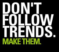
Don't follow trends to create a logo that works

  1. Don’t be trendy

Following the latest trends when creating a logo is a very bad idea. This means that you will end up with a logo that will be very popular for a short period of time and it might not work 5 years from now (or even 1). You can still adapt your logo so that it looks modern, but make sure the core design can stand the tests of time.
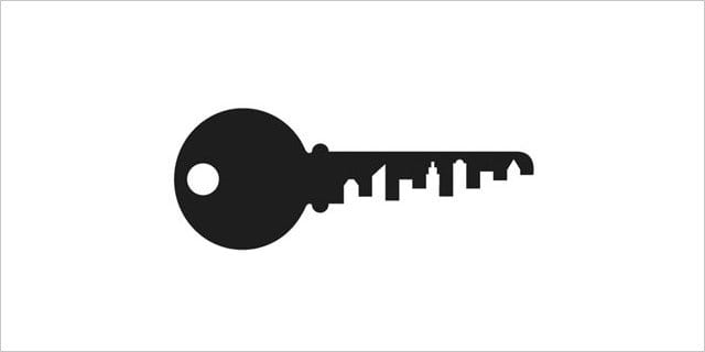
ns-american-institute-of-architects-center

  1. Negative space

Negative space is one of the best vector design elements that you can use for your logo. By using negative space you will be able to convey many different messages in a subtle way. Great examples of companies and organizations that make use of negative space in their logos include Girl Scouts of America, Guild of Food Writers and FedEx.

There are definitely many things that you will need to be careful with when creating a logo. It is a process which is actually more difficult than many people realize, but if you follow these basic guidelines, your logo will always make a good impression and won’t be easily forgotten. Don’t fall into the trap of bad logo design and most importantly – think outside the box. Your designer is only as good as your ideas.

Why Is Typography So Important For Web Design?

Web Design Tips No Comment

For laymen, the terms “typography” and “font” are not much different. In fact, these two terms are often used by the people interchangeably. However, for the graphic designer there is a lot more than fonts to typography. It is a whole science in itself and it plays a vital role in web design as well. In the last few years, web designers have started to recognize the importance of typography and the latest trends have affirmed its leading role in modern design.

If you think typography is all about choosing the font that looks the prettiest, you are totally wrong. It is way more than that.

So, what is it exactly?

Robert Bringhurst, a Canadian typographer, describes typography in his book as “the craft of human language with a durable visual form”. Ellen Lupton puts it in a similar way, but with simpler words: “Typography is what language looks like.”

In simple words, typography is the technique and art of arranging type. That includes each possible element which can affect the web design, like typeface choice, color palette, point size, line length, design integration and layout among others.

This leads us to the next question:

What is its purpose?

Due to the fact that typography is so closely bonded with web design, many people suffer the misconception that its purpose is to make the site beautiful. A reason for that could be the fact that people link the term “design” to making certain things look beautiful, as is the case with interior design, and this misconception is transferred to typography as well.

They are wrong. The main purpose of typography has nothing to do with beauty. It is actually readability that typography aims at. This does not mean that it should not look pretty at the same time, but this is just an added bonus. The main goal that stands before the typographer is to make sure that the type is readable.

So, why is typography so important, then?

An average 95% of every website is occupied by content. And typography is the art of displaying content. So that makes it pretty important, don’t you think?

But putting the math aside, the sad fact is that there is still a common notion among many web designers that typography is all about pretty fonts and web design is all about fancy graphics. This oversimplification can really play a nasty trick on you. Even design professionals seem to forget sometimes that content is what brings visitors to a website and again, content is what keeps them on a website, and that content has to be easy to perceive.

Here we have gathered five reasons why typography should not be taken lightly and should be given its due importance.

  1. Typography communicates the website’s visual summary

When taking a look at a website, you can often say even from the first glance whether it is a fun or a serious, business-like vibe that it is sending out. A large part of this message is achieved through typography.

The layout and look of the website are complemented by the choice of colors and fonts and the way the content is arranged on the page to evoke certain feelings and emotions into the visitors. Just a quick glance of the page is enough to either grab your audience’s attention or drive them away for good.

  1. It carries your brand forward

You don’t believe that typography plays a part in branding? Then you should try this simple experiment out: Take a well-known brand and change its typeface and font. Then look at it again. Doesn’t that change your whole perception of that brand? Doesn’t it look out of balance?

A brand is largely defined by its logo. It is what establishes the brand’s identity among the users. There is no second opinion about that. However, if you have a great logo and don’t complement it with adequate web typography, you won’t go a long way as a brand. If, on the other hand, your font, logo and typeface go hand in hand harmoniously, then you have a winner!

  1. Typography guides the readers through your content

Good content is not enough for building a great website. It should be well presented, too. The solution to that task is typography. Every element can have its impact on the way your content is perceived – starting from the size and font of the text all the way to its alignment and arrangement on your pages and the colors you’ll select. Good typography will emphasize on the most important parts of your content and draw the readers’ attention to them, and it will also define the whole structure and flow of your website.

This is especially evident in the cases when you are reading articles on the internet. If you have a 1500-word post before you, which consists entirely of plain text, you will really have a hard time reading through the whole post, even if the topic is very interesting. On the other hand, even small tweaks and formatting like changing the font size, color or typeface of certain parts of the content can make the article a lot more easily readable and hold your attention right till the end of it.

  1. It can make content look attractive

Don’t get this the wrong way; this doesn’t mean that typography can turn bad content into good one. Content with no intrinsic value won’t be able to engage the viewers even if it is clad in the best typography. It may make the visitors take a look at it, but they will quickly reveal the deception and move away from your website.

However, even the most well written and clever content will look ridiculous if you just paste it on your page in 11 point neon green Times New Roman or, God forbid, Comic Sans. In that line of thought, if you have fairly decent copy, you can enhance its appeal through the use of adequate typography and make the readers feel compelled to read it.

  1. When done right, typography maintains the website’s consistency

The internet users are inclined to look for familiarity and order when they visit a website. Thus, your site should have a consistent design that won’t prompt your visitors to wander about looking for the navigation button they need or the contact information, which is hidden somewhere in the small print. Inconsistency and chaos make for a frustrating user experience and the visitors will most likely not come back to your site if they are faced with that kind of experience even once.

Good typography can help you out in this aspect as well. It straightens the site up and tidies things up so that all of its elements will be clearly visible and easy to find for the users. When uniformity is maintained throughout all the visual elements of a web page, such as typeface, font, color, size, etc., the user experience becomes much more pleasant, thus boosting the conversion rates too.


You can’t deny the fact that typography is capable of shaping the perception of your website’s visitors and engaging them with your web pages. It can also affect your conversion rates and play a major role for the effective content delivery to your users. You should abandon the obsession with “pretty” content and aesthetics and instead focus on the clever use of typography, as it is a powerful tool which can do wonders for your website. Go by the words of the famous type designer Matthew Carter, “…type is a beautiful group of letters, not a group of beautiful letters.


The 12 Ground Rules of Web Design

Developers, Web Design Tips No Comment

Whether you decide to create your website on your own or to collaborate with a web designer in the process, there are certain basic rules that your web design should follow in order for your site to be user-friendly and for the visitors to want to come back to it. This is especially vital for business websites, as the online visibility is one of the most crucial components of brand management in today’s world. Here we have listed out the twelve must-have components of every good web design.

  1. Take your target audience into account. You may be tempted to use a theme that you like, but you should first think of whether it is appropriate for the content you will be displaying and the way your audience is going to perceive it.
  2. Your website should look professional. Make sure there are no spelling and grammatical errors, poor quality graphics or broken links anywhere on the site. “Under construction” pages also look bad in the eyes of the viewers. With the tools you have at your disposal today, there is really no excuse for such issues on your site.
  3. Quick loading time – there is nothing more annoying for a visitor than waiting for a page to load forever. Your website should load almost instantly. Large graphics and flash presentations can really slow your site down and they don’t work well on iPhones and iPads anyway. Keep these things in mind and work on your site’s loading time, if you don’t want your visitors to lose interest and go elsewhere.
  4. Your website should be easily readable. Do not use light text on a light background or dark one on a dark background, or very tiny fonts, as that will only frustrate your visitors and make them leave your site more quickly.
  5. Use a standard and popular program or platform of a current version to design your site, like the WordPress platform. The more common program your web designer uses, the higher the chances that it will still look good when newer browser versions are released. That will also make your site easier to maintain and update as the people you entrust that task with will be more likely to have the necessary skills.
  6. It is best not to use flash intros, music, flashing banners or scrolling marquees unless absolutely necessary for communicating the core message of your website. Otherwise they will just annoy the visitors and waste their time. If you can add “audio on/off” or “skip intro” buttons this is the first sign that you can do without these elements.
  7. Go easy on the colors. Use them sparingly and make sure they harmonize well. The same rule applies to the fonts on your site – stick to a maximum of two or three fonts.
  8. Easy navigation – although you may be tempted to use unlabeled active areas, disappearing menus and buttons without any descriptive text on your website, as they may look cool, the chances are that your visitors will be frustrated by them and will lose interest in browsing your site further.

Test your site with a small audience representing your target visitors, before you publish it online. Check their feedback on the layout and design of the navigation and see if they had any difficulties in using it. Doing this in the course of the development of the site can spare you some tedious and costly changes afterwards.

  1. Use consistent navigation designs and page layouts throughout the entire site. Visitors tend to get really annoyed when they cannot find the navigation link on the same place where it was on the previous pages. And some may not be able to find the link at all.
  2. Make sure you have all the legal rights of the design, fonts and images you are about to use on your website. Copyright infringement is the last thing you would want to deal with – it may not only cause you to pay money but may also bring your site really bad publicity.
  3. There are currently numerous web browsers and platforms in use. While you may find it hard to get your website to look perfect on them all, you should focus on making it look good on the most commonly used ones that the majority of web users rely on, like the latest versions of Firefox, Internet Explorer, Google Chrome, etc.

Also, keep in mind the rapidly growing trend of mobile device browsing and design a special mobile-friendly version of your site that will run well on Android, iOS and Windows devices with different screen resolutions. This involves a lot of hard labor but an experienced web design specialist should not have any problems in making your site compatible with multiple platforms.

  1. You should understand that the design of your site will never be over and done. In order to make visitors come back and check your site again and again, you should make sure that you provide them with information that is up-to-date and relevant and brings value to the readers. Outdated information, lack of any new content and broken links are a recipe for disaster as these will cause your visitors and perhaps potential customers to lose interest and maybe never come back to your site again. This issue can be addressed with a well structured blog and content marketing strategy, but that is a theme for another post altogether.

Web design is no child’s play. It involves a lot of expertise and requires you to factor in a lot of different aspects. You should address the process of creating your website seriously and professionally in order to get good results and proper visibility.


How Will Responsive Web Design Develop in 2014?

Developers, Web Design Tips No Comment

2013 was widely deemed as the “Year of Responsive Web Design”And indeed, 2013 saw a massive rise in the popularity of responsive design with even major sites like those of Mashable and Times Magazine, not to mention thousands of others, adopting the responsive design philosophy. In 2013, responsive design clearly went mainstream and it has now reached a point, where it has become the thing that consumers and designers expect to see.

Image source: infocux Technologies – https://www.flickr.com/photos/infocux/8240904818

2013 was also a great year for responsive design tools with the coming out of Foundation 4 in February, followed by Bootstrap 3 in August and Foundation 5 shortly after that. Yahoo released their Pure in May, entering the big game, while Thoughtbot has been continuously developing their Bourbon Neat. We saw the rise of new polyfills, plugins and practices. With such powerful tools, building responsive websites has become much easier.

With such rapid development in 2013, we can’t help but wonder what 2014 will bring for responsive web design.

Responsive Design Will Get Smarter

In 2014, our knowledge and understanding about building and optimizing websites for any type of device will become much deeper and more comprehensive. Responsive sites have been the victims of a number of optimization issues of different complexity, but with the improvement of the tools available, the developers are now starting to form a system of good practices and standards. Elements such as the off-canvass panels and the “hamburger” navigation icon that has now become ubiquitous are gaining popularity and now work pretty responsively.

With the new plugins and tools, elements such as the selective loading of media and assets, the device capability detection and the optimization for hardware and speed will all become more easily understandable and much less difficult to implement.

Improved Device Recognition

It has always been hard to pin down the device classes, but the common separation of mobiles, tablets and desktop computers will be totally shattered in 2014. There are already devices on the market that fall somewhere between the common definition of a tablet and a phone, or a tablet and a desktop computer. Furthermore, now there is also a whole new range of devices added to all those like smartwatches, the Google Glass and the like and who knows, perhaps we will finally see the Apple iWatch this year, too. Add to that the smart TVs and all the other home media devices with web connection capabilities and you will end up with a huge number of device types and categories, which often overlap and intertwine.

With all that in mind, responsive design is already taking the first steps towards true device agnosticism. By the end of the year, we will see significant development in this direction. This trend means that designers can make plans even for devices that are not invented yet and they can accommodate a range of specific device constraints and capabilities.

More Advanced Frameworks

Our predictions will be incomplete if we don’t examine what 2014 holds in store for the responsive design frameworks, like Bootstrap and Foundation, for instance. The area that will have the greatest opportunities for development in 2014 will be the complex tools that include a lot of components and input means and also trickier to display data models. Up till now, responsive web design has been implemented predominantly in content and marketing sites, while complex apps have taken a backseat.

However, many designers are already working in that direction and rebuilding their apps (product apps etc.) on responsive frameworks in order to be more flexible and responsive. The developers of the major responsive design frameworks are also recognizing this trend and incorporating numerous web app centered components into their products. This will surely make the building of complex apps a lot easier and more straightforward.


If 2013 was a great year for responsive web design, 2014 will be even bigger. With all the ongoing development and improvement in the device recognition capabilities, the flexibility, and the available framework and with the constant enhancements in the knowledge about responsive design, we are eagerly waiting to see what more 2014 has in store for us all!


How to Select a Graphic Designer – Tips to Adhere to

Managers, Web Design Tips No Comment

In a recent inquiry about the areas in which businesses struggle most, there was a prevailing response received from a large number of small business owners. If you think that this was social media or marketing, etc. then you are in for a surprise. The area in which small businesses most commonly face hurdles and feel most disoriented is hiring a graphic designer. Small business owners often feel out of their comfort zone when it comes to selecting a professional to design their logos, printed materials and website design elements, and they are often left unsatisfied with the final results. To prevent this scenario, here are a few tips to stick to when choosing a graphic designer for your business needs.

Image source: University of Salford – https://www.flickr.com/photos/salforduniversity/8424131760

Hire a professional

As much as you may be tempted to engage a relative or a student to create your design, always prefer hiring a professional! A professional designer is the only person who is well versed enough with the ever-changing technology and will know the right software to be used for each specific type of design requirement. For example, T-shirt and billboard industries do not use the Adobe Creative Suite but instead rely on other software products.

Your chosen designer should have ample knowledge of computers, web and print production and the compatibility of different software solutions. For instance, the products of Apple do not run Flash.

Remember that if something looks good on the computer screen it will not necessarily look good when printed out. Thus, the professional you hire should be well versed with all the aspects of the graphic design.

Know what you want and give examples

Before even setting out on a search for a designer, you should determine what exactly you need. If you give your graphic designer only vague suggestions, you are most likely not going to be satisfied with the final product and you will have to start all over again.

Providing examples can be of great help in this regard. You can find sources or website that have a look and feel similar to what you are aiming to achieve for your design. These will be a good starting point that will aid both you and the designer in the process.

Draw a preliminary frame

This directly corresponds with the above tip. Even a very basic mockup or sketch will go a long way in putting you and the graphic designer you have chosen to work with on the same page prior to starting the project. This is also an easier way to clear your thoughts and expectations from your desired graphic design. This is even more useful if you are engaged in a large-scale project, for instance a website, as it will also give an insight into the user experience.

Asses the way the designers present their own work

Before making a final selection of the graphic designer or agency you will engage to do your job, take a look at the way they present their own work. If they are taking great care in projecting a professional appearance, they will most likely exercise the same attention to detail when working on your project, too.

Also, always select an artist who has enough experience in the specific type of design work you need them for. Choose a professional whose design style corresponds with the one you need (note that we say need and not want, as what you want may not necessarily fit your target audience’s needs). This approach has an added bonus, too – when the designer is working within their comfort zone, the results are always more impressive.

Take care of the ownership rights

Always ensure that all the ownership rights of the graphic design you pay for and the source files are transferred to your name in the end. Also, never hesitate to ask for a written agreement with the designer. It is a crucial rule to have the entire legal rights of ownership to your design, be it a logo, a print design or a web design, because that shields you from legal actions and allows you to use the graphic content in any way you see fit in the future.

Do you have any experience in dealing with a graphic designer? Do you have any other tips to share?


11 Elements That Your Website’s Design Should Not Lack In 2014

Developers, Web Design Tips No Comment

There is no way to give a single answer to the question “What makes a good site?” However, attractive, purposeful and clear yet functional design plays a major role for the success and effectiveness of a website. It is not as easy and straightforward to achieve all those things simultaneously as some people may believe, and maintaining the balance among them can be even harder. With the ever-evolving web design field and the ever-changing customer tastes, it is essential to run with the trends in order to stay relevant. Here, we have tried to list out the elements that your website should definitely have in 2014 in order to stay up to date.

  1. Simplicity

A cluttered and overdone website is the easiest way to scare off the visitors and make them close the tab with your website. Forbes has ranked simplicity as one of the major trends in web design for 2014. Clean and simple design is the most ‘in’ thing right now and by the look of it, this trend will continue to grow steadily throughout the year. If you think that keeping your website simple will lead to a plain, bland or boring design, you are totally wrong. Minimalism is a whole art category in itself. Simplicity can yield an aesthetically pleasing and impressive site and at the same time, the uncluttered design can be perfectly complemented by a clean, easy to access and use navigation. You don’t have to use excessive design and visual elements just for the sake of it. Instead, avoid the information and visual overload by keeping in mind the actual message of your website at all times.

  1. Flat Design

This is another major trend that is seeing a rise in 2014. Avoid 3D and over-the-top visuals and stick to a flat layout instead. The redesign of Apple iOS has played a major role for the popularity of this trend and flat design is quickly turning into the most sought-after design form. In short, this design method relies on sleek looks and clean interface with more neutral and subtle colors and less complicated layouts. A fine example of good flat design is Winamp’s website.

  1. Maximize the User Experience

The best user experience is your ultimate goal when designing a website. Today, the primary thing that users want when they land on a website is to be able to access and utilize the services or information that they need easily and quickly. This is one of the reasons why, as we already mentioned in the first point, minimalistic design is so widely preferred these days. When you are composing and designing your website, make sure that the things which people will need can be seen clearly and that nothing on the site will cause confusion or distraction, even to the visitors with limited experience in computer use.

  1. Easy User Registration

In our fast-paced world, no one has time for long registration forms. Obtaining the contact information and building mailing lists of your customers or visitors is as vital as ever, but you should keep your registration forms easy to access and fill. Instead of prompting your visitors to go out of their way in order to sign up for your updates, for instance (which will most likely make them lose patience and give up), try to incorporate your user registration form somewhere on a main page of your site or use a pop-up where they would simply have to enter their email address. Try to add some benefit to subscribing for your newsletters, too.

  1. Go Big, Go Bold

You should keep your site’s fonts, text and typography big and bold. When you stick to this rule, everything will stand out (especially when well combined with a simple design), you will capture the attention of your visitors and this will also improve the readability for the ones browsing your site through mobile devices. If your visitors have to squint or zoom in to be able to read your content, they will soon be tired and annoyed and may decide to leave your site. Prevent that through the use of bold and distinctive typography.

  1. Mobile Compatibility

With the number of people who use their smartphones for accessing the Internet constantly rising, you should ensure that your website is easily readable on mobile devices; otherwise you may lose a lot of traffic, and revenue too. You should keep the use of Flash to a minimum and test your website’s compatibility with different devices, both mobile and desktop ones. Responsive web design is your best bet in this regard, as it can cater to multiple device types with just one website.

  1. Videos

Videos can put across messages and ideas as well as present products much more effectively than text and static images. They also do that a lot more quickly and engage the viewers more successfully. They break the monotony of the web page and studies have shown that people get bored more easily when they have to go through large sections of text as compared to watching a video with a few minutes’ length.

  1. Incorporate Animations

When properly done, animations can play a great role in communicating a particular message or idea or presenting a product to the users. Furthermore, it is not necessary that they should take up too much space on your website. A clever animation which is well blended in with the other sections of your site can also aid you in gaining or holding the attention of the visitors without looking too promotional or sales-oriented.

  1. Fast Loading Pages

If you place big amounts of content and large files on your pages, they will take a lot longer to load. Apart from being impractical, this is also annoying, and today people don’t have the time or patience to wait long for web pages to load.

  1. Fixed Navigation Toolbar

This particular element has a huge role to play for the usability of your website. Use a fixed navigation toolbar to keep everything straightforward. Make sure the navigation stays at the top of the page all the time in order for people to be able to easily navigate around your website and find whatever they are looking for without much effort. Users don’t like to spend much time looking for the desired navigation button. Organize your site navigation cleverly and do not overstuff it with categories.

  1. Clearly Visible Contact Information

It is utterly annoying to struggle to locate a company’s contact information and it has been proven that people are inclined to give up on this task pretty quickly in case they cannot find the contact info at a glance. Don’t make your visitors exert efforts in order to find your contact information. Keep it clearly visible; it is best to ensure that you have it or a link to it included on each one of your website’s pages.

In Conclusion

We have gathered just a few tips to help you get started with your web design. There is a lot more to learn along the way. You should keep a close watch on the design trends and the developments in the field. Also, don’t forget to put yourself in the users’ shoes and keep improving the user experience for maximum satisfaction of your visitors.


5 Strong Reasons to Embrace Responsive Web Design in 2014

Web Design Tips No Comment

If you haven’t given a thought to adopting responsive web design yet, it is high time that you did. If you want to keep up with the web design trends and not lag behind your competitors, you should seriously consider building a responsive site for your business. Here are the five most important reasons that should convince you to take this decision.


  1. Google Recommends It!

You could not think of a stronger reason to convince you to embrace responsive design. Ever since 2012, when Google first recommended the use of responsive design, this design technique has gained the reputation of the best way to optimize websites for smartphone viewing. Responsive sites use the same HTML and have only one URL, unlike separate mobile and desktop site versions. What this means for Google is that its bots can crawl and index the content of your site easily. This alone should be reason enough to adopt responsive design today!

  1. Lower Bounce Rate

In case a visitor lands onto your website and returns to the search engine result page immediately after that, without viewing any other page of your site, in the eyes of Google your site will not be considered the best match for the query that the visitor has made. If the visitor reaches your site through a mobile device and the site is not easy to view and navigate, this bounce rate is expected to be higher.

However, when you incorporate responsive design elements into your website, the CSS values will change based on the device the site is viewed from. This will significantly lower the bounce rate. And given the fact that close to 28% of the visitors used their mobiles to browse the internet in 2013 and by 2015 this percentage is expected to exceed the percentage of desktop viewers, you should not ignore mobile traffic and mobile optimization unless you want to lose a lot of potential customers.

  1. 1 Website = 1 SEO Campaign

If you have both a desktop version and a mobile version of your site, you are most likely managing a separate SEO campaign for each. This is no doubt a tedious task, not to mention the costs involved.

If you choose to employ responsive design, you will only have one website to take care of and you can concentrate all your SEO efforts on it. The need to promote two separate websites for mobile users and desktop users will be eliminated. This way, your link juice will flow to only one site and it will rank better. That will surely give you the upper hand on those of your competitors that have not gone responsive yet.

  1. Responsive Design Combines Redesigning and Long-Term Maintenance

Many companies are still using mobile dedicated websites as their primary websites today. However, a mobile site poses a number of maintenance issues. With the drastic change of technological trends, the design of the mobile site will require more frequent updates and maintenance procedures as compared to a site built with responsive web design. Responsive sites require much less maintenance and at the same time have a longer life.

Fluid grids combined with media queries can give your responsive design sustainability. Even though the user devices may get updated at certain intervals of time, there will rarely be any need for updates of your responsive site in order to keep up with these changes.

  1. The ROI (Return on Investment) Is Guaranteed

For all the factors listed so far, there is one outcome that they have in common and that is receiving maximum return on investment (ROI). On the contrary, if you have a non-responsive website, it will most likely be unable to compete with the websites of your rivals and thus your business’s returns will be affected negatively. In order for your business to be able to grow and gain a bigger market share, you have to have a broader outreach than your competitors and be able to get to more people than them. Adopting responsive web design for your website will ensure that you reach to a wider target audience thus improving your conversion chances.

Get the Right Response by Getting Responsive

If we look at the statistics pertaining to responsive web design in 2013, we will clearly see why every company must embrace this trend for their website as soon as possible. Thanks to its capability to detect devices and load content and data selectively with a higher speed, responsive design will continue to be the dominating trend throughout 2014, too, and maybe even in the following years.


5 Essential Tips for Impressive Graphic Design

Web Design Tips No Comment

Creating memorable graphic designs for your websites is a tough task which is not ridden of obstacles. Thus, it is essential to keep a few tips in mind which can aid you in coming up with impressive and great-looking projects and graphics. Here are the more important tips you should keep at the back of your mind when working on each one of your projects.

Tip № 1: Use contrast cleverly to make your design distinguishable

Using contrast will help your design projects stand out and be more memorable. Particularly when selecting the background color and the one of the graphics or fonts, it is very important to aim for good contrast, as otherwise the design will not only be unimpressive, but it may also be unreadable. This is extremely important for web design in particular. The thumb rule is: combine a background in a lighter color with a dark colored font, and vice versa. That way, the texts and graphics in your design will be easier to perceive.

Tip № 2: Selecting a color scheme for the design

The color scheme you use should be consistent throughout your design. Start with two or three colors and their hues. A very popular range of colors that has recently been extensively adopted by many designers and is in trend at the moment is the range of bright pastel hues. Make sure that you use the colors you have chosen in all your branding and website elements, if you are working on a project for web design.

Tip № 3: Choose a palette for your fonts

In the same way you select a color scheme for your design, you should focus on a palette for your fonts as well, and use it consistently throughout the entire project. When selecting font colors, you should not forget that black and white will always be safe bets as they can match almost all color schemes.

You may already have a few fonts that you implement in your work often or you may have also developed your own fonts. Whatever the case, you will have to select a font for your headings, the subtitles and the main body text. It is great to choose an impressive font for the heading, as that will help it get noticed, but you should select less complicated fonts for the subtitles and body text, which will also be more easily readable. Your aim is not only to impress, but to also make the design easy to read.

Tip № 4: Leave no freestanding (“naked”) images

Incorporating images into your graphic design will make it more interesting and more easily perceivable. Images break the monotony of plain text and make it easier to digest. However, your images should not just be scattered around the layout with no order whatsoever. If you use a grid or a frame to arrange the images (even if it is an invisible one) they will look much better organized and the entire design will acquire a much more professional look.

Tip № 5: Keep it as simple as possible

Each element of your graphic design should be placed where it is for a reason. It is very easy to get carried away and add too many images, different fonts and graphics. However, this will only make your design look cluttered and unorganized, and for website layouts it can be very overwhelming and distracting for the visitors of the website. It is always better to keep the number of colors, shapes, fonts and frames you use to the bare minimum. That way, each element can shine with its own beauty, without being overshadowed by the clutter.

These tips can be especially useful in case you are designing a layout for a website, but they can come in handy in all your other graphic design projects as well.

Color: A Powerful Tool in Graphic and Web Design

Web Design Tips No Comment

Color is one of the greatest tools that a graphic or web designer has at his/her disposal. Color has the ability to engage the emotions of a website’s visitors and this usually happens on a subconscious level. It is a powerful web design tool of non-verbal communication and it can provoke both emotional and physical reactions in the viewers.

Thus, the color scheme of a website should be given careful consideration. It is very important to get it right in order to get the desired reaction and results. A website’s color scheme should be built in compliance with the main principles of the color theory, but for best results, a website owner should definitely seek professional advice.

The color theory is a complex art in itself, but here we will focus more on the symbolism and meaning of the different colors and the emotions that they evoke into the visitors.

The Popular Meaning of Colors

A certain color can have different meanings across different cultures. Thus, when you are designing a website, you should take your target audience and its cultural distinctions into consideration. You have to be well aware of the way your audience perceives the colors. If you know what your website’s color scheme is saying, you can avoid some serious mistakes.

The immediate opinion of a visitor of your website is formed at the moment he/she sees your site for the first time. And the first impression is formed not because of your products or content, but because of the appearance of the web page itself and a big part of this appearance is formed by the color scheme. The chosen colors work on the subconscious level and the visitors react to them intuitively. If your site’s color scheme is chosen in such a way that it grabs the attention of your audience, your work is half done.

Here are the emotions that the different colors evoke at the first glance.

Blue

Blue is associated with peace, patience, tranquility and stability. It is one of the favorite colors of men. It also evokes the feeling of trust, the perception of professionalism, honor and security.

Red

Red is the color of passion, desire and excitement. It is associated with love, power, energy, strength, boldness and leadership. However, it also carries associations of danger, alarms and other negative feelings. Thus, it should be used wisely.

Yellow

This is the color which is most closely connected with liveliness. Yellow is a very energetic color and evokes feelings of happiness. It also carries associations with amusement, joy, curiosity, brightness, optimism, etc.

Green

Green is the color of nature, harmony, healing, health and food. It is also often associated with money.

Orange

Orange is the color of creativity and cheerfulness. It is also associated with confidence, friendliness, courage, playfulness, steadfastness, etc.

Purple

Purple is traditionally associated with nobility, wealth and power. Other associations that it provokes are those of royalty, wisdom, independence, luxury, ambition, magic, mystery and dignity.

Brown

This is the color of confidence and relaxation. It means nature, earthiness, durability, reliability, comfort, etc. Some perceive it as the color of sophistication, solidity, etc.

Grey

Grey is a color which is most strongly associated with conservatism, seriousness and traditionalism. It can evoke the feelings of innocence and purity as well. Security, intelligence, reliability, dignity, practicality, maturity are all associations that grey can provoke. But it can also mean sadness, boredom, gloominess. When combined with orange, for instance, grey evokes a sense of perfection and looks really stunning.

White

White is the color of purity, innocence, calmness and simplicity. It is great to use as an accent or background color as it highlight all the other colors.

Black

Black is an elegant, stylish color which we associate with power, formality, sophistication, etc. It is a great technical color and it can add some mystery to the site’s design. But it can provoke feelings of depression, too, if it is used over large areas. So, black should be used moderately. On the other hand, if you choose black for the background it can improve the depth and perspective of the design. Black is a great color to use for photography sites, as it makes the other colors very vibrant.

Pink

Pink is the color of romance, tenderness, femininity, emotional healing, affection, care, sweet taste and smell, etc.

A Few Useful Tips:

As a conclusion, here are a few invaluable tips that will assist you in selecting a suitable color scheme for your site. These pieces of advice are used widely by the professional designers.

– For your texts to be readable without difficulties, select contrasting colors. The background and the text should contrast each other for better readability.

– Use fewer colors. You don’t want your website to look like a rainbow or a circus. To achieve the strongest impact, use one color in the headlines and another one in the text.

– Use a sufficient number of colors. It is good to use fewer colors, but they should be sufficient to convey your message. If you use too few hues, your site may look too plain and boring. Strike a good balance.

– Use intense color hues for the sections you want to attract the attention of the audience to. However, be careful, as if you have a too intense color scheme which attracts the visitors’ eyes to too many elements, it will be more distracting than beneficial.

– Seek inspiration from nature – there are incredible complementary color schemes found in nature, take advantage of them.

6 Indispensable Web Design Tips for 2014

Web Design Tips No Comment

So, you have a business website and you haven’t made changes to its design and content for quite a while. However, you should know that even if you own a medium or small business, your website should be kept up with the times and relevant; otherwise, you will soon find that your brand is no longer visible in the online world and you are losing your grasp on your market share. In 2014, online visibility will be more important than ever. So, here are a few essential web design tips for 2014 that will help you keep up with the trend and attract the interest of your potential clients.

1. Use WordPress to build your website


wordpress-logo-simplified-rgb

There is a reason for WordPress to be the most popular and widely used CMS recently. It allows you a lot of flexibility – you may choose to use a premium theme with a very high quality or go for a tailor-made design. It also gives you an easy way to edit and update all the pages of your site. You could even do it on your own. However, if you decide to take a more professional approach and engage a web designer to build your WordPress website for you, the professionals can come up with a completely custom-made design tailored to your needs and content, which will also have a user-friendly admin panel, so that you can easily make all the updates to your site even on your own.

2. Responsive design

You may have heard this term in relation with web design a lot of times but what does “responsive design” mean exactly? With so many people now using their mobile devices to go online, this means that your site should have a full-fledged mobile version to address the needs of these users. It is much more inconvenient for the users to see the information when they open links and they stack in tabs one over the other on their mobile devices. Instead, a separate mobile version of your site should display it in a single text and column where the content and images can be easily read. It should also be compatible with multiple screen resolutions, as not all mobile devices have the same display sizes and ratios.

3. Keep your site fresh and in line with the trends

Even 1-year-old design can look extremely outdated today. The trends are changing with a very fast pace. And in order not to lose traffic, you have to go with the flow. The trends in 2014 are all about flat design, typography, simple color combinations, longer pages that have visual anchors throughout, white space optimization and making good use of video content. A skillful web designer can combine these elements perfectly and make the difference between just another mediocre design and a fresh site with a great quality web design.

4. Include a blog into your site

It is not just enough to have a blog on your website; you have to update it regularly, too. Granted, updating your blog on a regular basis is a large commitment. However, the drawbacks cannot overshadow the immense advantages of a well managed blog. Through your blog, you can improve your brand awareness, educate your viewers and demonstrate your expertise. This allows you to attract traffic that is relevant to your niche and improve your marketing strategy. However, make sure the blog has been integrated into the site itself and it can be seen in the main navigation. This is a more professional approach and can lead people to your other pages, too.

5. Content marketing adoption

In some cases embracing content marketing may mean that you have to change your entire website and marketing strategy and go back to the basics of marketing – you have to define your target audience and the relevant info to communicate to the viewers, and determine what you want the people’s perception about your brand to be.
You have to get the suitable tools, too – a blog, a detailed content marketing plan, the suitable social media channels where your target audience lies. And then you have to draw a plan for a balanced mix of stories, educational and shareable content that you will distribute across these channels regularly. The content you create should be consistent, show personality and be varied, too. It may be hard in the beginning, but with time you will get better at it, and there is always professional help available as well.

6. Social media integration

It’s not enough to just stick a Twitter or Facebook icon on your home page. The icons should be properly linked to the pages of your brand on the respective social media; that goes without saying. But you should also check what first impression your social media pages make. This includes examining your latest updates, the design of the social channel, the engagement of the public, the relevance and shareability of the updates, etc.
The social media forms a large part of your brand recognition and development. Thus, you should use it responsibly and optimally. If your content is interesting and your social channels are very active, you can do more on your blog and site than just linking to social media through icons. You can add Instagram, Pinterest and Twitter feeds, comment and “like” options for Facebook and social sharing buttons to your blog. You can employ many more tools for managing your social media activities as well.

All these elements may sound overwhelming to you, if you haven’t dealt with web design and content management before. If yours is a small business, you may even be tempted to ignore these tips and stick to the age-old designs and strategies. However, this could be detrimental to your online visibility and your entire business. If you want to survive in the era of the online generation, you need to stay up to date in every aspect.

Good experience

★★★★★
5 5 1
SimplioWebStudio did a great job

Project accomplished

★★★★★
5 5 1
Project accomplished

Plugin developed successfully

★★★★★
5 5 1
Plugin developed successfully

ANOTHER SUCCESSFUL PROJECT

★★★★★
5 5 1
ANOTHER SUCCESSFUL PROJECT

Thank you Simplio team

★★★★★
5 5 1
Great experience

Working with Simplio Web Studio was a fantastic experience.

★★★★★
5 5 1
Working with Simplio Web Studio was a fantastic experience. The service provided was amazing and professional. It was a delight to work with Nir, who went the extra mile to meet our demands in a timely manner. He really made our vision a reality by creating us a classic site, but moreover the relationship we formed is something our company really appreciates. It was a pleasure working with Nir and the team at Simplio Web Studio. We highly recommend them to all and we look forward to working and doing more business with them in the future.

a great project

★★★★★
5 5 1
a great project

All the best

★★★★★
5 5 1
All the best to Simplio

My website is Live

★★★★★
5 5 1
My website is Live , thank you Simplio

From beginning to end, the team at Simplio provided top of the line customer service.

★★★★★
5 5 1
From beginning to end, the team at Simplio provided top of the line customer service. The web developers are incredible and made sure we got exactly what we were looking for! They truly went above and beyond to make us happy and we couldn’t have been more pleased with their talents. We would highly recommend them. Thanks so much Nir!

After over two years of research we chose Simplio.

★★★★★
5 5 1
After over two years of research we chose Simplio. We are so far very satisfied. These people answered the phone on a Sunday and fixed a problem that was not even their fault. It was the host company which I had chosen that had caused our site to go down.

Outstanding in both knowledge and professionalism.

★★★★★
5 5 1
Outstanding in both knowledge and professionalism. Nir and the staff at Simplio are Excellent in branding, web design and overall web presence. Definitely recommended!

I cannot even imagine having another company managing my Presta shopping cart.

★★★★★
5 5 1
They are now part of the Diastasis Rehab business team after working with them almost a year now. I cannot even imagine having another company managing my Presta shopping cart. After a bad experience with a programmer, I needed a new programmer (one that knew prestashop shopping cart) and most important one that I could trust. Finding all three was a difficult process! Lucky for me I found them. I cannot say enough about the diversity of services that this company provides. Every step of the way they make amazing suggestions to increase my sales and they get back to be right away either by email or phone. They have even created a simple and easy check out program for Presta Shop. They are actually a one stop shop! They updated my SSL, are setting up and changing my server to a dedicated one, setting up streaming of my DVD, website design, creating a specific program for address verification on Presta cart and handled the integration of Presta cart with my fulfillment house. I am now working on developing an APP with them

Simplio really helped me out of a jam.

★★★★★
5 5 1
Simplio really helped me out of a jam. They did exactly what I needed on a very tight time frame (with little notice too!!!!) They are my new go-to guys for any Prestashop needs! Thanks Simplio!

Excellent service!

★★★★★
5 5 1
Excellent service! Nir was exceptionally helpful in solving a lot of issues with our website and making the user experience more smooth. He understood the needs of our school and helped improve the website tremendously.

impressed

★★★★★
5 5 1
What impressed me most about working with Simplio was their attention to detail and excellent communication. Not only are they talented developers, but, they are also pleasant to work with and highly professional. Highly recommended!

professional service

★★★★★
5 5 1
What a profissional service Simplio offers.I hired them to rebuild my website for my business and they were creative and professional. Nir was on top of the whole project from day one, until he delivered the project on time. I will defiantly recommend Simplio to anyone who is looking for website services. From creating, designing to maintaining your image online. Good Job Nir and the rest of your group.

Great Logo

★★★★★
5 5 1
Great Logo, Very happy

fantastic to work with

★★★★★
5 5 1
Simplio was fantastic to work with. They were fast, communicative and incredibly helpful to me. I highly recommend them to anyone who needs help with their digital needs!

Awesome experience

★★★★★
5 5 1
All details and requests were met in prompt an friendly manner. Would recommend on any day to anyone who wants to feel their business is in great hands.