Top WordPress Plugins of All Time Overall rating: ★★★★★ 5 based on 23 reviews
5 1

BlogSimplio Labs Blog

“Once we accept our limits, we go beyond them.”

Albert Einstein

Top WordPress Plugins of All Time

Wordpress No Comment

wordpress-plug-in

Plugins are the only way to get your WordPress more functional and appealing. Though the core components of WordPress are suited for all kinds of needs, it takes a special and extra effort to perfect the contents on the WordPress. With plugins, you can assure that your stuff looks better and is more functional than otherwise. Let us have a review on the top plugins that are available for WordPress.

Jetpack by WordPress.com

Jetpack is a complete plugin solution that gets your self-hosted WordPress site with the reserves of Cloud utilities associated with the WordPress.com options. The features are easy and comfortable to handle and do not contribute to that extra load on your server. Some of the other options and features included are Email subscriptions for the posts and comments on the blog, interlink to the social networks, forms, URL shortener, links to embed YouTube, Vimeo, Dig etc. There are featured aspects that make the experience easy and faster with effortless choices. The options are also linked to the likes of services from Google, Facebook, Twitter and more of the likes with instant access options.

Backup WordPress

One of the most resourceful plugin you cannot do without, Backup Plugin gets you the safer options all the way to update, improve or retrieve your files with ease and comfort. The plugin has been carefully designed to be used with simple options and works pretty even if you have little memory out. The additional features included in the plugin are the special inclusion for multiple schedules, email notification on your backup, Support on Linux and Windows and Language options. One of the best features of the plugin is the extensive support and service with accuracy and most of the services are spot on.

MailPoet Newsletters for WordPress

This plugin provides you an easy option to send newsletters, notifications or enable auto responders. With this plugin, you can drop your posts, social icons and picked images in your newsletter. Also, it allows you to change fonts and colors, use custom themes within an instant. The plugin also has the support subscribers. The editors included are easy to access and operate with drag and drop options. Also, the mail looks exactly the way you wanted in any of the Email clients, be it outlook or Gmail. On an overall a good tool, if you need to increase the visibility of your site!

WordPress SEO Plugin by Yoast

Yoast is one of the better SEO plugins you could have on WordPress. In fact, Yoast is far better than most of the plugins available. The free version offers keyword-based analysis that includes the options for editing titles and meta-descriptions. Also featured for editing are the canonical tagging and robots meta configuration. Yoast comes with all featured utilities that mean you do not need to search one after the other for most of the need on WordPress. The plugin is easy to access and implement with most of the options and features easily operated through the basic operation. However, there is a reasonable class in updates that gets you more options for your WordPress and hence, forms one complete pack for SEO tools perfected for WordPress.

5 Things You Should Not Do With Your Website

Business Advice, Web Design Tips No Comment

website-01

A simple mistake can prove to be a crucial point for the traffic on your website. If you are a novice in the field and are still trying your hands here, we have got a compiled a list of 5 things you should not do with your website!

  • Getting those picky media into your website

No visitor is out there to watch media on your website. In fact, there is social media and YouTube of course that gets better off with those multimedia kind of marketing. So, what you need in the website is to keep things simple and accessible for you visitors. The lesser the contents on your homepage the better it would be for your website. Many times, most of the web developers have a thought of getting the website to look and feel sophisticated to keep the visitors interested, but in reality, it works otherwise and you may lose an important visitor.

  • Engage visitors to the website without their consent

One of the biggest mistakes is to get those flashy adverts and those pop ups without the consent of the visitor. It is one of the most common mistakes and the most destructive strategy that you would want to take to complete tumble your website of any authentic status. And as with statistics through the analytics, nothing much has ever been off this aggressive advertising for the better prospect for your website. Yes, you can take the better of the adverts with the consent of your visitors, once they are happy to go on to stay on your website.

  • Get the visitors to sort out the pages

Web pages are not an easy aspect as far as the more commoner on the internet is concerned. However, many visitors to your website may be occasional visitors or users on the internet. So, the last thing they could ever want is to get the things and contents sorted on the web page. This would not only confuse them, it would also drive the visitors from your website. So there is a good chance of making the business work if the website is more accessible. In fact, it pays to be simple these days.

  • Multiple links and no shortcuts to the homepage

On an average, most of the visitors to your website might have been accessing the contents on your web page for the very first time. So, it is quite obvious they would be interested if you do not get them the right choices to get the easy and convenient access to the website. So, multiple links is a big NO and getting the shortcuts to the homepage is one of the most important aspects of your website. Getting the link to the homepage on every page of the web page is one best strategy to get the visitors interested and pleased.

  • Annoy your visitors with cluttered and low-quality content

As with any website, the content has to be spot on. The more accurate the content and the information on your web page, the more chances to have conversions on your web page. Also, having the grammar checked really pays of in the practical sense of the website.

Faster WordPress Site With Cloudways and WPMU DEV Plugins

SEO Tips, Wordpress No Comment

wordpress-pluginsI Made My WordPress Site 1311% Faster With Cloudways and WPMU DEV Plugins..

I received a 1311% speed hike by installing on my server Cloudways controlled cloud hosting in association with Hummingbird & Smush Pro plugins. Ever since Hummingbird was introduced we have compiled so many new ideas. Take a peek at the project page to discover every latest feature. Look out for Hummingbird.

You were fed into thinking that optimizing your portal for speed is vital. Ultimately 40% of persons won’t spare 3 seconds for the loading of your front page, whereas Google sets a time of 2 seconds for loading of your site, but you should actually go for 500ms for the maximum SERP ranking.

However, really attaining quick page speeds is extremely deceptive and time taking. I ponder, what the thing a render blocking resource is? (Certainly, that’s a pompous question, but do you recollect the time when you first encountered it on Google PageSpeed Insights?)

Hence, on being asked to evaluate Cloudways’ administered hosting service, I was doubtful. The reality is, I dislike writing reviews on item I don’t prefer, I simply can’t perform such a task, therefore I informed Cloudways that  if anything didn’t convince me I would let it be known to them. However, they presented me with a test account somehow…. and to my surprise…and let truth prevail, I was unbelievably thrilled when I viewed the pace at which my demo website functioned speedily after adding our Hummingbird & Smush Pro plugins to the lot.

Hence, let’s take the challenge. This is how I kick started my portal 1311% quicker employing cloud hosting with Cloudways and also our Hummingbird and WP Smush Pro plugins,- and how my web pages loaded at the bat of an eyelid (within 300 to 400 milliseconds) Continue reading

Role Of Effective Landing Pages

Web Design Tips No Comment

Landing pages are separate web pages created for the specific purpose of encouraging visitors to sign up for something, download something, register for something and pretty much be able to take any action that would lead them to be your paying customers in no time.

landing-pageSo you’ve got your marketing all set. Search ads, Facebook page, well-organized content, busy traffic – all check? (Sheer idealism, I know, but let’s just go with it!) Still, you’re not seeing any lucrative sign ups or prospects; should you throw in the towel? Not just yet. Ask yourself what people do AFTER they’ve gone through your ads. If you don’t have a good landing page it’s like going fishing without a net – you may land a big one but how to reel it into your boat?

To create effective landing pages you must write an awesome headline that promotes your offer value as well as explains why the offer is valuable and better than others in clear and concise terms.

  • ABC

The mantra of your landing page should be summed up as ABC- Always Be Closing. And the way to accomplish ABC is by focusing on your Call To Action. The Call To Action (CTA) denotes what you want your site visitors to do: Shop Now. Sign Up. Contact Us. These will move people further along the line, by asking them – clearly and encouragingly – to Engage.

  • Focus on the CTA

Must you have this toolbar here and that hyperlink there? Excess information drives the visitors away. Less of it fails to enlighten and thus attract them to act. Thus, stick to the point. Simply explain what the offers are and how the people benefit from it. Use bolded, highlighted and colorful texts and bullet points to make it all clear and summarized. Navigation links and social media buttons are discouraged.

  • Examples matter

From answer sheets to landing pages info always feels incomplete without examples and that means images. Show the people what they’re buying into and have been missing out on. Be strategic in your use of images and other pictorial representation of info (block diagrams, flow charts, etc.). Images can always speak a thousand words and can often turn out to be the ace up your sleeve.

  • Keep it short

Too much is usually too bad. You understandably want to collect as much contact and personal information from your visitors but asking too many questions tends to intimidate them away. Likewise providing too much information might just prop up a dislike and scare away some potential moneybags.

  • Show off

What if someone backs off thinking he/she is the first one to sign up with you? Show them that the guy next door is buying too and simply watch them follow suit! As social creatures, we tend to place greater value on pre-approved stuff. Make sure your landing page has press mentions, testimonials, customer reviews etc.

Thus your offers may be stellar and your ads optimized pieces of perfection but with a good landing page, your business is bound to flourish.

The Best and Worst Olympic Logo Designs

Web Design Tips No Comment

With Rio Olympics 2016 fully trending now, we bring you few of the best as well as the worst logos produced to promote the Olympic event. Modern Olympics was launched in 1896 and the most recognized graphic of the game which is five interlinked circles or rings was introduced first in 1912. But it only became popular after 1930s with the material of promotion targeting typography and symbolic depictions of the human figure. The Olympics of 1924 presented the first graphics which could be considered as a logo officially.
paris-logo

  • Paris, 1924

The line drawn for this Olympics had an outline that was shaped like a shield along with a ship at the center. Milton Glaser, an American Designer, deemed it as a bad start and also called the text unreadable.
los-angeles-olympics

  • Los Angeles, 1932

The logo mainly had a banner that was star spangled, with the game’s motto.
london-olympics

  • London, 1948

This was the first Olympics post the world war and had the five rings overlaid on each other above the Parliament building of London.
helsinki-1952

  • Helsinki, 1952

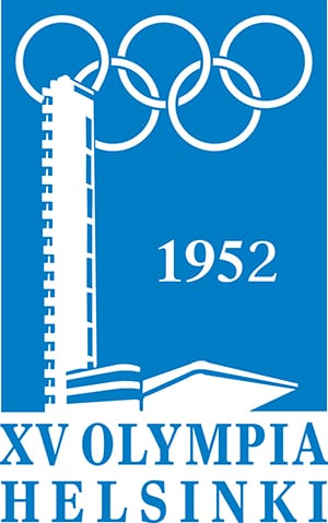
This blue and white logo took inspiration from the Finnish flag. Besides being used as a logo, it was also printed on badges which the dignitaries and guests of the game ceremonies wore. The design featured the stadium tower of Olympics in the front and the iconic five rings in the background over it.
tokyo-1964

  • Tokyo, 1964

The symbol of Japan, bright and red sun, and the five rings above the words in “Tokyo 1964” in block bold letters was the logo.
mexico-1968

  • Mexico, 1968

This was designed by an American designer, Lance Wyman,. The logo revolves around a multi stroke typeface which embedded the Olympic rings into the number 68. The modified designs of this logo, along with patterns of diagonal lines and curves radiating, were used in a lot of places all over the city while the event was being promoted.
munich-1972

  • Munich, 1972

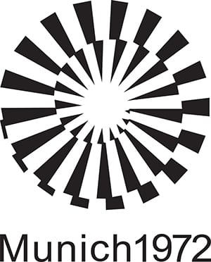
Though this Olympic is known for the tragic things that happened while the event took place, the logo is a creative graphic design. This design was developed by Otto Aicher, a German designer, who was among the first ones to drop the idea of showing the five rings which Glaser calls as a powerful abstraction.
montreal-1976

  • Montreal, 1976

The Olympic rings were transformed to depict the letter M standing for Montreal. Glaser deems the design to be more fitting for a paper towel company.
seoul-1988

  • Seoul, 1988

Glaser calls this design as Harmonious. The picture shows bold lines that are converging to convert into a circular pattern that is concentric, following the steps of Olympic rings.
barcelona-1992

  • Barcelona, 1992

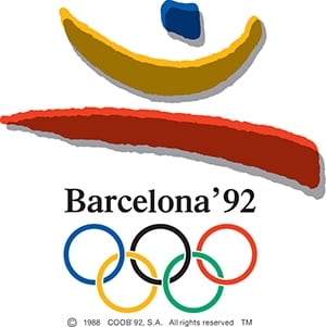
Three strokes coming from the structure of a jumping athlete is what the logo was. The selection of shapes and colors showed a clear relationship between the text and rings and the logo.
sydney-2000

  • Sydney, 2000

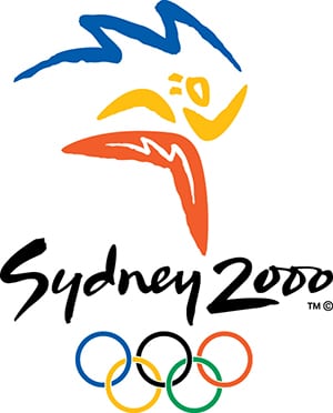
This design by Michael Bryce, an Australian designer and Architect, is a favorite of Glaser because of its lettering. The gestural ability of the logo and the typography makes it look harmonious.
london-2012

  • London, 2012

This logo would be visible on screens but the results were kind of controversial. The logo is remembered for all wrong reasons as it is as clumsy and the typography was garish.

Rio2016_FINAL

  • Rio de Janeiro, 2016

This logo felt like a new thing according to Glaser. It was designed by Tatil, a Brazilian agency after an elaborate selection process.

Web Design Terms You Need to Know (Part 2)

Web Design Tips No Comment

Web design has always been an ever advancing subject. With the new trends that keep on emerging every now and then, web design is a tough subject to make a pace with. And even tougher is the web design terminology that keeps on adding new jargons every day. Let’s talk about a few such web design terms.

  • Responsive

responsive_webdesign

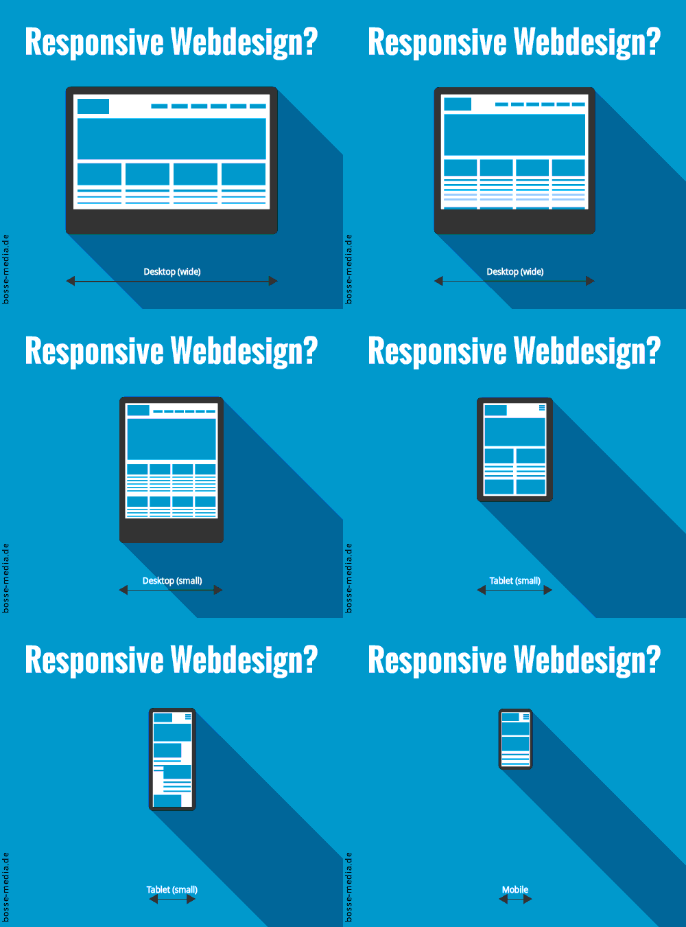
You might be thinking what could the website design respond to, after all? But you should know that the website must be responsive to the kind of device it is viewed on. We are living in the era wherein the usage of tablets and smartphones are consistently on the rise. Hence, it is very imperative that your website design must have a responsive design as well that is compatible with any kind of device the site is opened on. This is one thing you should mind while you are designing your website.

  • Flat Design

Operativnik Flat Website Design by Felix Baky

Well, this is quite simple. The flat design endorses the philosophy of optimum functionality with simplicity. In correspondence with its literary sense, flat design is actually flat and does not have the depth of dimensions. Rather than involving design elements that seem like you can reach out to them and grab them, the flat design travels back to the primitive age wherein the designs just had bright colors, simple texts and primitive shapes and basic icons.

  • Skeuomorphism

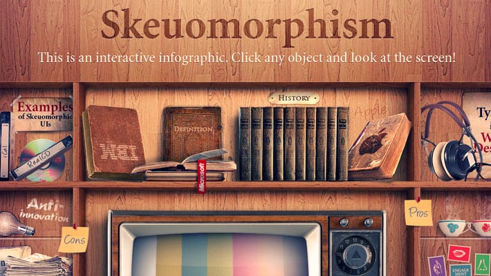
Awesome-Examples-of-Skeuomorphism-01

This is a complicated word but rest assured it is most certainly an important word. You could call this as an antonym to the Flat design as it does exactly opposite to what the flat design does. Do you remember the old design of Apple’s iOS that had real life designs? The Newsstand, the Calendar, the compass and so on? That is what Skeuomorphism is all about. It has been popular for a long time now and is on the verge of its extinction.

  • Metro Design

metro-web-design-01

It is also called as the Microsoft Design Language. This design was introduced by Microsoft itself and is used on many products that belong to them. The design took its inspiration from transportation signs and aims to achieve the same visual clarity that the latter provides. This design has a key motto to offer a design space that has an interface which is action oriented than look like a canvas of picturesque art.

  • Masonry Grid

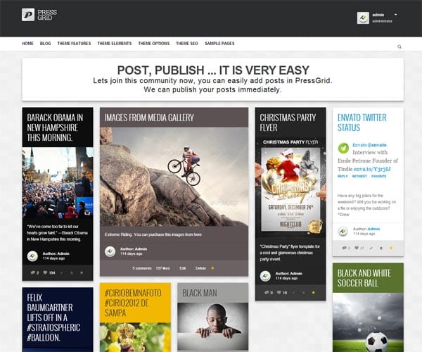
masonry-grid-01

This layout design gained its popularity after the Pinterest achieved success. This design follows the style of parallel fitting of pieces of content into the grids which do not have any kind of symmetry. This style results in uneven positioning of grids which manages to maintain a neat and an organized look.
If you have missed reading the part 1 of our Web Design Terms You Need to Know series, you can do so by going to this link: https://www.simpliowebstudio.com/web-design-terms-you-need-to-know/

Things People Absolutely Hate about Your Website

Business Advice, Web Design Tips No Comment

hate-your-website-01

In the 21st century, putting up a website is not that big a deal but making it likable and maintaining a steady flow of traffic is the hard part. The important thing to remember here is that the likability of the website is what is going to determine the fate of the website; so getting rid of things people don’t like about our website should be your topmost priority. It is, for this reason, we will look at the things that people usually hate about a website.

  1. One dimensional website

When we are talking about one dimension here, we are not talking about graphics or style of the website. If your website is such that it can only be accessed via a desktop then be ready to get a substantial amount of online glaring because that is being one dimensional. Almost everyone now has a smartphone and if your website is not optimized for people visiting it through their phones, then you will observe a prominent dip in your overall traffic which is something you wouldn’t want to see. You have to understand that people don’t really have time to zoom into your pictures to understand their meaning or note your number from the site to call you; so making sure that the user experience of mobile users is amicable.

  1. Too many pop ups

Another thing that can really annoy people is pop ups. No one would like to see an advertisement pop up right when they are reading something important on your website.  You have to make sure that there is a degree of moderation when it comes to pop-ups. You can introduce ideas like a slide in CTAs which are considered far less annoying than your standard pop-up page.
  1. Loading speed

Ever wondered how you felt when you wanted to see a video and it took ages to load? This is exactly how your visitors feel when your website takes too long to load. Remember, people online have the attention span of a baby and they can decide whether your website is good enough in as less as 10 seconds. So you have to understand that if you make them wait a little too long, then will find another website which is sure to dent your conversion rate. Here, optimizing your websites is the need of the hour, so try avoiding complicated codes, large images, videos, to get a better loading speed.

  1. Navigational issues

Patience is key but that doesn’t apply to your visitors as they want to know all that is to know about your website in no time. It is for this reason that you have to make it absolutely clear of where they need to go to get what they need. It is a fact that that they are not patient enough to dig through all your web pages to find out what they want. In layman’s terms, they need to be spoon-fed, so guiding them as far as navigation is concerned is something that can bring you good results.

Good experience

★★★★★
5 5 1
SimplioWebStudio did a great job

Project accomplished

★★★★★
5 5 1
Project accomplished

Plugin developed successfully

★★★★★
5 5 1
Plugin developed successfully

ANOTHER SUCCESSFUL PROJECT

★★★★★
5 5 1
ANOTHER SUCCESSFUL PROJECT

Thank you Simplio team

★★★★★
5 5 1
Great experience

Working with Simplio Web Studio was a fantastic experience.

★★★★★
5 5 1
Working with Simplio Web Studio was a fantastic experience. The service provided was amazing and professional. It was a delight to work with Nir, who went the extra mile to meet our demands in a timely manner. He really made our vision a reality by creating us a classic site, but moreover the relationship we formed is something our company really appreciates. It was a pleasure working with Nir and the team at Simplio Web Studio. We highly recommend them to all and we look forward to working and doing more business with them in the future.

a great project

★★★★★
5 5 1
a great project

All the best

★★★★★
5 5 1
All the best to Simplio

My website is Live

★★★★★
5 5 1
My website is Live , thank you Simplio

From beginning to end, the team at Simplio provided top of the line customer service.

★★★★★
5 5 1
From beginning to end, the team at Simplio provided top of the line customer service. The web developers are incredible and made sure we got exactly what we were looking for! They truly went above and beyond to make us happy and we couldn’t have been more pleased with their talents. We would highly recommend them. Thanks so much Nir!

After over two years of research we chose Simplio.

★★★★★
5 5 1
After over two years of research we chose Simplio. We are so far very satisfied. These people answered the phone on a Sunday and fixed a problem that was not even their fault. It was the host company which I had chosen that had caused our site to go down.

Outstanding in both knowledge and professionalism.

★★★★★
5 5 1
Outstanding in both knowledge and professionalism. Nir and the staff at Simplio are Excellent in branding, web design and overall web presence. Definitely recommended!

I cannot even imagine having another company managing my Presta shopping cart.

★★★★★
5 5 1
They are now part of the Diastasis Rehab business team after working with them almost a year now. I cannot even imagine having another company managing my Presta shopping cart. After a bad experience with a programmer, I needed a new programmer (one that knew prestashop shopping cart) and most important one that I could trust. Finding all three was a difficult process! Lucky for me I found them. I cannot say enough about the diversity of services that this company provides. Every step of the way they make amazing suggestions to increase my sales and they get back to be right away either by email or phone. They have even created a simple and easy check out program for Presta Shop. They are actually a one stop shop! They updated my SSL, are setting up and changing my server to a dedicated one, setting up streaming of my DVD, website design, creating a specific program for address verification on Presta cart and handled the integration of Presta cart with my fulfillment house. I am now working on developing an APP with them

Simplio really helped me out of a jam.

★★★★★
5 5 1
Simplio really helped me out of a jam. They did exactly what I needed on a very tight time frame (with little notice too!!!!) They are my new go-to guys for any Prestashop needs! Thanks Simplio!

Excellent service!

★★★★★
5 5 1
Excellent service! Nir was exceptionally helpful in solving a lot of issues with our website and making the user experience more smooth. He understood the needs of our school and helped improve the website tremendously.

impressed

★★★★★
5 5 1
What impressed me most about working with Simplio was their attention to detail and excellent communication. Not only are they talented developers, but, they are also pleasant to work with and highly professional. Highly recommended!

professional service

★★★★★
5 5 1
What a profissional service Simplio offers.I hired them to rebuild my website for my business and they were creative and professional. Nir was on top of the whole project from day one, until he delivered the project on time. I will defiantly recommend Simplio to anyone who is looking for website services. From creating, designing to maintaining your image online. Good Job Nir and the rest of your group.

Great Logo

★★★★★
5 5 1
Great Logo, Very happy

fantastic to work with

★★★★★
5 5 1
Simplio was fantastic to work with. They were fast, communicative and incredibly helpful to me. I highly recommend them to anyone who needs help with their digital needs!

Awesome experience

★★★★★
5 5 1
All details and requests were met in prompt an friendly manner. Would recommend on any day to anyone who wants to feel their business is in great hands.