


When the Presidential elections are around the corner, there are a number of aspects we have to focus on and compare: which candidate has the best economic policies, healthcare policies and the likes. But there is one really interesting point to note here. Which presidential candidate has the best campaign website? The quality of the candidate’s website speaks volumes about the candidate in question. This is, basically, the hub of online campaigning and everyone has to get this absolutely right.
However, presidential campaign websites are not a new thing. They have been doing the rounds for the last 20 years ever since their inception by Bob Dole. Let us now see what the different presidential campaign websites offer us.
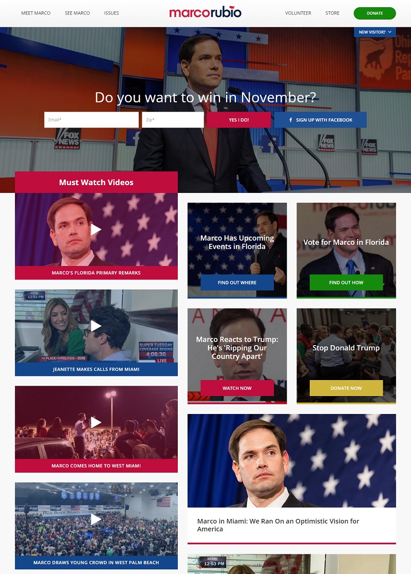
Marco Rubio
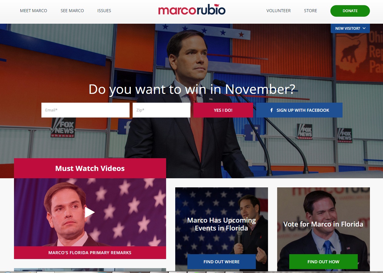
Website URL: https://marcorubio.com/
Tagline: A New American Century
At first glance, the website for Marco seems impressive and pretty much well balanced. So, this gives a good first impression. However, a little into the website, we encounter a series of pictures and videos that overcrowd the space, mainly because of their irregular shapes and sizes. There are also different caption bars varying in colors between red and blue. So, the best thing to do here is to organize the content in a more regular and eye pleasing manner with a much more simplified visual design.
Hilary Clinton
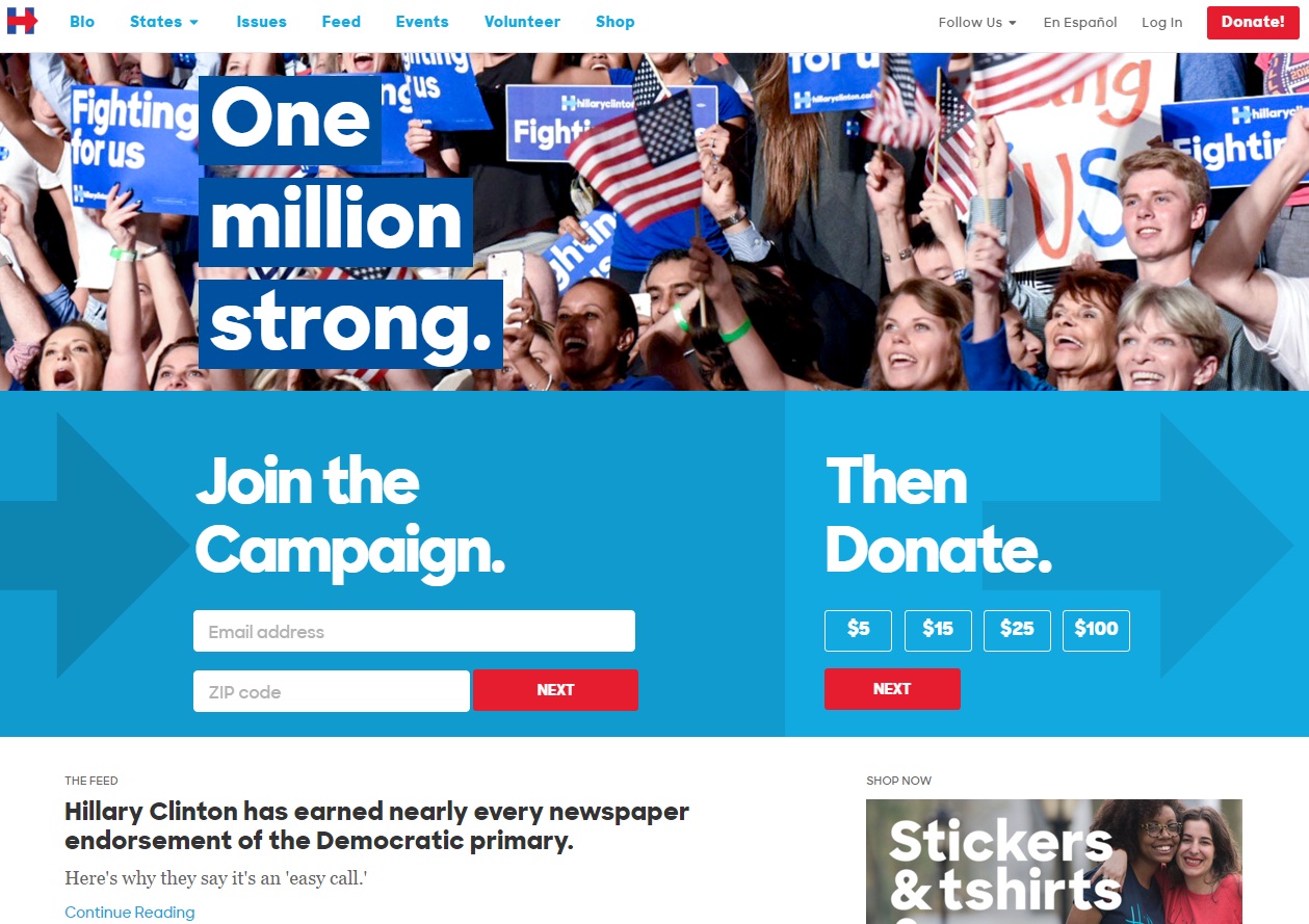
Website URL: https://www.hillaryclinton.com/
Tagline: Hillary for America starts right here
This campaign website is a lot different. This makes use of a lot of modern fonts and designs that appease the public at first glance. There are hero images in the first page which is a major positive. That page itself is the lead to joining the campaign and donating for the same. However, the site starts to feel a little incomplete and inadequate towards the portion of the main content. This is a slight let down as compared to the top half of the website.

Donald Trump
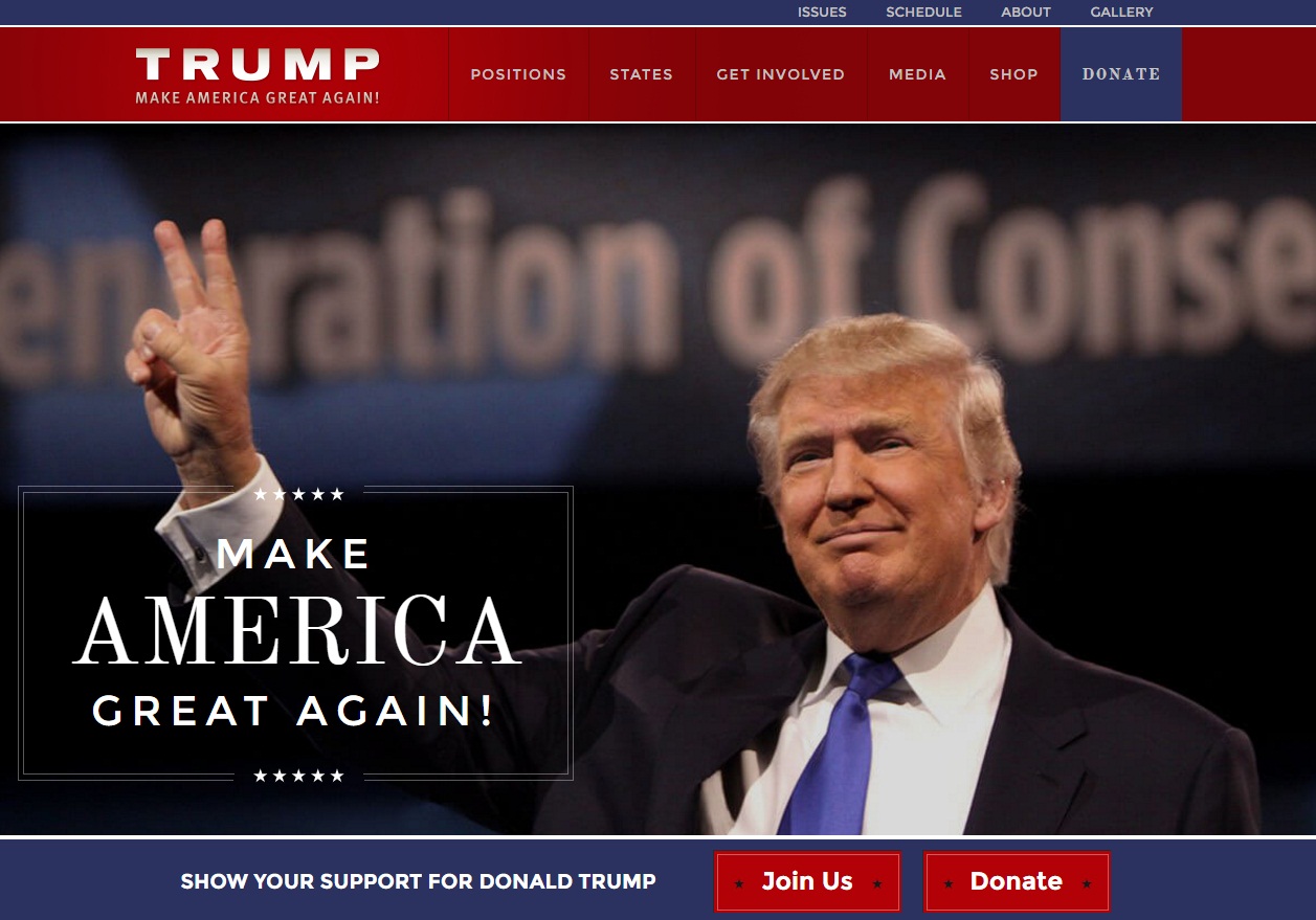
Website URL: https://www.donaldjtrump.com/
Tagline: Make America Great Again!
Donald Trump’s campaign website has what the other two couldn’t provide sufficiently: balance. It does not have too much content that makes the page too overcrowded. There are, however, a lot of videos that can engage the readers. Each of these focuses on Trump talking about and dealing with the problems and issues ahead of the United States. Sometimes, there might be a little too much media on the page, but this Presidential candidate makes perfect use of this online platform to communicate with his voters. There are also specific options to share the word through major social networking websites.
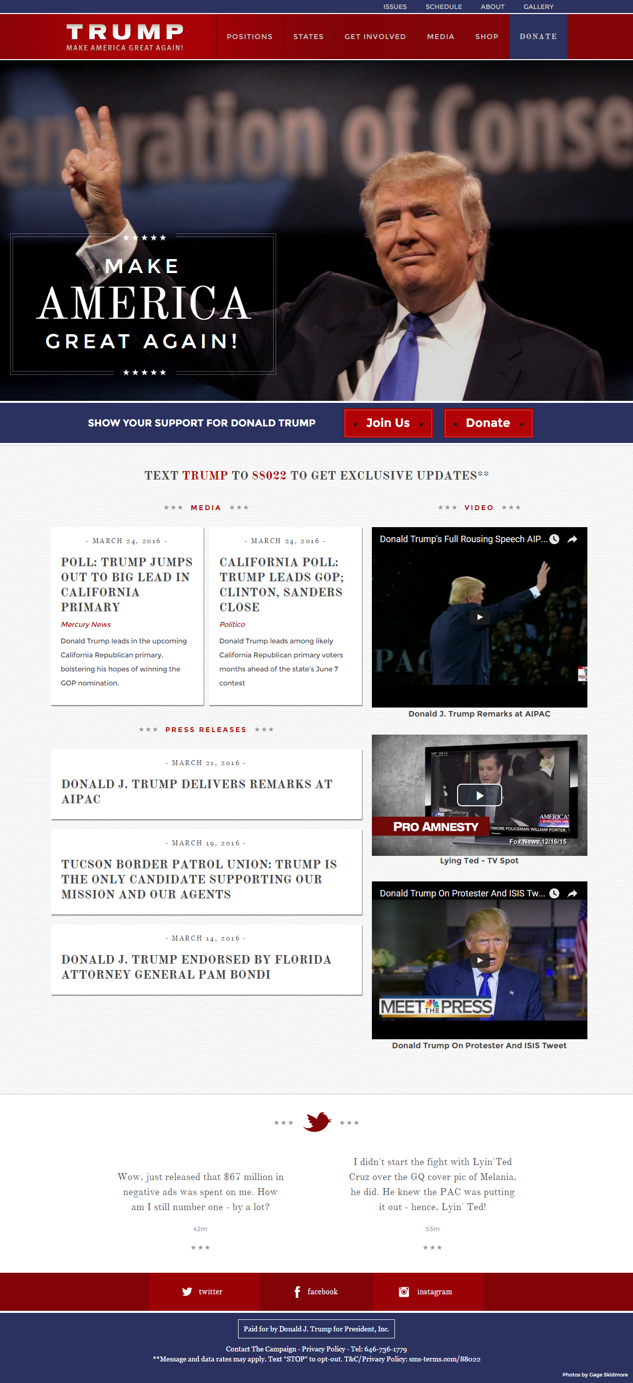
While all the three websites mentioned above have their pros and cons, the Donald Trump campaign website seems to stand out in the lot. At present, there is a huge chunk of people using social media, with 65% adults included in this group, as compared to the 25% in 2008. So getting the website right means reaching out to more people. Barack Obama’s campaign perfected the art of making websites and Trump is on track to achieving the feat. Unlike Clinton and Rubio’s websites where the issues are organized alphabetically, Trump has kept them according to priority and relevance. With interesting graphics and a good design layout, Trump tends to edge over the other two candidates here to be the best campaign website.
