


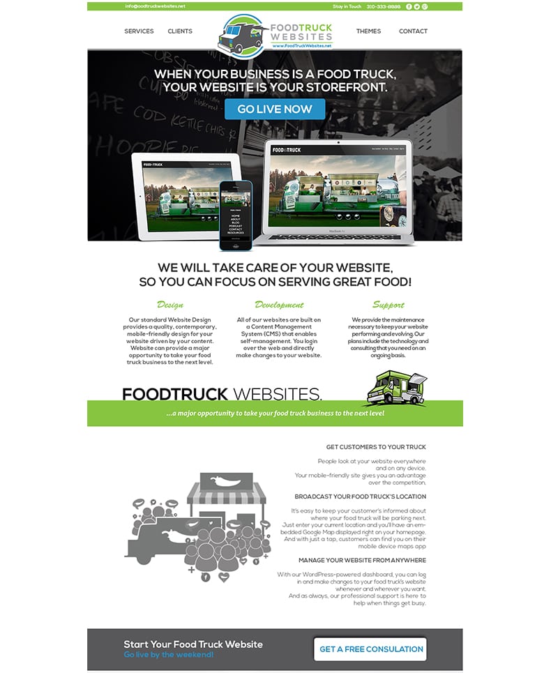

Food Truck Website Design
The food truck website design tells its story effectively in a single page design where the content is organized efficiently. The overall color choices of the website -shades of green, blue and grey are in consistent with its brand logo design. It starts with a minimalistic horizontal menu with a visible logo in the middle followed by the wisely placed call to action center. The ‘Go Live’ button which is the primary call to action center of the page is embedded into a graphical content with vivid images that effectively portray the purpose of the website. A short textual description of the service provided by the website is placed above the button to let users get started easily.
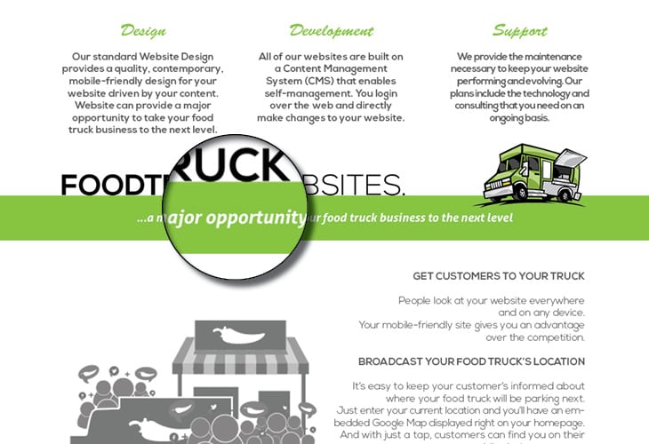
The rest of the content acts more like below the fold content explaining the various services of the company and neatly presents them in a column style paragraph arrangement.
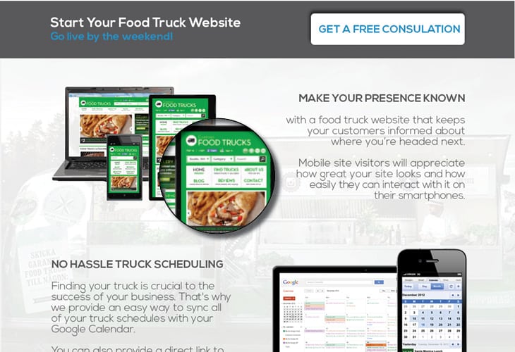
More details about the company are presented further below with the lesser font size and the site neatly demarcates the content boundaries with the help of bright green spaces containing business related quotes. The site bears another call to action button for getting a free consultation at the very bottom of the page to ensure that customers can don’t exit the page without performing any action after reaching the end.
