What you need to know about Webmaker – Mozilla’s latest project

Web Design Tips, What's New No Comment

Mozilla is known as a large community of builders, thinkers and technologists from around the world. Its projects have always been user-oriented. Mozilla is best-known for its extremely popular Firefox, Thunderbird and FireZilla projects. However, it is also developing other project such as Persona which provides users with a much better and easier way to sign in to various websites.

Webmaker

Mozilla has also launched a new project recently, called Webmaker. This seems like a very promising thing with a big future ahead of it. Webmaker is again made with users in mind and it aims to help people create cool things on the web regardless of their coding knowledge. According to their own words, the idea is to help people understand how the web works and use that knowledge to make a web with no limits.

But what does Webmaker offer?

The things that people can take advantage of with Webmaker are divided into three sections:

  1. Tools

This is one of the best things about Webmaker. For now it only offers 4 tools that people can use, but we can expect the list to grow very soon. Each tool gives people the option to create something from scratch or remake something that someone else has published. Here are the 4 tools you can play with:

  • X-Ray Goggles

Have you even clicked the right button and then “Inspect Element”? This tool is similar, except it shows you the elements of any web page in real time when you hover over them with your mouse. Needless to say, you can edit each of those elements to your liking and even publish the page that you have edited.

  • Thimble

Thimble lets you create your own HTML web pages and work on the CSS right from the browser in a quick and easy way. It shows you the results of the code you are writing in real time and you can host and share all of your projects with a couple of clicks.

  • Popcorn Maker

With Popcorn Maker, everyone can edit web videos, images and audio and embed the end product anywhere they like. You can use this tool to drag and drop all kinds of content from around the web, combine, cut and skip parts of videos, add different layers of audio and much more from your browser.

  • Appmaker

Perhaps the best of the 4 tools, Appmaker allows you to create your own mobile apps with simple drag and drop actions. This is extremely easy to use even if you have absolutely no coding knowledge at all. With this tool you just drag different “bricks” from simple headers and buttons to more advanced chat rooms and media players and drop them on the screen of a mobile device. It’s as easy as that.

Webmaker

  1. Resources

Webmaker offers much more than just 4 tools. People who want to learn or learn how to teach can use the many available resources which include useful and easy to understand information about web mechanics, security, design and accessibility, coding/scripting, collaborating, sharing and more.

Webmaker Event

  1. Events

On the Events page of the Webmaker website people can find out about different events around the world and how they can join. Currently there are 2,098 events and you can either search for one or create one of your own. These events are also known as Maker Parties and they are all about celebrating the web. People who join such Parties will be able to learn anything from making a video on the web to why privacy matters.

Overall, Mozilla has started another great project and we can only imagine what it has in store for us. Webmaker is already a lot of fun and offers people with minimal or no coding knowledge at all to learn something new and basically to understand the web.

How to create a logo that works

Business Advice, Web Design Tips No Comment

Starting a new company is always a challenging task and somewhere in the chaos of things you will have to find some time to create a logo. Of course, you are not a designer, but you will have to tell the person who will be creating your logo exactly what you want. And even the best designer won’t be able to save you if you want something that’s just not nice.

What it Takes to Create a Good Logo?

One of the most important things for your logo is that it should work on all kinds of platforms. In order to create that, you should be able to work with your designer. Here are some tips that will help you to make the right requests for the best result:

Create a logo that is readable

  1. Readability

Creating a custom font for your logo nowadays is easy. However, sometimes these custom fonts are extremely hard to read and that’s a big mistake when it comes to creating logos. Your custom font might be beautiful to look at, but your slogan or brand name should be readable. Otherwise, the text will just take space and you might as well not write anything at all.

keep-it-simple

  1. Simplicity

Simplicity is at the core of modern day design and more specifically logo design. Creating a logo with intricate patterns might indeed look good, but your logo is not a painting. It has to do a certain type of job – tell people who you are at a glance. A simple logo that is clear, crisp and easy to understand is what you should aim for. If you can’t describe your logo in a sentence, it is probably too complicated and you should think of another design. Keep in mind that vector graphics usually work best for logo design.

Scalability

  1. Scalability

The size of a logo can be a tricky subject. Many logos look great when they are being viewed as big illustrations, but when you scale them down they become unreadable and unrecognizable. Your logo should be designed in such a way that it looks as great on billboards as it does as a favicon.

Color wheel to create a logo

  1. Colors

Choosing the colors for your logo is a very important process and most times it is best to let your designer do that for you. Most designers will make sure that the logo they are creating also looks great in grayscale, but another thing you will need to consider is if your logo looks good in a single color.

Don't follow trends to create a logo that works

  1. Don’t be trendy

Following the latest trends when creating a logo is a very bad idea. This means that you will end up with a logo that will be very popular for a short period of time and it might not work 5 years from now (or even 1). You can still adapt your logo so that it looks modern, but make sure the core design can stand the tests of time.

ns-american-institute-of-architects-center

  1. Negative space

Negative space is one of the best vector design elements that you can use for your logo. By using negative space you will be able to convey many different messages in a subtle way. Great examples of companies and organizations that make use of negative space in their logos include Girl Scouts of America, Guild of Food Writers and FedEx.

There are definitely many things that you will need to be careful with when creating a logo. It is a process which is actually more difficult than many people realize, but if you follow these basic guidelines, your logo will always make a good impression and won’t be easily forgotten. Don’t fall into the trap of bad logo design and most importantly – think outside the box. Your designer is only as good as your ideas.

Why Is Typography So Important For Web Design?

Web Design Tips No Comment

For laymen, the terms “typography” and “font” are not much different. In fact, these two terms are often used by the people interchangeably. However, for the graphic designer there is a lot more than fonts to typography. It is a whole science in itself and it plays a vital role in web design as well. In the last few years, web designers have started to recognize the importance of typography and the latest trends have affirmed its leading role in modern design.

If you think typography is all about choosing the font that looks the prettiest, you are totally wrong. It is way more than that.

So, what is it exactly?

Robert Bringhurst, a Canadian typographer, describes typography in his book as “the craft of human language with a durable visual form”. Ellen Lupton puts it in a similar way, but with simpler words: “Typography is what language looks like.”

In simple words, typography is the technique and art of arranging type. That includes each possible element which can affect the web design, like typeface choice, color palette, point size, line length, design integration and layout among others.

This leads us to the next question:

What is its purpose?

Due to the fact that typography is so closely bonded with web design, many people suffer the misconception that its purpose is to make the site beautiful. A reason for that could be the fact that people link the term “design” to making certain things look beautiful, as is the case with interior design, and this misconception is transferred to typography as well.

They are wrong. The main purpose of typography has nothing to do with beauty. It is actually readability that typography aims at. This does not mean that it should not look pretty at the same time, but this is just an added bonus. The main goal that stands before the typographer is to make sure that the type is readable.

So, why is typography so important, then?

An average 95% of every website is occupied by content. And typography is the art of displaying content. So that makes it pretty important, don’t you think?

But putting the math aside, the sad fact is that there is still a common notion among many web designers that typography is all about pretty fonts and web design is all about fancy graphics. This oversimplification can really play a nasty trick on you. Even design professionals seem to forget sometimes that content is what brings visitors to a website and again, content is what keeps them on a website, and that content has to be easy to perceive.

Here we have gathered five reasons why typography should not be taken lightly and should be given its due importance.

  1. Typography communicates the website’s visual summary

When taking a look at a website, you can often say even from the first glance whether it is a fun or a serious, business-like vibe that it is sending out. A large part of this message is achieved through typography.

The layout and look of the website are complemented by the choice of colors and fonts and the way the content is arranged on the page to evoke certain feelings and emotions into the visitors. Just a quick glance of the page is enough to either grab your audience’s attention or drive them away for good.

  1. It carries your brand forward

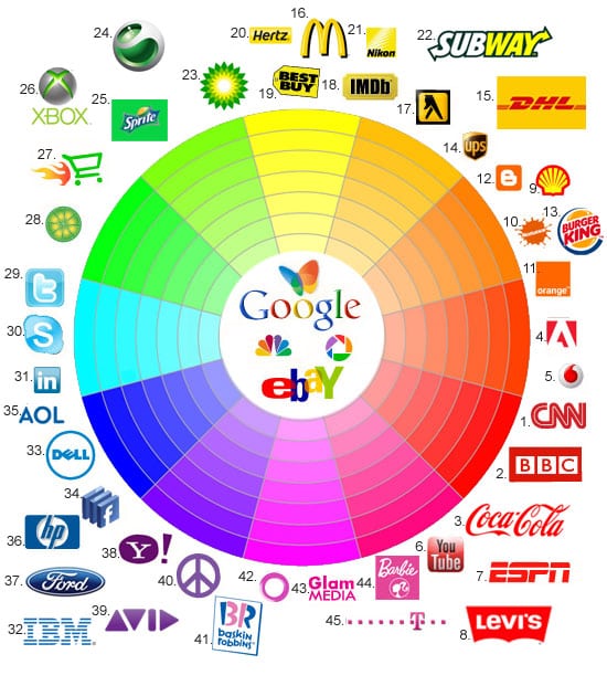
You don’t believe that typography plays a part in branding? Then you should try this simple experiment out: Take a well-known brand and change its typeface and font. Then look at it again. Doesn’t that change your whole perception of that brand? Doesn’t it look out of balance?

A brand is largely defined by its logo. It is what establishes the brand’s identity among the users. There is no second opinion about that. However, if you have a great logo and don’t complement it with adequate web typography, you won’t go a long way as a brand. If, on the other hand, your font, logo and typeface go hand in hand harmoniously, then you have a winner!

  1. Typography guides the readers through your content

Good content is not enough for building a great website. It should be well presented, too. The solution to that task is typography. Every element can have its impact on the way your content is perceived – starting from the size and font of the text all the way to its alignment and arrangement on your pages and the colors you’ll select. Good typography will emphasize on the most important parts of your content and draw the readers’ attention to them, and it will also define the whole structure and flow of your website.

This is especially evident in the cases when you are reading articles on the internet. If you have a 1500-word post before you, which consists entirely of plain text, you will really have a hard time reading through the whole post, even if the topic is very interesting. On the other hand, even small tweaks and formatting like changing the font size, color or typeface of certain parts of the content can make the article a lot more easily readable and hold your attention right till the end of it.

  1. It can make content look attractive

Don’t get this the wrong way; this doesn’t mean that typography can turn bad content into good one. Content with no intrinsic value won’t be able to engage the viewers even if it is clad in the best typography. It may make the visitors take a look at it, but they will quickly reveal the deception and move away from your website.

However, even the most well written and clever content will look ridiculous if you just paste it on your page in 11 point neon green Times New Roman or, God forbid, Comic Sans. In that line of thought, if you have fairly decent copy, you can enhance its appeal through the use of adequate typography and make the readers feel compelled to read it.

  1. When done right, typography maintains the website’s consistency

The internet users are inclined to look for familiarity and order when they visit a website. Thus, your site should have a consistent design that won’t prompt your visitors to wander about looking for the navigation button they need or the contact information, which is hidden somewhere in the small print. Inconsistency and chaos make for a frustrating user experience and the visitors will most likely not come back to your site if they are faced with that kind of experience even once.

Good typography can help you out in this aspect as well. It straightens the site up and tidies things up so that all of its elements will be clearly visible and easy to find for the users. When uniformity is maintained throughout all the visual elements of a web page, such as typeface, font, color, size, etc., the user experience becomes much more pleasant, thus boosting the conversion rates too.


You can’t deny the fact that typography is capable of shaping the perception of your website’s visitors and engaging them with your web pages. It can also affect your conversion rates and play a major role for the effective content delivery to your users. You should abandon the obsession with “pretty” content and aesthetics and instead focus on the clever use of typography, as it is a powerful tool which can do wonders for your website. Go by the words of the famous type designer Matthew Carter, “…type is a beautiful group of letters, not a group of beautiful letters.


The 12 Ground Rules of Web Design

Developers, Web Design Tips No Comment

Whether you decide to create your website on your own or to collaborate with a web designer in the process, there are certain basic rules that your web design should follow in order for your site to be user-friendly and for the visitors to want to come back to it. This is especially vital for business websites, as the online visibility is one of the most crucial components of brand management in today’s world. Here we have listed out the twelve must-have components of every good web design.

  1. Take your target audience into account. You may be tempted to use a theme that you like, but you should first think of whether it is appropriate for the content you will be displaying and the way your audience is going to perceive it.
  2. Your website should look professional. Make sure there are no spelling and grammatical errors, poor quality graphics or broken links anywhere on the site. “Under construction” pages also look bad in the eyes of the viewers. With the tools you have at your disposal today, there is really no excuse for such issues on your site.
  3. Quick loading time – there is nothing more annoying for a visitor than waiting for a page to load forever. Your website should load almost instantly. Large graphics and flash presentations can really slow your site down and they don’t work well on iPhones and iPads anyway. Keep these things in mind and work on your site’s loading time, if you don’t want your visitors to lose interest and go elsewhere.
  4. Your website should be easily readable. Do not use light text on a light background or dark one on a dark background, or very tiny fonts, as that will only frustrate your visitors and make them leave your site more quickly.
  5. Use a standard and popular program or platform of a current version to design your site, like the WordPress platform. The more common program your web designer uses, the higher the chances that it will still look good when newer browser versions are released. That will also make your site easier to maintain and update as the people you entrust that task with will be more likely to have the necessary skills.
  6. It is best not to use flash intros, music, flashing banners or scrolling marquees unless absolutely necessary for communicating the core message of your website. Otherwise they will just annoy the visitors and waste their time. If you can add “audio on/off” or “skip intro” buttons this is the first sign that you can do without these elements.
  7. Go easy on the colors. Use them sparingly and make sure they harmonize well. The same rule applies to the fonts on your site – stick to a maximum of two or three fonts.
  8. Easy navigation – although you may be tempted to use unlabeled active areas, disappearing menus and buttons without any descriptive text on your website, as they may look cool, the chances are that your visitors will be frustrated by them and will lose interest in browsing your site further.

Test your site with a small audience representing your target visitors, before you publish it online. Check their feedback on the layout and design of the navigation and see if they had any difficulties in using it. Doing this in the course of the development of the site can spare you some tedious and costly changes afterwards.

  1. Use consistent navigation designs and page layouts throughout the entire site. Visitors tend to get really annoyed when they cannot find the navigation link on the same place where it was on the previous pages. And some may not be able to find the link at all.
  2. Make sure you have all the legal rights of the design, fonts and images you are about to use on your website. Copyright infringement is the last thing you would want to deal with – it may not only cause you to pay money but may also bring your site really bad publicity.
  3. There are currently numerous web browsers and platforms in use. While you may find it hard to get your website to look perfect on them all, you should focus on making it look good on the most commonly used ones that the majority of web users rely on, like the latest versions of Firefox, Internet Explorer, Google Chrome, etc.

Also, keep in mind the rapidly growing trend of mobile device browsing and design a special mobile-friendly version of your site that will run well on Android, iOS and Windows devices with different screen resolutions. This involves a lot of hard labor but an experienced web design specialist should not have any problems in making your site compatible with multiple platforms.

  1. You should understand that the design of your site will never be over and done. In order to make visitors come back and check your site again and again, you should make sure that you provide them with information that is up-to-date and relevant and brings value to the readers. Outdated information, lack of any new content and broken links are a recipe for disaster as these will cause your visitors and perhaps potential customers to lose interest and maybe never come back to your site again. This issue can be addressed with a well structured blog and content marketing strategy, but that is a theme for another post altogether.

Web design is no child’s play. It involves a lot of expertise and requires you to factor in a lot of different aspects. You should address the process of creating your website seriously and professionally in order to get good results and proper visibility.


Responsive Web Design: Make Your Site Mobile-Friendly

Developers No Comment

In the last few years, the mobile market has gained momentum very rapidly and the percentage of mobile searches has grown tremendously. By 2015, the number of searches made through mobile devices is expected to surpass the number of desktop queries and by 2016, in the U.S. local search market alone, the mobile queries are expected to exceed the desktop ones by a staggering 27.8 billion searches.

This upward mobile use trend includes not only traffic that comes in from searches, but also emails and social media, which have enjoyed a steady growth in popularity in the past few years. If you have thought you could ignore mobile traffic, the above data should quickly prove you wrong. You cannot afford to miss out on the traffic coming in from mobile users.

At the end of 2013, some websites have registered that close to 25% of their traffic was coming from mobile devices – mainly smartphones and tablets. However, websites designed for desktop viewing do not work that well with mobile devices. This calls for developing a more mobile-friendly version of your website.

What Are Your Options

If you run a small business, when it comes to displaying your website on mobile platforms there are actually three options you can turn to. You can choose to do nothing with your web design, you can develop a fully mobile dedicated website or you can incorporate responsive web design elements into your existing website. Let’s take a look at these options and see what effects they will have on your website and traffic.

Do Nothing

The web browsers are highly advanced today. You will hardly find a website today that is perfect and doesn’t have any errors in its code, even minor ones, and yet the browsers are smart enough to work around these errors and display the web pages correctly. They even work quite decently with displaying websites that are not optimized for mobile viewing on tablets and other mobile devices.

So, even if your site is not mobile optimized, it will most probably still be displayed correctly on mobile platforms. However, the user experience will be terrible. The desktop version of your site is built for a much bigger screen resolution than the ones of the common mobile devices and all content and links will appear very small, which will require the user to zoom in, in order to be able to read your site. This will often annoy users and make them leave your website very quickly, thus lowering your conversion rates.

Build a Separate Mobile Version of Your Site

Websites that are displayed on the browsers of mobile devices with an URL like m.example.com are actually separate websites created with the purpose of being viewed on mobile platforms only.

The benefit of this option is that it allows you to create a much better user experience for the people who browse your site through their mobiles. These sites have larger buttons and are more easily readable. Furthermore, you can rearrange the most important parts of the navigation like the contact info, etc. in such a way that it will be easier for the mobile users to find it.

But there is a downside to this option, too. You will actually have to maintain two separate websites – one desktop version and one mobile version. This doubles your efforts of updating the data on your site. Furthermore, the mobile version can be optimized for either tablets or smartphones, but not both.

You have to be extremely careful; otherwise you may commit mistakes that will harm your website’s search engine performance and cost you traffic. Google in particular does not tolerate broken pages or incorrectly mapped redirects, which are common issues with mobile dedicated websites.

Responsive Web Design

Finally, we come to the third option you have at your disposal for displaying your site on mobile devices. Through incorporating advanced CSS and HTML coding, responsive design can automatically adapt your website’s layout to the screen resolution of the device on which it is displayed. This way, your site visitors can get an optimal user experience regardless of whether they view your site from a desktop, a tablet or a smartphone.

Although designing a responsive website takes a bit of an effort, it fixes the common issues with mobile sites – you have only one website to take care of and there are no redirects that can go wrong. If a responsive website is designed correctly, it can combine the benefits of desktop and mobile dedicated sites. For the mobile users, you may choose to display important data like your contact info or a map in an easily accessible location, like with the mobile dedicated sites. Well built responsive websites are powerful and flexible and that is why this is the best option you can choose out of the three.

Conclusion

The growing mobile use requires from you to be flexible with your business website, too, even if you own a small business. Responsive web design is your best bet in order to achieve a satisfying user experience for both users who browse through their desktop computers and those who use their mobile devices for surfing the internet. It may require some effort on your part initially, but in the long run it will be much easier and cheaper to maintain than supporting two separate websites for mobile and desktop users.


How Will Responsive Web Design Develop in 2014?

Developers, Web Design Tips No Comment

2013 was widely deemed as the “Year of Responsive Web Design”And indeed, 2013 saw a massive rise in the popularity of responsive design with even major sites like those of Mashable and Times Magazine, not to mention thousands of others, adopting the responsive design philosophy. In 2013, responsive design clearly went mainstream and it has now reached a point, where it has become the thing that consumers and designers expect to see.

Image source: infocux Technologies – https://www.flickr.com/photos/infocux/8240904818

2013 was also a great year for responsive design tools with the coming out of Foundation 4 in February, followed by Bootstrap 3 in August and Foundation 5 shortly after that. Yahoo released their Pure in May, entering the big game, while Thoughtbot has been continuously developing their Bourbon Neat. We saw the rise of new polyfills, plugins and practices. With such powerful tools, building responsive websites has become much easier.

With such rapid development in 2013, we can’t help but wonder what 2014 will bring for responsive web design.

Responsive Design Will Get Smarter

In 2014, our knowledge and understanding about building and optimizing websites for any type of device will become much deeper and more comprehensive. Responsive sites have been the victims of a number of optimization issues of different complexity, but with the improvement of the tools available, the developers are now starting to form a system of good practices and standards. Elements such as the off-canvass panels and the “hamburger” navigation icon that has now become ubiquitous are gaining popularity and now work pretty responsively.

With the new plugins and tools, elements such as the selective loading of media and assets, the device capability detection and the optimization for hardware and speed will all become more easily understandable and much less difficult to implement.

Improved Device Recognition

It has always been hard to pin down the device classes, but the common separation of mobiles, tablets and desktop computers will be totally shattered in 2014. There are already devices on the market that fall somewhere between the common definition of a tablet and a phone, or a tablet and a desktop computer. Furthermore, now there is also a whole new range of devices added to all those like smartwatches, the Google Glass and the like and who knows, perhaps we will finally see the Apple iWatch this year, too. Add to that the smart TVs and all the other home media devices with web connection capabilities and you will end up with a huge number of device types and categories, which often overlap and intertwine.

With all that in mind, responsive design is already taking the first steps towards true device agnosticism. By the end of the year, we will see significant development in this direction. This trend means that designers can make plans even for devices that are not invented yet and they can accommodate a range of specific device constraints and capabilities.

More Advanced Frameworks

Our predictions will be incomplete if we don’t examine what 2014 holds in store for the responsive design frameworks, like Bootstrap and Foundation, for instance. The area that will have the greatest opportunities for development in 2014 will be the complex tools that include a lot of components and input means and also trickier to display data models. Up till now, responsive web design has been implemented predominantly in content and marketing sites, while complex apps have taken a backseat.

However, many designers are already working in that direction and rebuilding their apps (product apps etc.) on responsive frameworks in order to be more flexible and responsive. The developers of the major responsive design frameworks are also recognizing this trend and incorporating numerous web app centered components into their products. This will surely make the building of complex apps a lot easier and more straightforward.


If 2013 was a great year for responsive web design, 2014 will be even bigger. With all the ongoing development and improvement in the device recognition capabilities, the flexibility, and the available framework and with the constant enhancements in the knowledge about responsive design, we are eagerly waiting to see what more 2014 has in store for us all!


How to Select a Graphic Designer – Tips to Adhere to

Managers, Web Design Tips No Comment

In a recent inquiry about the areas in which businesses struggle most, there was a prevailing response received from a large number of small business owners. If you think that this was social media or marketing, etc. then you are in for a surprise. The area in which small businesses most commonly face hurdles and feel most disoriented is hiring a graphic designer. Small business owners often feel out of their comfort zone when it comes to selecting a professional to design their logos, printed materials and website design elements, and they are often left unsatisfied with the final results. To prevent this scenario, here are a few tips to stick to when choosing a graphic designer for your business needs.

Image source: University of Salford – https://www.flickr.com/photos/salforduniversity/8424131760

Hire a professional

As much as you may be tempted to engage a relative or a student to create your design, always prefer hiring a professional! A professional designer is the only person who is well versed enough with the ever-changing technology and will know the right software to be used for each specific type of design requirement. For example, T-shirt and billboard industries do not use the Adobe Creative Suite but instead rely on other software products.

Your chosen designer should have ample knowledge of computers, web and print production and the compatibility of different software solutions. For instance, the products of Apple do not run Flash.

Remember that if something looks good on the computer screen it will not necessarily look good when printed out. Thus, the professional you hire should be well versed with all the aspects of the graphic design.

Know what you want and give examples

Before even setting out on a search for a designer, you should determine what exactly you need. If you give your graphic designer only vague suggestions, you are most likely not going to be satisfied with the final product and you will have to start all over again.

Providing examples can be of great help in this regard. You can find sources or website that have a look and feel similar to what you are aiming to achieve for your design. These will be a good starting point that will aid both you and the designer in the process.

Draw a preliminary frame

This directly corresponds with the above tip. Even a very basic mockup or sketch will go a long way in putting you and the graphic designer you have chosen to work with on the same page prior to starting the project. This is also an easier way to clear your thoughts and expectations from your desired graphic design. This is even more useful if you are engaged in a large-scale project, for instance a website, as it will also give an insight into the user experience.

Asses the way the designers present their own work

Before making a final selection of the graphic designer or agency you will engage to do your job, take a look at the way they present their own work. If they are taking great care in projecting a professional appearance, they will most likely exercise the same attention to detail when working on your project, too.

Also, always select an artist who has enough experience in the specific type of design work you need them for. Choose a professional whose design style corresponds with the one you need (note that we say need and not want, as what you want may not necessarily fit your target audience’s needs). This approach has an added bonus, too – when the designer is working within their comfort zone, the results are always more impressive.

Take care of the ownership rights

Always ensure that all the ownership rights of the graphic design you pay for and the source files are transferred to your name in the end. Also, never hesitate to ask for a written agreement with the designer. It is a crucial rule to have the entire legal rights of ownership to your design, be it a logo, a print design or a web design, because that shields you from legal actions and allows you to use the graphic content in any way you see fit in the future.

Do you have any experience in dealing with a graphic designer? Do you have any other tips to share?


Selecting a Graphic Designer – The 5 Most Crucial Steps

Developers No Comment

Your marketing materials can make or break the first impression on your customers about your company. A design below par can even make that the last impression. This is why it is highly recommendable to involve an experienced professional in the process of designing and creating both the offline and online materials you will use in presenting your business to the world – be they brochures, business cards, banners, adds or business logos, etc.

Image source: University of Salford – https://www.flickr.com/photos/salforduniversity/8423041041

If you hire a person who knows what they are doing, you are more likely to capture the interest of your potential customers. However, you should be able to gauge whether the person you have contacted for your graphic design needs will really be able to do the job well. Here are the five things that you should not miss doing in order to achieve that.

  1. Request for samples of their previous work

Every professional designer should have a portfolio of the wok he or she has done in the past. You can use this portfolio to assess the quality of work of that particular designer and to see if they have a consistent design style. Do they pay attention to detail? Or does their work look sloppy and unfinished? Even if you like the previous work of the artist, note than not every design would work well with every type of business, so it is up to you to evaluate whether the style of the graphic designer would be suitable for your marketing materials.

  1. Ask about professional affiliations

Your designer should follow the rules and not infringe any copyright or trademarks, as that could lead you into big trouble. By that we mean not only embarrassment and bad reputation, but costly lawsuits as well. Some professional organizations like the American Institute of Graphic Arts, for instance, require from their members to abide by certain ethical rules.

  1. Versatility is the spice of life

The professional designer you engage for your campaign should be able to incorporate the graphic design concept throughout different platforms and media. This includes printed and digital media: prints optimized for different formats, web pages and video, among others. The portfolio of your chosen designer should contain different types of designs. For instance, if you want your design to have the ability to be displayed properly on different web browsers, the designer should have at least some knowledge of web coding protocols.

  1. Don’t be afraid to take a risk, but only a moderate one

Even if you are not too certain about a particular design offered by your designer, it often pays to take the risk and go for it. Professionals often request from their clients to consider designs that are more forward-looking and can live longer and still appear “fresh”. A design that might seem a bit bizarre to you may outlive a lot of other designs that may appear more familiar. Don’t be afraid to go out of your comfort zone, but do that in moderation and don’t take too wild risks.

  1. Read the contract carefully

First of all, you should always sign a written contract with the artist you choose to do your graphic design. Never rely on spoken promises alone, as without a contract you cannot be guaranteed of anything. Furthermore, read the contract carefully to know about the legal rights to the artwork you are provided with. In the most common scenario, the graphic designers retain the rights of ownership to the design and the clients are granted with limited reproduction rights.

Also, do not forget to save all the elements or files of the design for future use, once the new website, business cards or brochure is done. This allows you to maintain an archive of your branded materials, including trademarked designs, which is an inseparable part of your brand’s identity.

The work of your graphic designer is crucial for your brand development and popularization. Thus, you should be extremely vigilant when choosing the professional to deal with. It is best to work in collaboration with your designer and give your input and feedback throughout the design process in order to achieve the best end results.


11 Elements That Your Website’s Design Should Not Lack In 2014

Developers, Web Design Tips No Comment

There is no way to give a single answer to the question “What makes a good site?” However, attractive, purposeful and clear yet functional design plays a major role for the success and effectiveness of a website. It is not as easy and straightforward to achieve all those things simultaneously as some people may believe, and maintaining the balance among them can be even harder. With the ever-evolving web design field and the ever-changing customer tastes, it is essential to run with the trends in order to stay relevant. Here, we have tried to list out the elements that your website should definitely have in 2014 in order to stay up to date.

  1. Simplicity

A cluttered and overdone website is the easiest way to scare off the visitors and make them close the tab with your website. Forbes has ranked simplicity as one of the major trends in web design for 2014. Clean and simple design is the most ‘in’ thing right now and by the look of it, this trend will continue to grow steadily throughout the year. If you think that keeping your website simple will lead to a plain, bland or boring design, you are totally wrong. Minimalism is a whole art category in itself. Simplicity can yield an aesthetically pleasing and impressive site and at the same time, the uncluttered design can be perfectly complemented by a clean, easy to access and use navigation. You don’t have to use excessive design and visual elements just for the sake of it. Instead, avoid the information and visual overload by keeping in mind the actual message of your website at all times.

  1. Flat Design

This is another major trend that is seeing a rise in 2014. Avoid 3D and over-the-top visuals and stick to a flat layout instead. The redesign of Apple iOS has played a major role for the popularity of this trend and flat design is quickly turning into the most sought-after design form. In short, this design method relies on sleek looks and clean interface with more neutral and subtle colors and less complicated layouts. A fine example of good flat design is Winamp’s website.

  1. Maximize the User Experience

The best user experience is your ultimate goal when designing a website. Today, the primary thing that users want when they land on a website is to be able to access and utilize the services or information that they need easily and quickly. This is one of the reasons why, as we already mentioned in the first point, minimalistic design is so widely preferred these days. When you are composing and designing your website, make sure that the things which people will need can be seen clearly and that nothing on the site will cause confusion or distraction, even to the visitors with limited experience in computer use.

  1. Easy User Registration

In our fast-paced world, no one has time for long registration forms. Obtaining the contact information and building mailing lists of your customers or visitors is as vital as ever, but you should keep your registration forms easy to access and fill. Instead of prompting your visitors to go out of their way in order to sign up for your updates, for instance (which will most likely make them lose patience and give up), try to incorporate your user registration form somewhere on a main page of your site or use a pop-up where they would simply have to enter their email address. Try to add some benefit to subscribing for your newsletters, too.

  1. Go Big, Go Bold

You should keep your site’s fonts, text and typography big and bold. When you stick to this rule, everything will stand out (especially when well combined with a simple design), you will capture the attention of your visitors and this will also improve the readability for the ones browsing your site through mobile devices. If your visitors have to squint or zoom in to be able to read your content, they will soon be tired and annoyed and may decide to leave your site. Prevent that through the use of bold and distinctive typography.

  1. Mobile Compatibility

With the number of people who use their smartphones for accessing the Internet constantly rising, you should ensure that your website is easily readable on mobile devices; otherwise you may lose a lot of traffic, and revenue too. You should keep the use of Flash to a minimum and test your website’s compatibility with different devices, both mobile and desktop ones. Responsive web design is your best bet in this regard, as it can cater to multiple device types with just one website.

  1. Videos

Videos can put across messages and ideas as well as present products much more effectively than text and static images. They also do that a lot more quickly and engage the viewers more successfully. They break the monotony of the web page and studies have shown that people get bored more easily when they have to go through large sections of text as compared to watching a video with a few minutes’ length.

  1. Incorporate Animations

When properly done, animations can play a great role in communicating a particular message or idea or presenting a product to the users. Furthermore, it is not necessary that they should take up too much space on your website. A clever animation which is well blended in with the other sections of your site can also aid you in gaining or holding the attention of the visitors without looking too promotional or sales-oriented.

  1. Fast Loading Pages

If you place big amounts of content and large files on your pages, they will take a lot longer to load. Apart from being impractical, this is also annoying, and today people don’t have the time or patience to wait long for web pages to load.

  1. Fixed Navigation Toolbar

This particular element has a huge role to play for the usability of your website. Use a fixed navigation toolbar to keep everything straightforward. Make sure the navigation stays at the top of the page all the time in order for people to be able to easily navigate around your website and find whatever they are looking for without much effort. Users don’t like to spend much time looking for the desired navigation button. Organize your site navigation cleverly and do not overstuff it with categories.

  1. Clearly Visible Contact Information

It is utterly annoying to struggle to locate a company’s contact information and it has been proven that people are inclined to give up on this task pretty quickly in case they cannot find the contact info at a glance. Don’t make your visitors exert efforts in order to find your contact information. Keep it clearly visible; it is best to ensure that you have it or a link to it included on each one of your website’s pages.

In Conclusion

We have gathered just a few tips to help you get started with your web design. There is a lot more to learn along the way. You should keep a close watch on the design trends and the developments in the field. Also, don’t forget to put yourself in the users’ shoes and keep improving the user experience for maximum satisfaction of your visitors.


5 Strong Reasons to Embrace Responsive Web Design in 2014

Web Design Tips No Comment

If you haven’t given a thought to adopting responsive web design yet, it is high time that you did. If you want to keep up with the web design trends and not lag behind your competitors, you should seriously consider building a responsive site for your business. Here are the five most important reasons that should convince you to take this decision.


  1. Google Recommends It!

You could not think of a stronger reason to convince you to embrace responsive design. Ever since 2012, when Google first recommended the use of responsive design, this design technique has gained the reputation of the best way to optimize websites for smartphone viewing. Responsive sites use the same HTML and have only one URL, unlike separate mobile and desktop site versions. What this means for Google is that its bots can crawl and index the content of your site easily. This alone should be reason enough to adopt responsive design today!

  1. Lower Bounce Rate

In case a visitor lands onto your website and returns to the search engine result page immediately after that, without viewing any other page of your site, in the eyes of Google your site will not be considered the best match for the query that the visitor has made. If the visitor reaches your site through a mobile device and the site is not easy to view and navigate, this bounce rate is expected to be higher.

However, when you incorporate responsive design elements into your website, the CSS values will change based on the device the site is viewed from. This will significantly lower the bounce rate. And given the fact that close to 28% of the visitors used their mobiles to browse the internet in 2013 and by 2015 this percentage is expected to exceed the percentage of desktop viewers, you should not ignore mobile traffic and mobile optimization unless you want to lose a lot of potential customers.

  1. 1 Website = 1 SEO Campaign

If you have both a desktop version and a mobile version of your site, you are most likely managing a separate SEO campaign for each. This is no doubt a tedious task, not to mention the costs involved.

If you choose to employ responsive design, you will only have one website to take care of and you can concentrate all your SEO efforts on it. The need to promote two separate websites for mobile users and desktop users will be eliminated. This way, your link juice will flow to only one site and it will rank better. That will surely give you the upper hand on those of your competitors that have not gone responsive yet.

  1. Responsive Design Combines Redesigning and Long-Term Maintenance

Many companies are still using mobile dedicated websites as their primary websites today. However, a mobile site poses a number of maintenance issues. With the drastic change of technological trends, the design of the mobile site will require more frequent updates and maintenance procedures as compared to a site built with responsive web design. Responsive sites require much less maintenance and at the same time have a longer life.

Fluid grids combined with media queries can give your responsive design sustainability. Even though the user devices may get updated at certain intervals of time, there will rarely be any need for updates of your responsive site in order to keep up with these changes.

  1. The ROI (Return on Investment) Is Guaranteed

For all the factors listed so far, there is one outcome that they have in common and that is receiving maximum return on investment (ROI). On the contrary, if you have a non-responsive website, it will most likely be unable to compete with the websites of your rivals and thus your business’s returns will be affected negatively. In order for your business to be able to grow and gain a bigger market share, you have to have a broader outreach than your competitors and be able to get to more people than them. Adopting responsive web design for your website will ensure that you reach to a wider target audience thus improving your conversion chances.

Get the Right Response by Getting Responsive

If we look at the statistics pertaining to responsive web design in 2013, we will clearly see why every company must embrace this trend for their website as soon as possible. Thanks to its capability to detect devices and load content and data selectively with a higher speed, responsive design will continue to be the dominating trend throughout 2014, too, and maybe even in the following years.