The 5 Most Common Site Navigation Mistakes

SEO Tips No Comment

The site navigation plays a huge role for the success of a website with both search engines and visitors. Inadequately built navigation can have disastrous results for ranking the site in the search engine results. Furthermore, it can confuse and frustrate the visitors even to a point where they might never want to come back to the same website again. Remember, every part of your website is connected to your site navigation. Thus, it should be as user friendly as possible and it should also be built optimally for the best search engine performance.
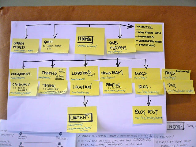
With these few points in mind, let’s see what the most common mistakes are that people commit when they build their websites’ navigation and how they can be avoided.

  1. Non-Standard Location and/or Style

Usually, the navigation is placed at the top of the site’s pages or on the left. These are the most common locations where visitors can find the navigation menu and they usually expect to find it there. If it is placed somewhere else on an uncommon location or it is hidden behind an unconventional style, the visitors will only be confused and may not be able to navigate around your website.

Your goal is predictability – as much as you may want to be original, play it safe when it comes to the style of the website navigation. An easy-to-use structure will lower your bounce rates, improve your conversions and lead to a higher ratio of the pages viewed per visit.

  1. Generic Labels

Instead of the highly generic category labels such as “Products”, “Who we are”, “What we do” etc., use more descriptive labels that reveal the nature of the product or service you offer. This saves your visitors the extra click.

Through your navigation, you have the opportunity to show your site’s relevance to the search engines. Using particular keywords and phrases pertaining to your industry or line of work, which you can find by employing the Google Keywords Tool and other similar tools, will improve your search engine results. Remember: your site navigation and site structure should be built with the search engines in mind from the very beginning.

  1. Too Many Categories in Your Site Navigation

It is a proven fact that the short-term memory of the human can store just up to seven items at a time. What this means for your navigation is that even eight categories on the menu can be too many. When there are fewer items in the navigation, the visitors can view them more clearly and are less likely to miss one of them in the lot. The best strategy is to stick to five or six categories on the menu at the maximum.

This goes for the other parts of the web page, and not only the navigation, too. The fewer the items/products/pictures displayed on a single page, the better visible they are.

Compact navigation has an effect on SEO as well. Since your home page will usually have more backlinks than the other pages, it will also have higher Page Authority. This authority is passed down to the other internal pages of the site, too. However, if the navigation features too many links, the “link juice” gets diluted, so to say, and less authority is passed to the internal pages. Thus, a more compact navigation structure will pass more link juice to the internal pages, improving their ranking chances.

  1. The Drop-Down Menu

There are different opinions about drop-down menus and whether they should be included in the website navigation. However, the predominating perception is that they bring more bad than good effects.

First, if they are done inadequately, they can be hard or even impossible to crawl for the search engines. But that is not the biggest problem.

According to studies on the usability of drop-down menus conducted by the NN Group, these are incredibly annoying for the visitors. This is because we read faster than we can click with the mouse and before we can click and see the drop-down menu, we may have already made up our mind where to click. Then, as a menu drops down it gives us more options and our mind glitches for a moment. This may lead the visitors to skip important pages placed on drop-downs.

There are exceptions to this rule, too, like very long and complex drop-downs with many options. They require more concentration and the visitors may actually take the time to read through the options carefully. These can be used successfully if you have a very big number of site sections.

  1. Wrong Order of Category Arrangement

When making any kind of list, you should keep in mind that the items that are listed on the first and last positions will get the most attention from the viewers. This holds true for site navigation as well. Psychological studies have inferred the “serial position effect” – the things at the beginning and the end of long lists enjoy more attention and retention.

What does this mean for your navigation? You should place the most important categories and items at the beginning and at the end, and the ones with least importance in the middle. This is also the reason why the “Contact” section is usually placed last in the top navigation menu – this has become a standard.

If you avoid these common mistakes and build your website navigation right, you will enjoy better results with both search engines and visitors. Have you ever experienced some of the negative effects of such mistakes on your site? How did you resolve the issue?

How Can Responsive Web Design Help You Gain More Visitors?

Mobile No Comment

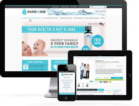
In case your website’s design is not responsive, there are high chances that you are missing out on a lot of traffic, visitors and potential customers. Here are the main reasons why responsive web design can get you more visitors and why failing to implement it can harm your business.

Catering to mobile platforms better

Most probably, many of your visitors, both current and potential ones, are using a mobile device of some type to access your website. A responsive design will adjust your site automatically to the type of device and screen size of the particular user. But if your site doesn’t have that type of design, then most probably its text will be displayed in a very tiny format, making it extremely uncomfortable to read, or it may not fit in the screen size entirely. This will prevent your site from capturing the attention of potential visitors using mobile platforms as it will be bothersome for them to view it.

Enhanced user experience

With responsive web design, there is no redirection, no awkward page or site renditions which appear different on the different platforms or may not load properly in many cases, and no duplicate content either. With responsive design, you have a website with a consistent appearance which works equally well on all types of devices. Thus, the visitor experience is significantly improved, and this will lead to more visitors coming to your site and even increased conversion rates.

Search engine visibility is improved as well

Google and the other search engines show preferences for responsive websites and these rank more successfully in the search engine result pages both in international and local searches. This in turn means not only better overall visibility, but also improved exposure of your site to local audiences. This will increase the number of both your national and global visitors.

Optimized marketing strategies

The goal of every business is reaching as many customers in the target market as possible. Responsive web design facilitates the seamless integration of marketing campaigns throughout all media and device types – desktops, tablets, cell phones, etc. Thus, your message will reach a larger number of visitors and attract more potential customers.

You remain relevant

Last but not least, if you refuse to update your website’s design to the latest responsive trends, you will not only lose a portion of your visitors, but will also miss out on the chance to get new ones from different platforms. If you employ the latest technology for designing your site, you will improve the user experience and your website will look great when displayed across all platforms. This will improve your traffic and lower your bounce rates as well.

Today, the design of your website has to be much more than a fancy visual representation method for displaying your brand and business. It has to have the capability to adapt to the medium your visitors will be viewing it from, be it a desktop, a laptop, a cell phone, a tablet or any other type of device. If you haven’t yet taken the step towards responsive web design, it is high time you did that. This will definitely gain you more visitors and bring your business to the next level.


5 Essential Tips for Impressive Graphic Design

Web Design Tips No Comment

Creating memorable graphic designs for your websites is a tough task which is not ridden of obstacles. Thus, it is essential to keep a few tips in mind which can aid you in coming up with impressive and great-looking projects and graphics. Here are the more important tips you should keep at the back of your mind when working on each one of your projects.

Tip № 1: Use contrast cleverly to make your design distinguishable

Using contrast will help your design projects stand out and be more memorable. Particularly when selecting the background color and the one of the graphics or fonts, it is very important to aim for good contrast, as otherwise the design will not only be unimpressive, but it may also be unreadable. This is extremely important for web design in particular. The thumb rule is: combine a background in a lighter color with a dark colored font, and vice versa. That way, the texts and graphics in your design will be easier to perceive.

Tip № 2: Selecting a color scheme for the design

The color scheme you use should be consistent throughout your design. Start with two or three colors and their hues. A very popular range of colors that has recently been extensively adopted by many designers and is in trend at the moment is the range of bright pastel hues. Make sure that you use the colors you have chosen in all your branding and website elements, if you are working on a project for web design.

Tip № 3: Choose a palette for your fonts

In the same way you select a color scheme for your design, you should focus on a palette for your fonts as well, and use it consistently throughout the entire project. When selecting font colors, you should not forget that black and white will always be safe bets as they can match almost all color schemes.

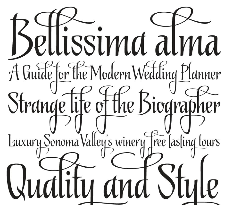
You may already have a few fonts that you implement in your work often or you may have also developed your own fonts. Whatever the case, you will have to select a font for your headings, the subtitles and the main body text. It is great to choose an impressive font for the heading, as that will help it get noticed, but you should select less complicated fonts for the subtitles and body text, which will also be more easily readable. Your aim is not only to impress, but to also make the design easy to read.

Tip № 4: Leave no freestanding (“naked”) images

Incorporating images into your graphic design will make it more interesting and more easily perceivable. Images break the monotony of plain text and make it easier to digest. However, your images should not just be scattered around the layout with no order whatsoever. If you use a grid or a frame to arrange the images (even if it is an invisible one) they will look much better organized and the entire design will acquire a much more professional look.

Tip № 5: Keep it as simple as possible

Each element of your graphic design should be placed where it is for a reason. It is very easy to get carried away and add too many images, different fonts and graphics. However, this will only make your design look cluttered and unorganized, and for website layouts it can be very overwhelming and distracting for the visitors of the website. It is always better to keep the number of colors, shapes, fonts and frames you use to the bare minimum. That way, each element can shine with its own beauty, without being overshadowed by the clutter.

These tips can be especially useful in case you are designing a layout for a website, but they can come in handy in all your other graphic design projects as well.

Color: A Powerful Tool in Graphic and Web Design

Web Design Tips No Comment

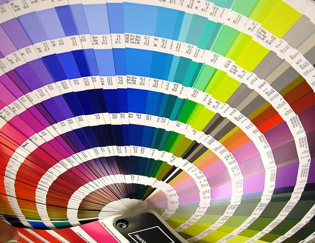
Color is one of the greatest tools that a graphic or web designer has at his/her disposal. Color has the ability to engage the emotions of a website’s visitors and this usually happens on a subconscious level. It is a powerful web design tool of non-verbal communication and it can provoke both emotional and physical reactions in the viewers.

Thus, the color scheme of a website should be given careful consideration. It is very important to get it right in order to get the desired reaction and results. A website’s color scheme should be built in compliance with the main principles of the color theory, but for best results, a website owner should definitely seek professional advice.

The color theory is a complex art in itself, but here we will focus more on the symbolism and meaning of the different colors and the emotions that they evoke into the visitors.

The Popular Meaning of Colors

A certain color can have different meanings across different cultures. Thus, when you are designing a website, you should take your target audience and its cultural distinctions into consideration. You have to be well aware of the way your audience perceives the colors. If you know what your website’s color scheme is saying, you can avoid some serious mistakes.

The immediate opinion of a visitor of your website is formed at the moment he/she sees your site for the first time. And the first impression is formed not because of your products or content, but because of the appearance of the web page itself and a big part of this appearance is formed by the color scheme. The chosen colors work on the subconscious level and the visitors react to them intuitively. If your site’s color scheme is chosen in such a way that it grabs the attention of your audience, your work is half done.

Here are the emotions that the different colors evoke at the first glance.

Blue

Blue is associated with peace, patience, tranquility and stability. It is one of the favorite colors of men. It also evokes the feeling of trust, the perception of professionalism, honor and security.

Red

Red is the color of passion, desire and excitement. It is associated with love, power, energy, strength, boldness and leadership. However, it also carries associations of danger, alarms and other negative feelings. Thus, it should be used wisely.

Yellow

This is the color which is most closely connected with liveliness. Yellow is a very energetic color and evokes feelings of happiness. It also carries associations with amusement, joy, curiosity, brightness, optimism, etc.

Green

Green is the color of nature, harmony, healing, health and food. It is also often associated with money.

Orange

Orange is the color of creativity and cheerfulness. It is also associated with confidence, friendliness, courage, playfulness, steadfastness, etc.

Purple

Purple is traditionally associated with nobility, wealth and power. Other associations that it provokes are those of royalty, wisdom, independence, luxury, ambition, magic, mystery and dignity.

Brown

This is the color of confidence and relaxation. It means nature, earthiness, durability, reliability, comfort, etc. Some perceive it as the color of sophistication, solidity, etc.

Grey

Grey is a color which is most strongly associated with conservatism, seriousness and traditionalism. It can evoke the feelings of innocence and purity as well. Security, intelligence, reliability, dignity, practicality, maturity are all associations that grey can provoke. But it can also mean sadness, boredom, gloominess. When combined with orange, for instance, grey evokes a sense of perfection and looks really stunning.

White

White is the color of purity, innocence, calmness and simplicity. It is great to use as an accent or background color as it highlight all the other colors.

Black

Black is an elegant, stylish color which we associate with power, formality, sophistication, etc. It is a great technical color and it can add some mystery to the site’s design. But it can provoke feelings of depression, too, if it is used over large areas. So, black should be used moderately. On the other hand, if you choose black for the background it can improve the depth and perspective of the design. Black is a great color to use for photography sites, as it makes the other colors very vibrant.

Pink

Pink is the color of romance, tenderness, femininity, emotional healing, affection, care, sweet taste and smell, etc.

A Few Useful Tips:

As a conclusion, here are a few invaluable tips that will assist you in selecting a suitable color scheme for your site. These pieces of advice are used widely by the professional designers.

– For your texts to be readable without difficulties, select contrasting colors. The background and the text should contrast each other for better readability.

– Use fewer colors. You don’t want your website to look like a rainbow or a circus. To achieve the strongest impact, use one color in the headlines and another one in the text.

– Use a sufficient number of colors. It is good to use fewer colors, but they should be sufficient to convey your message. If you use too few hues, your site may look too plain and boring. Strike a good balance.

– Use intense color hues for the sections you want to attract the attention of the audience to. However, be careful, as if you have a too intense color scheme which attracts the visitors’ eyes to too many elements, it will be more distracting than beneficial.

– Seek inspiration from nature – there are incredible complementary color schemes found in nature, take advantage of them.

3 Basic but Indispensable Web Design Tips for the Owner of Any Business

Developers No Comment

Regardless of whether you own a small, medium-sized or big business enterprise, the goal you aim at with designing a website for your business is the same – converting visitors into customers. Your web design should perform optimally in this task for you to enjoy good returns.

In today’s online-driven world, in the majority of cases your web design is the first interaction that people have whatsoever with your business and you. That means that your site has a crucial role to play when it comes to seizing the opportunity to convert a new visitor into a customer in the future. So here, we have gathered three tips which you can use when designing your website for a maximum impact on new visitors. These can be implemented when redesigning your already existing site, too.

  1. Focus on the Value

Your customers will care about your service or product because you offer them value and a return on their investment. Your website has to deliver your company’s value proposition adequately. Your main goal should be to make it extremely easy for the customers to make a purchase, or subscribe for your newsletter, etc. But how can you do that?

The focus should be shifted from you onto your customers. It is all about the customers. You should understand what they care about, their challenges and pains – and build the content of your site to resonate with those needs and desires.

Also, address the clients individually; your copy should not speak to a crowd, but to the individual person. This will help you connect with your visitors and build credibility and trust.

  1. Minimize Distractions

The last thing you want your visitors to be wondering is where to go next. If you have a number of calls to action or your site navigation includes an excessive amount of links to select from, your visitor’s attention will be diverted in way too many directions. They will be wondering where to go instead of focusing on the advantages of your service/product and your message.

To prevent that, segment your navigation into two parts – a primary and a secondary menu. The primary navigation which will be present on top of all pages should include only links to a handful of pages which are critical to your mission – the ones that sell your product and educate the visitors.

The remaining pages can be added to the secondary navigation, where they will still be accessible but they won’t distract the visitors.

  1. Optimize Your Calls to Actioncall to action

    Image source – https://www.flickr.com/photos/smemon/5683575389

Each element of your business website must be designed around the company’s purchase funnel. In other words – the path a visitor takes from your home page/landing page to the eventual conversion into a subscriber or paying customer.

The bottom of your purchase funnel is the call-to-action sections. These may be in the form of buttons to sign up for an account, or to buy a product, or to subscribe to your newsletter, etc.

Take a look at these three simple ways to optimize your website’s calls to action:

  • Be explicit

Your call to action should never be vague. Your visitors should be given explicit instructions on the exact action you want them to perform. For instance, if you want the visitor to sign up for your newsletter, instead of the rather vague “Submit” form button, you should use something which describes the action better – “Subscribe to the newsletter” or something similar.

You should set the expectations from your calls to actions clearly. Your visitors should not wonder what would happen if they clicked a button on your website.

  • Reduce the Friction

Whenever customers have to make a transaction on the web, they display some amount of natural resistance. They are never entirely comfortable with punching in their credit card info and sometimes even giving their e-mail address. There will always be some sort of fear of being scammed, spammed or duped. Thus, you must do everything possible to overcome the natural resistance of your clients, and to do that, you need to “reduce the friction”.

You should convey to the customers in every way possible that there is no risk involved. For instance, if you offer a free service or sample, the call to action should include the word “free”. Or you can offer a money-back guarantee and make sure that this is clearly visible.

You want to make your potential customers feel secure in dealing with you. And the fear of compromising credit card information is very justified in today’s world. So, you should add symbols that indicate that the connection is secure, like a lock icon, and display the SSL certificate that proves your site’s security measures. This will help ease the customer’s mind.

  • Differentiate your call-to-action buttons visually

You will want to ensure that your call-to-action buttons are clearly visible and stand out from the rest of your content. A good way to do that would be to choose a different color for the calls to action. For instance, if you have a grey and blue color scheme on your website, you can make the call to action green or yellow. But make sure that no other element of the page except the call-to-action buttons is in that chosen color.

This way, the CTAs will stand out and they will attract the attention of the visitors. But that also serves another purpose – your visitors will be able to find their way on your website more easily and will get more familiar with the layout. And after they have browsed a few pages and are ready to take an action, they will know what to look for – the green or yellow call-to-action button.


These are just a few simple tips and techniques you can use to improve your business website’s design in order to get the most out of the opportunities it presents you with. If you implement these tips that will surely improve the user experience and help you convert more visitors into customers in the long run.


6 Indispensable Web Design Tips for 2014

Web Design Tips No Comment

So, you have a business website and you haven’t made changes to its design and content for quite a while. However, you should know that even if you own a medium or small business, your website should be kept up with the times and relevant; otherwise, you will soon find that your brand is no longer visible in the online world and you are losing your grasp on your market share. In 2014, online visibility will be more important than ever. So, here are a few essential web design tips for 2014 that will help you keep up with the trend and attract the interest of your potential clients.

1. Use WordPress to build your website


wordpress-logo-simplified-rgb

There is a reason for WordPress to be the most popular and widely used CMS recently. It allows you a lot of flexibility – you may choose to use a premium theme with a very high quality or go for a tailor-made design. It also gives you an easy way to edit and update all the pages of your site. You could even do it on your own. However, if you decide to take a more professional approach and engage a web designer to build your WordPress website for you, the professionals can come up with a completely custom-made design tailored to your needs and content, which will also have a user-friendly admin panel, so that you can easily make all the updates to your site even on your own.

2. Responsive design

You may have heard this term in relation with web design a lot of times but what does “responsive design” mean exactly? With so many people now using their mobile devices to go online, this means that your site should have a full-fledged mobile version to address the needs of these users. It is much more inconvenient for the users to see the information when they open links and they stack in tabs one over the other on their mobile devices. Instead, a separate mobile version of your site should display it in a single text and column where the content and images can be easily read. It should also be compatible with multiple screen resolutions, as not all mobile devices have the same display sizes and ratios.

3. Keep your site fresh and in line with the trends

Even 1-year-old design can look extremely outdated today. The trends are changing with a very fast pace. And in order not to lose traffic, you have to go with the flow. The trends in 2014 are all about flat design, typography, simple color combinations, longer pages that have visual anchors throughout, white space optimization and making good use of video content. A skillful web designer can combine these elements perfectly and make the difference between just another mediocre design and a fresh site with a great quality web design.

4. Include a blog into your site

It is not just enough to have a blog on your website; you have to update it regularly, too. Granted, updating your blog on a regular basis is a large commitment. However, the drawbacks cannot overshadow the immense advantages of a well managed blog. Through your blog, you can improve your brand awareness, educate your viewers and demonstrate your expertise. This allows you to attract traffic that is relevant to your niche and improve your marketing strategy. However, make sure the blog has been integrated into the site itself and it can be seen in the main navigation. This is a more professional approach and can lead people to your other pages, too.

5. Content marketing adoption

In some cases embracing content marketing may mean that you have to change your entire website and marketing strategy and go back to the basics of marketing – you have to define your target audience and the relevant info to communicate to the viewers, and determine what you want the people’s perception about your brand to be.
You have to get the suitable tools, too – a blog, a detailed content marketing plan, the suitable social media channels where your target audience lies. And then you have to draw a plan for a balanced mix of stories, educational and shareable content that you will distribute across these channels regularly. The content you create should be consistent, show personality and be varied, too. It may be hard in the beginning, but with time you will get better at it, and there is always professional help available as well.

6. Social media integration

It’s not enough to just stick a Twitter or Facebook icon on your home page. The icons should be properly linked to the pages of your brand on the respective social media; that goes without saying. But you should also check what first impression your social media pages make. This includes examining your latest updates, the design of the social channel, the engagement of the public, the relevance and shareability of the updates, etc.
The social media forms a large part of your brand recognition and development. Thus, you should use it responsibly and optimally. If your content is interesting and your social channels are very active, you can do more on your blog and site than just linking to social media through icons. You can add Instagram, Pinterest and Twitter feeds, comment and “like” options for Facebook and social sharing buttons to your blog. You can employ many more tools for managing your social media activities as well.

All these elements may sound overwhelming to you, if you haven’t dealt with web design and content management before. If yours is a small business, you may even be tempted to ignore these tips and stick to the age-old designs and strategies. However, this could be detrimental to your online visibility and your entire business. If you want to survive in the era of the online generation, you need to stay up to date in every aspect.

Web Design and SEO: Why is Responsive Design the Best for SEO?

Web Design Tips No Comment

With web browsing through mobile devices showing a steady upward trend, responsive web design has proven to be the best solution that combines the benefits of desktop and mobile dedicated sites. When your website incorporates responsive design elements that means that all the content on it can be displayed to all the users, regardless of whether they are using a mobile device or a desktop computer for viewing it. Furthermore, a responsive site can still tailor the data for easier viewing through mobiles through a few changes in the navigation and the order of showing content.

Responsive Web Design

That being said, the benefits of responsive web design do not end here. Responsive design has the upper hand on building separate desktop and mobile dedicated sites when examined from an SEO perspective, too. Let’s see why.

A Responsive Site Ranks for More Searches than a Mobile One

Often, the website developed for the mobile platforms has different content from the desktop version of the main website. This can be observed in a few common scenarios.

The mobile site has fewer pages than the desktop one

Since the mobile version of the site is almost every time built after the main site, the owners of the site often choose to add to the mobile site only the “important” web pages of the primary site. However, though the “less important” pages that are left out may receive smaller traffic, they have at least some traffic. If you exclude those pages, you will lose the mobile users who would have reached your site by finding those pages through the search engines.

The mobile site has different pages from the desktop one

If our mobile site features content that is not found on the desktop version, you may face two issues.

  • First, the mobile-only content may take longer to get indexed. Your desktop website is likely to be stronger as compared to the mobile version, thus Googlebot will visit it more often. So, the content that is only available on the mobile version will be a lot harder to find.
  • The other issue you may run into is that your desktop visitors will be deprived of that content. Even if you think that the desktop users won’t be interested in a certain page, do not exclude it from the desktop version; just don’t prioritize it in the site navigation. In the worst case, some pages of your site won’t have any mobile traffic and others won’t have any desktop traffic, but you won’t be losing visitors due to missing content.

There are the same pages on the desktop and mobile site, but the mobile version has less content

This can mean one of the following two things:

  • The mobile visitors have access to less information compared to the desktop viewers. – In that case, it will be harder for your mobile site to rank for the same amount of search terms the desktop version would rank for. It may be tempting to have less content because of the smaller screen, but do not forget that mobile users are used to scrolling and expect it.
  • The desktop visitors receive redundant or superfluous information and the mobile viewers get streamlined content. – In this scenario, the excessive information on the desktop version may be unnecessary anyway and it only creates clutter.

A responsive site has all the pages included

Responsive web design can resolve all the above issues as the content added to a responsive website is aimed at all visitors and not mobile or desktop users in particular. The site will have all the pages and the flexible navigation will allow the users to access the data they are interested in most. Thus, the rankings of the website won’t suffer due to missing or unmatching pages in the mobile and desktop versions.

There Are No Redirect Issues with Responsive Sites

In case you use different HTML in the mobile version of your website, you will need to bind the separate versions of every web page together. There are two options for that.

Dynamically served pages

In dynamically served mobile sites, the same URLs are used but depending on the user agent that is requesting the pages, the servers will send a different code. However, to the search engines this may appear like “cloaking” – sending different data to mask the real content of your site, and this attracts penalties. To prevent that, you must add a Vary HTTP Header.

Different URL for the mobile site

The URL is a unique ID for the search engines so your content should never be duplicated on two URLs. In case you choose to have a separate URL for the mobile version of the site, you have to select one of the sites as your “original” content source and use the rel=”canonical” tag for the other page, the “copied” one. Usually, you will have a canonical tag placed on the mobile site and it will be pointing to the desktop site. Google’s recommendation is to place a rel=”alternate” tag on the desktop pages too, so that the search engine will know that there is a mobile version of the site as well.

A responsive site is just the same site

In case you do the tagging of the mobile and desktop versions properly, the mobile site will most likely rank equally as well as a responsive site, but the scope for errors with tags and redirects is very big. On the other hand, a responsive site won’t face this issue in the first place as it is the same site you will be serving every time.

Responsive Design Yields Better Mobile Websites

This is important mainly for businesses. Here’s why:

If you choose to have separate mobile and desktop versions of your website, the tasks of updating, changing and maintaining the two versions will also be separated. In some cases, there are even separate teams dealing with these tasks. Often, the changes to the mobile site are usually made after updating the desktop version, which means that the mobile version may lag behind the desktop one. When adding new pages, that can pose issues with redirects, and when making changes to the content, the mobile visitors will receive inferior content compared to the desktop ones. This makes the job of your mobile team even harder.

Desktop and mobile updates and changes are integrated in responsive sites

On the other hand, when you use responsive web design for your site, all the changes and updates made to the site will be enacted onto the mobile and desktop versions simultaneously and instantaneously. This eliminates the need for a separate mobile team and the worries about inconsistencies, wrong redirects and lagging behind in content.

In Conclusion

A separately designed mobile version of your site may not always be inferior to a responsive site. It may be just as good if it is built really professionally, but that requires a lot of ongoing effort. Also, there are some cases when you might want to have different content on your mobile site and in such instances, a separate mobile site may be a better decision.

However, in the majority of cases, responsive web design is a much better strategy for displaying your site on different platforms, as it can save you a lot of time, effort and money and spare you from a host of issues. And as we were able to see, responsive sites have better prospects for ranking well with the search engines. We can safely say that responsive design is your best bet in terms of SEO.


The 5 Web Design Trends that Will Dominate 2014

Web Design Tips No Comment

With the online space expanding so rapidly, the significance of web design is growing, too. And with this fast-pace development, keeping up to date with the trends is essential in order to be able to stand out from the crowd. 2014 is shaping up to be a year of many changes in web design – changes that you too can and should adopt. Let’s take a look at the five most boldly pronounced web design trends for 2014.

Continue reading

The 10 Most Expensive Logo Designs and Rebranding Campaigns of All Times… And A Few That Cost Surprisingly Little

Web Design Tips 6Comment
Branding and logo design are the most vital part of a company’s corporate identity. A company’s logo should incorporate its essence, what it is and does. It is a symbol, an idea, and a bundle of information. The importance of the logo design has been recognized long ago and it has turned into an industry, and some may even say an art form. Companies are willing to spend a lot of effort and money in order to come up with a memorable logo that will represent their business perfectly.

most expensive logos

You will be surprised to find out how much money exactly some of the most prominent companies in the world have paid for their logo design or rebranding throughout the years. And maybe you will be even more surprised when you see the big brand names that spent close to nothing for their logos.

Continue reading