Post Content
If you haven’t given a thought to adopting responsive web design yet, it is high time that you did. If you want to keep up with the web design trends and not lag behind your competitors, you should seriously consider building a responsive site for your business. Here are the five most important reasons that should convince you to take this decision.
[caption id="" align="aligncenter" width="600"]
 Image source: Philippe Martin - https://www.flickr.com/photos/lafabriquedeblogs/8589066773
[/caption]
-
Google Recommends It!
You could not think of a stronger reason to convince you to embrace responsive design. Ever since 2012, when Google first recommended the use of responsive design, this design technique has gained the reputation of the best way to optimize websites for smartphone viewing. Responsive sites use the same HTML and have only one URL, unlike separate mobile and desktop site versions. What this means for Google is that its bots can crawl and index the content of your site easily. This alone should be reason enough to adopt responsive design today!
-
Lower Bounce Rate
In case a visitor lands onto your website and returns to the search engine result page immediately after that, without viewing any other page of your site, in the eyes of Google your site will not be considered the best match for the query that the visitor has made. If the visitor reaches your site through a mobile device and the site is not easy to view and navigate, this bounce rate is expected to be higher.
However, when you incorporate responsive design elements into your website, the CSS values will change based on the device the site is viewed from. This will significantly lower the bounce rate. And given the fact that close to 28% of the visitors used their mobiles to browse the internet in 2013 and by 2015 this percentage is expected to exceed the percentage of desktop viewers, you should not ignore mobile traffic and mobile optimization unless you want to lose a lot of potential customers.
-
1 Website = 1 SEO Campaign
If you have both a desktop version and a mobile version of your site, you are most likely managing a separate SEO campaign for each. This is no doubt a tedious task, not to mention the costs involved.
If you choose to employ responsive design, you will only have one website to take care of and you can concentrate all your SEO efforts on it. The need to promote two separate websites for mobile users and desktop users will be eliminated. This way, your link juice will flow to only one site and it will rank better. That will surely give you the upper hand on those of your competitors that have not gone responsive yet.
-
Responsive Design Combines Redesigning and Long-Term Maintenance
Many companies are still using mobile dedicated websites as their primary websites today. However, a mobile site poses a number of maintenance issues. With the drastic change of technological trends, the design of the mobile site will require more frequent updates and maintenance procedures as compared to a site built with responsive web design. Responsive sites require much less maintenance and at the same time have a longer life.
Fluid grids combined with media queries can give your responsive design sustainability. Even though the user devices may get updated at certain intervals of time, there will rarely be any need for updates of your responsive site in order to keep up with these changes.
-
The ROI (Return on Investment) Is Guaranteed
For all the factors listed so far, there is one outcome that they have in common and that is receiving maximum return on investment (ROI). On the contrary, if you have a non-responsive website, it will most likely be unable to compete with the websites of your rivals and thus your business’s returns will be affected negatively. In order for your business to be able to grow and gain a bigger market share, you have to have a broader outreach than your competitors and be able to get to more people than them. Adopting responsive web design for your website will ensure that you reach to a wider target audience thus improving your conversion chances.
Get the Right Response by Getting Responsive
If we look at the statistics pertaining to responsive web design in 2013, we will clearly see why every company must embrace this trend for their website as soon as possible. Thanks to its capability to detect devices and load content and data selectively with a higher speed, responsive design will continue to be the dominating trend throughout 2014, too, and maybe even in the following years.
--------------------------------------------------------------------------------
Post Content
redesigned Was migrated from BigCommerce into a Wordpress & Woocommerce responsive platform.redesigned Was migrated from BigCommerce into a Wordpress & Woocommerce responsive platform.redesigned Was migrated from BigCommerce into a Wordpress & Woocommerce responsive platform.redesigned Was migrated from BigCommerce into a Wordpress & Woocommerce responsive platform.redesigned Was migrated from BigCommerce into a Wordpress & Woocommerce responsive platform.redesigned Was migrated from BigCommerce into a Wordpress & Woocommerce responsive platform.redesigned Was migrated from BigCommerce into a Wordpress & Woocommerce responsive platform.redesigned Was migrated from BigCommerce into a Wordpress & Woocommerce responsive platform.redesigned Was migrated from BigCommerce into a Wordpress & Woocommerce responsive platform.redesigned Was migrated from BigCommerce into a Wordpress & Woocommerce responsive platform.redesigned Was migrated from BigCommerce into a Wordpress & Woocommerce responsive platform.redesigned Was migrated from BigCommerce into a Wordpress & Woocommerce responsive platform.redesigned Was migrated from BigCommerce into a Wordpress & Woocommerce responsive platform.redesigned Was migrated from BigCommerce into a Wordpress & Woocommerce responsive platform.redesigned Was migrated from BigCommerce into a Wordpress & Woocommerce responsive platform.redesigned Was migrated from BigCommerce into a Wordpress & Woocommerce responsive platform.redesigned Was migrated from BigCommerce into a Wordpress & Woocommerce responsive platform.
Water on the Web redesigned Was migrated from BigCommerce into a Wordpress & Woocommerce responsive platform.
--------------------------------------------------------------------------------
Post Content
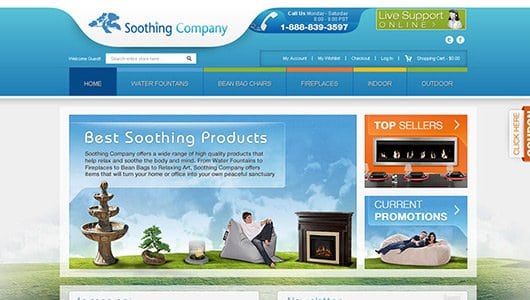
A Magento E-commerce that sells exquisite furniture and home decorations.A Magento E-commerce that sells exquisite furniture and home decorations.A Magento E-commerce that sells exquisite furniture and home decorations.A Magento E-commerce that sells exquisite furniture and home decorations.A Magento E-commerce that sells exquisite furniture and home decorations.A Magento E-commerce that sells exquisite furniture and home decorations.A Magento E-commerce that sells exquisite furniture and home decorations.A Magento E-commerce that sells exquisite furniture and home decorations.A Magento E-commerce that sells exquisite furniture and home decorations.A Magento E-commerce that sells exquisite furniture and home decorations.A Magento E-commerce that sells exquisite furniture and home decorations.A Magento E-commerce that sells exquisite furniture and home decorations.A Magento E-commerce that sells exquisite furniture and home decorations.A Magento E-commerce that sells exquisite furniture and home decorations.A Magento E-commerce that sells exquisite furniture and home decorations.A Magento E-commerce that sells exquisite furniture and home decorations.A Magento E-commerce that sells exquisite furniture and home decorations.A Magento E-commerce that sells exquisite furniture and home decorations.A Magento E-commerce that sells exquisite furniture and home decorations.A Magento E-commerce that sells exquisite furniture and home decorations.A Magento E-commerce that sells exquisite furniture and home decorations.
Soothing Company - A Magento E-commerce that sells exquisite furniture and home decorations.
--------------------------------------------------------------------------------


