


In the last few years, the mobile market has gained momentum very rapidly and the percentage of mobile searches has grown tremendously. By 2015, the number of searches made through mobile devices is expected to surpass the number of desktop queries and by 2016, in the U.S. local search market alone, the mobile queries are expected to exceed the desktop ones by a staggering 27.8 billion searches.
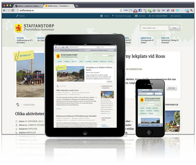
Image source: axbom – https://www.flickr.com/photos/axbom/6263640150
This upward mobile use trend includes not only traffic that comes in from searches, but also emails and social media, which have enjoyed a steady growth in popularity in the past few years. If you have thought you could ignore mobile traffic, the above data should quickly prove you wrong. You cannot afford to miss out on the traffic coming in from mobile users.
At the end of 2013, some websites have registered that close to 25% of their traffic was coming from mobile devices – mainly smartphones and tablets. However, websites designed for desktop viewing do not work that well with mobile devices. This calls for developing a more mobile-friendly version of your website.
What Are Your Options
If you run a small business, when it comes to displaying your website on mobile platforms there are actually three options you can turn to. You can choose to do nothing with your web design, you can develop a fully mobile dedicated website or you can incorporate responsive web design elements into your existing website. Let’s take a look at these options and see what effects they will have on your website and traffic.
Do Nothing
The web browsers are highly advanced today. You will hardly find a website today that is perfect and doesn’t have any errors in its code, even minor ones, and yet the browsers are smart enough to work around these errors and display the web pages correctly. They even work quite decently with displaying websites that are not optimized for mobile viewing on tablets and other mobile devices.
So, even if your site is not mobile optimized, it will most probably still be displayed correctly on mobile platforms. However, the user experience will be terrible. The desktop version of your site is built for a much bigger screen resolution than the ones of the common mobile devices and all content and links will appear very small, which will require the user to zoom in, in order to be able to read your site. This will often annoy users and make them leave your website very quickly, thus lowering your conversion rates.
Build a Separate Mobile Version of Your Site
Websites that are displayed on the browsers of mobile devices with an URL like m.example.com are actually separate websites created with the purpose of being viewed on mobile platforms only.
The benefit of this option is that it allows you to create a much better user experience for the people who browse your site through their mobiles. These sites have larger buttons and are more easily readable. Furthermore, you can rearrange the most important parts of the navigation like the contact info, etc. in such a way that it will be easier for the mobile users to find it.
But there is a downside to this option, too. You will actually have to maintain two separate websites – one desktop version and one mobile version. This doubles your efforts of updating the data on your site. Furthermore, the mobile version can be optimized for either tablets or smartphones, but not both.
You have to be extremely careful; otherwise you may commit mistakes that will harm your website’s search engine performance and cost you traffic. Google in particular does not tolerate broken pages or incorrectly mapped redirects, which are common issues with mobile dedicated websites.
Responsive Web Design
Finally, we come to the third option you have at your disposal for displaying your site on mobile devices. Through incorporating advanced CSS and HTML coding, responsive design can automatically adapt your website’s layout to the screen resolution of the device on which it is displayed. This way, your site visitors can get an optimal user experience regardless of whether they view your site from a desktop, a tablet or a smartphone.
Although designing a responsive website takes a bit of an effort, it fixes the common issues with mobile sites – you have only one website to take care of and there are no redirects that can go wrong. If a responsive website is designed correctly, it can combine the benefits of desktop and mobile dedicated sites. For the mobile users, you may choose to display important data like your contact info or a map in an easily accessible location, like with the mobile dedicated sites. Well built responsive websites are powerful and flexible and that is why this is the best option you can choose out of the three.
Conclusion
The growing mobile use requires from you to be flexible with your business website, too, even if you own a small business. Responsive web design is your best bet in order to achieve a satisfying user experience for both users who browse through their desktop computers and those who use their mobile devices for surfing the internet. It may require some effort on your part initially, but in the long run it will be much easier and cheaper to maintain than supporting two separate websites for mobile and desktop users.
