


What Is Email Design?
People who have email accounts receive messages everyday. So the major challenge you have is making sure that the person receiving the message reads it despite the many messages he receives everyday.
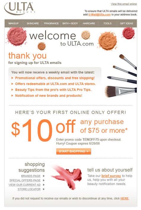
An example of a good e-mail design
You have less than five seconds to convince the person receiving the message to consider reading it. Thus, it is very important for the message to have the right message, tone, and look. That is why good email design is important.
The Email Design Process
Although there is no standard way of making an email message, a number of issues apply for email design. First, keep the subject line as relevant, interesting, and short as possible. When it comes to the content, consider using shorter paragraphs instead of longer ones. In addition, remember to add links to the content so that people can take action. Finally, apply the 80/20 rule when dealing with text and images respectively.
Complicated Design
There is an old adage that “less is more”. This concept applies when you are designing an email. Images should not be your priority in the email. Actually, you should design the email as if there will be no images. This is because many platforms leave out images unless the images allows. Many recipients of your message may not see the beautifully done images because of this. You need to persuade the recipients enough to open the images. Therefore, consider using a simple design for your email.
Using Loud Colors
Many people are tempted to use loud colors when they are desperate for attention from the online audience. Yes, you can get attention this way, but a different one. If you are too bright and loud, the audience will not listen to what you are saying. Here, the problem is overwhelming the visitor with colors and design. Eventually, you end up drowning your sales message and losing and perfect opportunity to sell your business. Consider using colors such as blue, grey, and white for your email. Red and orange are completely out of question.
Using Too Many Fonts
People usually make the mistake of using multiple fonts in different sections of the text. The reason for this is to attract attention. This can result into a busy and confusing design. The rule of the thumb is not to use more than two fonts. One font should be for the heading, and the other for the body.
If you must separate different sections of the message, alter the color and weight. Furthermore, italics are available if you need more sub-headings. Consider being more cautious about this and your brand strategy will be stronger.
Being Too Wordy
You do not want to bore your audience with superfluous stuff. Unfortunately, some people do this all the time. Instead of going directly to the point to explain the core issue to the recipient, you may be tempted to tire the audience with irrelevant details. You can avoid this mistake by identifying your valuable information and going directly to it.
A point to note is that emails should be a pointer to something else. This means that emails are a teaser to the main course. Give your audience a teaser of the main thing in the mail. For the rest, give links and encourage people to follow them.
Not Making the Message Mobile-Friendly
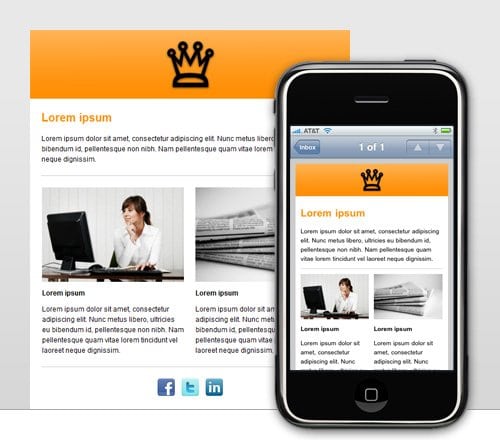
As of May 2014, 65 percent of email opens were on mobile devices. Going by earlier records, this trend is likely to continue for several more years. Gadgets that are more complicated are likely to continue entering the market as people move further from stationary devices. Therefore, you need to design your emails for mobile devices such as Smartphone and Tablet. Your designer can make sure that the email fits for a smaller screen apart from the conventional desktop. You should even be more committed on this because most of your competitors are already creating mobile-friendly emails.
The Ball Is In Your Court
There you have it. Setting an email campaign demands a certain degree of professionalism. While designing your email, you will need to make corrections and improvements. You can correct some of the errors by always doing a test email.
A professional yet easy-to-read design is critical for the success of any email campaign. If you make a good email, recipients will have an easier time reading it and using click-throughs. This is the basis of any email campaign.
Email campaign is an addition to the many forms of marketing available. None of these options has a one-size-fits-all solution. Therefore, make sure you try a number of layouts to see which one works best.
You may have been doing the shown by this article until today. Remember that it will take some time to make major improvements. If you follow the tips given here, your email campaign in 2015 and beyond will be exemplary.
