


Creating memorable graphic designs for your websites is a tough task which is not ridden of obstacles. Thus, it is essential to keep a few tips in mind which can aid you in coming up with impressive and great-looking projects and graphics. Here are the more important tips you should keep at the back of your mind when working on each one of your projects.
Tip № 1: Use contrast cleverly to make your design distinguishable
Using contrast will help your design projects stand out and be more memorable. Particularly when selecting the background color and the one of the graphics or fonts, it is very important to aim for good contrast, as otherwise the design will not only be unimpressive, but it may also be unreadable. This is extremely important for web design in particular. The thumb rule is: combine a background in a lighter color with a dark colored font, and vice versa. That way, the texts and graphics in your design will be easier to perceive.
Tip № 2: Selecting a color scheme for the design
The color scheme you use should be consistent throughout your design. Start with two or three colors and their hues. A very popular range of colors that has recently been extensively adopted by many designers and is in trend at the moment is the range of bright pastel hues. Make sure that you use the colors you have chosen in all your branding and website elements, if you are working on a project for web design.
Tip № 3: Choose a palette for your fonts
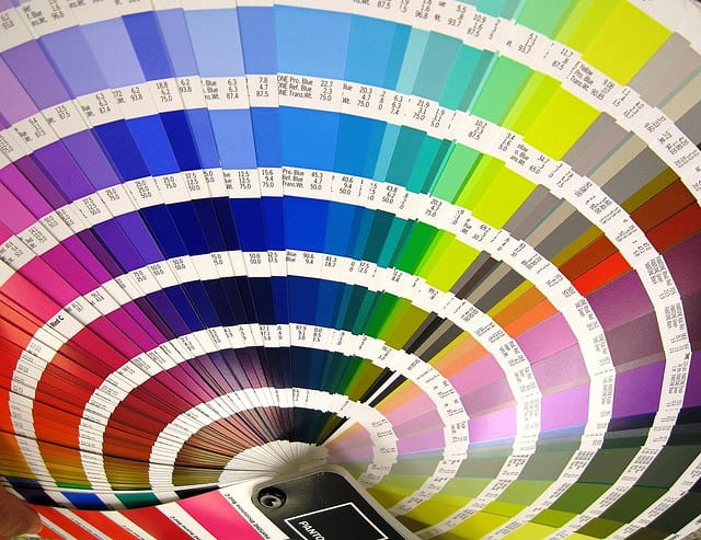
Image source: Ru Tover – https://www.flickr.com/photos/rutover/3681634702
In the same way you select a color scheme for your design, you should focus on a palette for your fonts as well, and use it consistently throughout the entire project. When selecting font colors, you should not forget that black and white will always be safe bets as they can match almost all color schemes.
You may already have a few fonts that you implement in your work often or you may have also developed your own fonts. Whatever the case, you will have to select a font for your headings, the subtitles and the main body text. It is great to choose an impressive font for the heading, as that will help it get noticed, but you should select less complicated fonts for the subtitles and body text, which will also be more easily readable. Your aim is not only to impress, but to also make the design easy to read.
Tip № 4: Leave no freestanding (“naked”) images
Incorporating images into your graphic design will make it more interesting and more easily perceivable. Images break the monotony of plain text and make it easier to digest. However, your images should not just be scattered around the layout with no order whatsoever. If you use a grid or a frame to arrange the images (even if it is an invisible one) they will look much better organized and the entire design will acquire a much more professional look.
Tip № 5: Keep it as simple as possible
Each element of your graphic design should be placed where it is for a reason. It is very easy to get carried away and add too many images, different fonts and graphics. However, this will only make your design look cluttered and unorganized, and for website layouts it can be very overwhelming and distracting for the visitors of the website. It is always better to keep the number of colors, shapes, fonts and frames you use to the bare minimum. That way, each element can shine with its own beauty, without being overshadowed by the clutter.
These tips can be especially useful in case you are designing a layout for a website, but they can come in handy in all your other graphic design projects as well.
