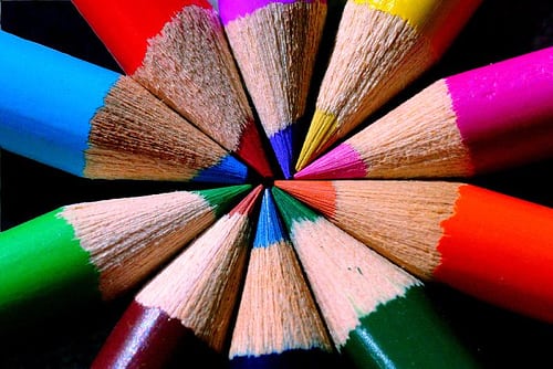
Color is one of the greatest tools that a graphic or web designer has at his/her disposal. Color has the ability to engage the emotions of a website’s visitors and this usually happens on a subconscious level. It is a powerful web design tool of non-verbal communication and it can provoke both emotional and physical reactions in the viewers.
Thus, the color scheme of a website should be given careful consideration. It is very important to get it right in order to get the desired reaction and results. A website’s color scheme should be built in compliance with the main principles of the color theory, but for best results, a website owner should definitely seek professional advice.
The color theory is a complex art in itself, but here we will focus more on the symbolism and meaning of the different colors and the emotions that they evoke into the visitors.
The Popular Meaning of Colors

Image source: Capture Queen – https://www.flickr.com/photos/uaeincredible/231011361
A certain color can have different meanings across different cultures. Thus, when you are designing a website, you should take your target audience and its cultural distinctions into consideration. You have to be well aware of the way your audience perceives the colors. If you know what your website’s color scheme is saying, you can avoid some serious mistakes.
The immediate opinion of a visitor of your website is formed at the moment he/she sees your site for the first time. And the first impression is formed not because of your products or content, but because of the appearance of the web page itself and a big part of this appearance is formed by the color scheme. The chosen colors work on the subconscious level and the visitors react to them intuitively. If your site’s color scheme is chosen in such a way that it grabs the attention of your audience, your work is half done.
Here are the emotions that the different colors evoke at the first glance.
Blue
Blue is associated with peace, patience, tranquility and stability. It is one of the favorite colors of men. It also evokes the feeling of trust, the perception of professionalism, honor and security.
Red
Red is the color of passion, desire and excitement. It is associated with love, power, energy, strength, boldness and leadership. However, it also carries associations of danger, alarms and other negative feelings. Thus, it should be used wisely.
Yellow
This is the color which is most closely connected with liveliness. Yellow is a very energetic color and evokes feelings of happiness. It also carries associations with amusement, joy, curiosity, brightness, optimism, etc.
Green
Green is the color of nature, harmony, healing, health and food. It is also often associated with money.
Orange
Orange is the color of creativity and cheerfulness. It is also associated with confidence, friendliness, courage, playfulness, steadfastness, etc.
Purple
Purple is traditionally associated with nobility, wealth and power. Other associations that it provokes are those of royalty, wisdom, independence, luxury, ambition, magic, mystery and dignity.
Brown
This is the color of confidence and relaxation. It means nature, earthiness, durability, reliability, comfort, etc. Some perceive it as the color of sophistication, solidity, etc.
Grey
Grey is a color which is most strongly associated with conservatism, seriousness and traditionalism. It can evoke the feelings of innocence and purity as well. Security, intelligence, reliability, dignity, practicality, maturity are all associations that grey can provoke. But it can also mean sadness, boredom, gloominess. When combined with orange, for instance, grey evokes a sense of perfection and looks really stunning.
White
White is the color of purity, innocence, calmness and simplicity. It is great to use as an accent or background color as it highlight all the other colors.
Black
Black is an elegant, stylish color which we associate with power, formality, sophistication, etc. It is a great technical color and it can add some mystery to the site’s design. But it can provoke feelings of depression, too, if it is used over large areas. So, black should be used moderately. On the other hand, if you choose black for the background it can improve the depth and perspective of the design. Black is a great color to use for photography sites, as it makes the other colors very vibrant.
Pink
Pink is the color of romance, tenderness, femininity, emotional healing, affection, care, sweet taste and smell, etc.
A Few Useful Tips:
As a conclusion, here are a few invaluable tips that will assist you in selecting a suitable color scheme for your site. These pieces of advice are used widely by the professional designers.
– For your texts to be readable without difficulties, select contrasting colors. The background and the text should contrast each other for better readability.
– Use fewer colors. You don’t want your website to look like a rainbow or a circus. To achieve the strongest impact, use one color in the headlines and another one in the text.
– Use a sufficient number of colors. It is good to use fewer colors, but they should be sufficient to convey your message. If you use too few hues, your site may look too plain and boring. Strike a good balance.
– Use intense color hues for the sections you want to attract the attention of the audience to. However, be careful, as if you have a too intense color scheme which attracts the visitors’ eyes to too many elements, it will be more distracting than beneficial.
– Seek inspiration from nature – there are incredible complementary color schemes found in nature, take advantage of them.


