


Branding and logo design are the most vital part of a company’s corporate identity. A company’s logo should incorporate its essence, what it is and does. It is a symbol, an idea, and a bundle of information. The importance of the logo design has been recognized long ago and it has turned into an industry, and some may even say an art form. Companies are willing to spend a lot of effort and money in order to come up with a memorable logo that will represent their business perfectly.
![]()
You will be surprised to find out how much money exactly some of the most prominent companies in the world have paid for their logo design or rebranding throughout the years. And maybe you will be even more surprised when you see the big brand names that spent close to nothing for their logos.
Let’s first see the list of the top 10 most expensive logo designs and re-branding campaigns of all times.
10. The Logo of the City of Belfast – Total Cost: $280,000

When the city of Belfast decided to change their logo in 2008, they spent the staggering $280,000 for the new design. The logo is a heart-shaped B with the name of the city written in it. The symbol of love was chosen for the design in order to convey a message of love and show that the city of Belfast has left its violent history in the past. According to the City Council, the B stands for “be” as in “be welcome”, “be vibrant”, “be part of it”.
9. The Logo of the City of Melbourne – Total Cost: $625,000

Designed in 2009 by the Landor Associates, this logo was meant to support Melbourne’s new corporate identity strategy. The price tags of this logo and the next one on our list are the same, but we feel this one is a bit better than the next one, thus providing better value for money. This has put it at the 9th place in our list.
8. The Logo of the 2012 London Olympics – Total Cost: $625,000

This logo was designed by a London based brand consultancy firm, Wolff Olins in 2007. The company was widely criticized for this design with comments about it being sloppy and unprofessional. Nevertheless, it cost $625,000 and its fame, though not too favorable, puts it at the 8th place among the most expensive logo designs ever.
7. The New Logo of Pepsi – Total Cost: $1,000,000
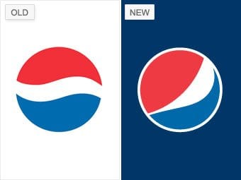
We are now entering the big league – the logo designs and re-branding campaigns that cost the companies who ordered them over a million dollars. PepsiCo is one of the biggest soft drink manufacturers in the world and the redesign of their logo in 2008 reportedly cost $1,000,000. However, some people view this logo change as a failure and a lost battle in the infamous Cola Wars, commenting that the Pepsi logo will never achieve the timeless identity of the Coca-Cola logo.
6. The Rebranding Campaign of BBC – Total Cost: $1,800,000
![]()
The British Broadcasting Corporation (BBC) had their logo redesigned in 1997 and the whole rebranding campaign cost the company the astonishing $1,800,000. Being a global network, brand awareness is vital for BBC and that was money well spent for them. The clear monochromatic logo is universally recognized. If BBC still continues to use this logo in 2016, this will be the logo with the longest life on screen (the 1971-1988 logo of BBC now holds this record).
5. The Rebranding of ANZ – Total Cost: $15,000,000

The rebranding campaign of the Australian and New Zealand Banking Group Ltd took two years, form 2010 till 2012, and cost 15 million dollars. However, this sum included its whole new marketing strategy as well. Being the biggest bank in New Zealand and the 3rd most popular one in Australia, adequate branding is crucial for ANZ, so spending such big money on logo design and rebranding was justified.
4. The Rebranding of Posten Norge – Total Cost: $55,000,000
![]()
Posten Norge is a company providing postal services in Norway. In 2008, the company launched a massive rebranding campaign that cost 300 million Norwegian kroner and included a whole new logo and marketing strategies. The campaign successfully created positive brand awareness among the users and clients of Posten Norge.
3. The Rebranding of Accenture – Total Cost: $100,000,000

Accenture is a multinational technology services, management consulting and outsourcing company. In 2000, Andersen Consulting terminated their contract with the Andersen accounting group and the consulting company was thus forced to change its name. They replaced their signature name with Accenture, which was meant to convey the message “accent on the future”. However, this has been deemed one of the biggest rebranding failures of all times – the new brand name was criticized for its lack of meaning. Nevertheless, the rebranding cost an estimated 100 million dollars, which puts it at number 3 in our list.
2. The Rebranding of BP – Total Cost: $211,000,000
![]()
In the year 2000, British Petroleum, known today as BP, replaced the strong logo that they had used for over 70 years with the current “Helios” logo, which cost a total of $211,000,000. The only element that was kept from the previous logo was the green and yellow color scheme. The Helios logo was meant to represent and symbolize BP’s strategy of green growth; however, this has been deemed another rebranding failure as people widely commented that there was nothing green about drilling for oil. The 2010 oil spill disaster for which BP was responsible even gave birth to a Greenpeace contest for mock logo design with the Helios turned into an oil spill.
1. The Rebranding of Symantec – Total Cost: $1,280,000,000

Symantec has gone down in history with its logo redesign and rebranding campaign that cost the company over a billion dollars. We can’t say if such a high cost was justified for a logo, but some see this as a rebranding failure, as the company that was once a major enterprise firm is now struggling to reposition itself on the market as a provider of mid-market solutions.
Now that we’ve seen how much money brands have been willing to spend on logos and building brand awareness, let’s see the other side of the medal – a few of the most famous companies in the world that spent nothing or close to nothing for their logos.
The Nike Swoosh – Total Cost: $35
![]()
It may seem surprising that such an iconic and recognizable logo cost just $35, but it is true. In 1971, the co-founder of Nike, Phil Knight bough the Swoosh from Carolyn Davidson, a graphic design student at the Portland State University, where Knight was teaching a class in accounting. When he bought the logo, Knight commented, “I don’t love it, but maybe it will grow on me.” Well, it has certainly grown on the Nike fans ever since then.
The Twitter Logo – Total Cost: $15
![]()
The rights to the famous blue bird logo were bought by Twitter on iStockphoto for just $15. And the author of the logo, Simon Oxley might have received just $6 for the job, after the fees. Although the Twitter logo has recently undergone a makeover, it is still based on the iconic blue bird which cost the company just spare change.
The Google Logo – Total Cost: $0

Despite the fact that Google’s famous multicolored logo has undergone a number of minor changes throughout the years the main concept has been kept. The original logo was designed in 1998 by Sergei Brin, one of the co-founders of Google. He used GIMP, a free graphics editing program. Afterwards, a friend of Larry Page and Sergei Brin from Stanford, Ruth Kedar worked on a few other prototypes of the logo. “I had no idea at the time that Google would become as ubiquitous as it is today, or that their success would be of such magnitude,” said Kedar in an interview in 2008.
The Microsoft Logo – Total Cost: $0
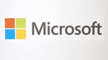
The logo of Microsoft was updated in 2012 and the current logo of the technological giant cost the company no additional expenditure, as they used their in-house team for the redesign. Although the new logo received mixed reviews, with some thinking that Microsoft could have done way better in the redesign, it is still a good logo that honors the heritage of the previous Microsoft logos with the four color window.
The Coca-Cola Logo – Total Cost: $0
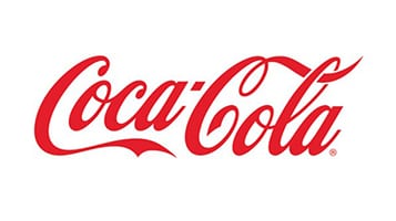
And finally, we’ll take a look at one of the greatest and most recognizable logo designs of all time – the one of Coca-Cola. The iconic Coca-Cola logo was created as far back as 1886, by Frank M. Robinson, the partner and accountant of John S. Pemberton, the company’s founder. He also suggested the name Coca-Cola, with the argument that the two capital Cs would appear well in advertizing. Robinson experimented with Spencerian script and came up with the unique logo of the brand. Though there have been minor changes to the logo in certain periods, the classic design has remained almost intact for almost 130 years. They say the best things in life are free; looks like that’s true, or at least in the case of Coca-Cola.
As you can see, a great logo can cost thousands of dollars, but even a price tag of millions doesn’t guarantee that a logo will be good or adequate. And sometimes, logos that cost negligible amounts of money or are even free can go down in history with their iconic brand messages.
