


With Rio Olympics 2016 fully trending now, we bring you few of the best as well as the worst logos produced to promote the Olympic event. Modern Olympics was launched in 1896 and the most recognized graphic of the game which is five interlinked circles or rings was introduced first in 1912. But it only became popular after 1930s with the material of promotion targeting typography and symbolic depictions of the human figure. The Olympics of 1924 presented the first graphics which could be considered as a logo officially.
![]()
-
Paris, 1924
The line drawn for this Olympics had an outline that was shaped like a shield along with a ship at the center. Milton Glaser, an American Designer, deemed it as a bad start and also called the text unreadable.
-
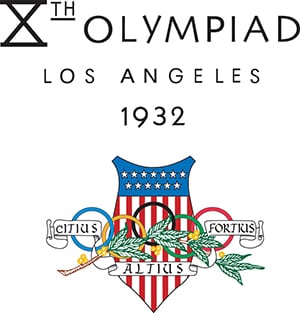
Los Angeles, 1932
The logo mainly had a banner that was star spangled, with the game’s motto.
-
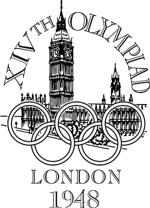
London, 1948
This was the first Olympics post the world war and had the five rings overlaid on each other above the Parliament building of London.
-
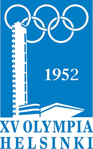
Helsinki, 1952
This blue and white logo took inspiration from the Finnish flag. Besides being used as a logo, it was also printed on badges which the dignitaries and guests of the game ceremonies wore. The design featured the stadium tower of Olympics in the front and the iconic five rings in the background over it.
-
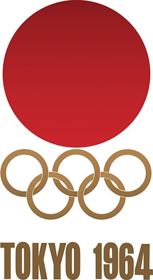
Tokyo, 1964
The symbol of Japan, bright and red sun, and the five rings above the words in “Tokyo 1964” in block bold letters was the logo.
-
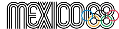
Mexico, 1968
This was designed by an American designer, Lance Wyman,. The logo revolves around a multi stroke typeface which embedded the Olympic rings into the number 68. The modified designs of this logo, along with patterns of diagonal lines and curves radiating, were used in a lot of places all over the city while the event was being promoted.
-
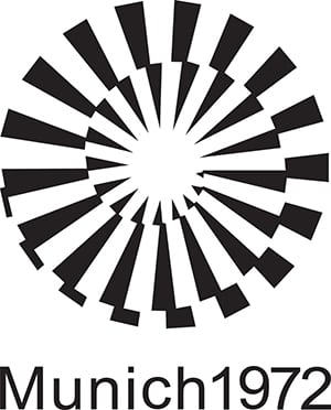
Munich, 1972
Though this Olympic is known for the tragic things that happened while the event took place, the logo is a creative graphic design. This design was developed by Otto Aicher, a German designer, who was among the first ones to drop the idea of showing the five rings which Glaser calls as a powerful abstraction.
-
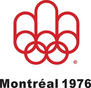
Montreal, 1976
The Olympic rings were transformed to depict the letter M standing for Montreal. Glaser deems the design to be more fitting for a paper towel company.
-
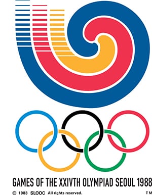
Seoul, 1988
Glaser calls this design as Harmonious. The picture shows bold lines that are converging to convert into a circular pattern that is concentric, following the steps of Olympic rings.
-
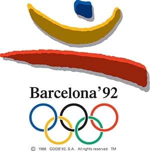
Barcelona, 1992
Three strokes coming from the structure of a jumping athlete is what the logo was. The selection of shapes and colors showed a clear relationship between the text and rings and the logo.
-
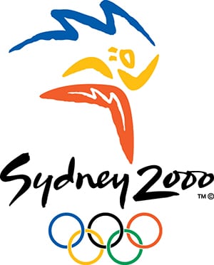
Sydney, 2000
This design by Michael Bryce, an Australian designer and Architect, is a favorite of Glaser because of its lettering. The gestural ability of the logo and the typography makes it look harmonious.
-
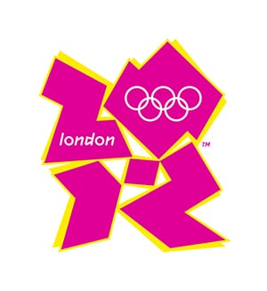
London, 2012
This logo would be visible on screens but the results were kind of controversial. The logo is remembered for all wrong reasons as it is as clumsy and the typography was garish.
-
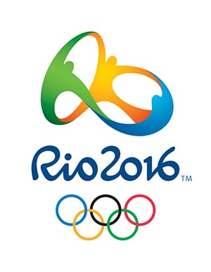
Rio de Janeiro, 2016
This logo felt like a new thing according to Glaser. It was designed by Tatil, a Brazilian agency after an elaborate selection process.
