


Post Content
A recent survey conducted among the small business owners has shown that one of the tasks they find most difficult in setting up their business is designing a logo for their company, blog, etc. While to some of you this may look like a thing that does not require much professional input and you may think you can easily do it on your own, many people feel this task to be quite overwhelming and are more inclined to leave it to a professional designer, rather than attempting to create a logo all on their own. At this point, we should also factor in the cost of hiring professional services. Creating a business logo can cost from a few hundred dollars to thousands and some big brands are even prepared to pay millions to get a unique logo. However, small businesses are often in no position to afford such expenditures and many of their owners are seeking for viable alternatives. This brings us to the next question: Does a small business really need a designated logo? And aren’t there other alternatives, too, that can substitute the professionally designed logo quite adequately? In fact, there are several alternatives that a small business can turn to. Note that we are not saying that these alternatives can completely substitute a good professionally designed business logo or that they can match the benefits it can offer. A professionally designed and bespoke logo is still the best way to build brand recognition and identity, but in case you decide to try and do it yourself, here’s what might prove to be good strategies.Use Negative Space
Negative space logos can be really beautiful and memorable. They use the background of the text to form an image or text. These types of logos have gained wide popularity recently. They are often an intricate combination of fore- and background text and images intertwined. When you look at a negative space logo, you can often see just one of the images and upon a more detailed examination, the other image or text becomes visible. However, you need more than just the basic graphic skills and quite a lot of creativity to come up with a good negative space logo on your own.Typography and Fonts
Often, the brand name of the business written in a good font can act as a logo quite well. If you decide to give this alternative a try, there are a few steps that you are advised to follow.
Use Super-Sizing on an Image
The so-called dingbats can be really helpful when you want to make a logo on your own. These are tiny ornaments or characters used in the typesetting. You can use the technique of super-sizing to enlarge such an image and incorporate it into your logo. However, you must note that you should use a vector graphic editing program for this purpose, as otherwise it would just pixelate the image. You can even find video tutorials on how to do this online.A Few Characteristics of a Good Logo
Finally, here are a few of the characteristics that a good logo should possess.- It should look equally good in color and in black and white. – Your logo will appear in different settings, so it is good that you follow this rule for the cases when you might need it too appear monochromatic.
- It should look equally good big and small. – It should have an equally good appearance on a business card, a billboard or the header of your website.
- You should be able to dress it up or down as need be. – You can play with your logo for different occasions like Christmas and other events, adding elements to it without changing its basic shape.
- It should be recognizable even without words. – This is the most important of all characteristics. Your logo should be unique, meaning that your audience should be able to recognize it even if your brand name is not attached to it.
--------------------------------------------------------------------------------
Post Content
--------------------------------------------------------------------------------
Post Content
- Prepare a design brief
- Conduct research on the industry
- Conduct research on successful logo designs
- Conceptualize and sketch
- Reflect on the design and its improvement
- Revise the design
- Present the logo design to the concerned people
- Get approval and deliver the design.
- Red – energy, bold, sex
- Orange – friendly, youthful
- Yellow- optimism
- Green – nature, growth, organic
- Blue- Calm, trust, medical
- Purple- wise, spiritual
- Black – powerful
- Pink – fun, play and flirty
--------------------------------------------------------------------------------
Post Content
Brand personality
Each brand stands for something unique. It has its own personality. These unique traits of a brand are reflected in its logo. If the logo design has a mismatching font, then it is a disaster. Fonts are the way by which audiences see your company. A law firm definitely can’t use a comic sans or decorative fonts. It should be a classic, bold and readable. Similarly an art store cannot have a boring font. It should have a lively logo design. The fonts must be free flowing and fun.Psychology behind logo designs
There is a psychology behind every logo design. A logo should be able to send subtle messages. It is designed to work for the target audience. It has the ability to deliver the brand identity beyond the literal sense. For this purpose, font selection must be given utmost importance. Certain fonts have a relaxing effect. Some fonts may invoke certain type of emotions. Thus, by selecting the right font, designers make a winning design.Standards and styling conventions
Font selection is critical to establishing a brand unity. The same font will be used for things related to the brand. It enforces the predefined standards on to the logo design.Legibility
Logo design is not all about pretty images. A logo design is incomplete without the right text or tagline. Even the best imagery requires some text. And text information is mandatory for your business cards and ads. Any text information presented should be easy to read. A font that is too difficult to grasp can make your logo less legible. The right font can deliver the message with clarity. Hence font selection obviously becomes a critical step in logo designing.Originality
Every aspect of your logo tells about your originality. Choosing an overused font style will make your logo look repetitive. The most desired quality of a logo design is its uniqueness. This cannot be achieved unless the font is also unique. A regular font can make your design look old and boring.Flexibility
A logo has to be used in various scenarios. It should look good on all the channels it is used. It should look good both on paper and a computer screen. It should be recognizable in any type of print medium. To provide this type of flexibility, your font selection must be appropriate. The font used should be appropriate and versatile. It should be able to scale well for all mediums.--------------------------------------------------------------------------------
Post Content
Logo and logo design play a vital role in the branding and marketing of products and companies. This is the reason why choosing a logo is a rigorous process to be able to create something that will represent your company or products well. Wherever we go, we will always come across a few famous logos and immediately recognize the brand. But did you know that these logos sometimes has a hidden message buried in them? It's surprising, but it’s true! Check out these 10 incredibly clever logos with hidden meanings.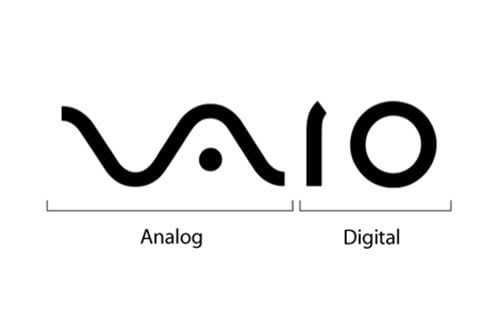
1. VAIO
VAIO, Sony’s brand line for its laptops has a logo that refers to integrating the ideas of analog and digital technology into one. ‘V’ and ‘A’ are used to represent analog waves and ‘I’ and ‘O’ to represent binary from the digital world.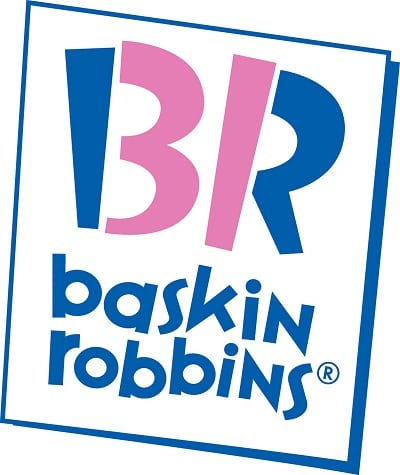
2. Baskin Robins
Notice how the BR of the Baskin Robins logo is made up of 2 different colors. Did you see the numbers 3 and 1? These numbers represents Baskin Robbins’ 31 flavors of ice-cream.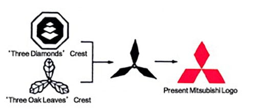
3. Mitsubishi
“Mitsubishi” is a combination of the words “mitsu” and “hishi.” “Mitsu” means three. “Hishi” means water chestnut, and the word is used to denote a rhombus or diamond shape.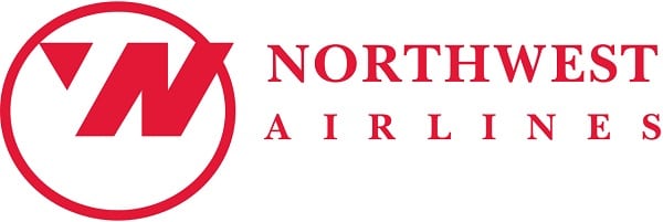
4. Northwest Airlines
The Northwest Airlines logo has the letters N and W in positive and negative spaces.5. Amazon
Amazon’s logo design is quite simple. But the arrow in Amazon’s logo has another meaning behind it. It is a representation of the wide range of items available for retail by Amazon, from A to Z.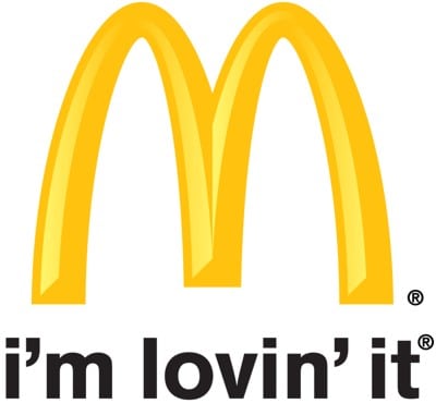
6. McDonald's
Originally, the golden arches in the logo it really means "M" for McDonald's and no other meaning is intended for it. In the 1960s, McDonald’s was retooling its image, which included discussing a possible new logo. Louis Cheskin, a psychologist and design consultant hired by McDonald’s urged them to keep the current logo. He said it's because customers unconsciously recognize the logo as "symbolism of a pair of nourishing breasts" (via BBC).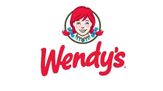
7. Wendy's
If you take a closer look at Wendy's collar and you might just see the word "mom." "This is something you may not notice consciously for years, but unconsciously it will leave an imprint on your brain and you will associate it with the brand," stocklogos.com wrote.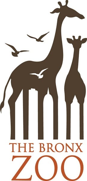
8. The Bronx Zoo
If you take a look between the legs of the giraffes, you can see New York’s iconic skyline of tall buildings.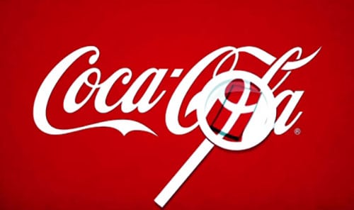
9. Coca Cola
This one is many of the unintentional hidden gems in logos. Hidden in the 'o' of Cola is the Denmark flag. Once Coca Cola discovered that part of its logo looks like the Danish flag, they setup a media stunt at Denmark's biggest airport welcoming customers with flags.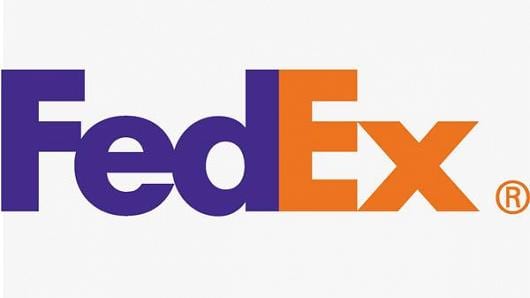
10. FedEx
If you take a look between the "E" and the "X," the negative space forms an arrow. "The arrow could connote forward direction, speed and precision, and if it remained hidden, there might be an element of surprise, that aha moment,” says Lindon Leader. The design has won over 40 awards and was ranked as one of the eight best logos in the last 35 years by Rolling Stone magazine. These are only 10 of the many logos with hidden meanings. Stay tuned for more!--------------------------------------------------------------------------------
Post Content
Ever wondered what make the companies set the logos they have to identify their brand name? Why they specifically chose the ones they have. Here are some of the famous company's logo designs and the hidden meaning behind them.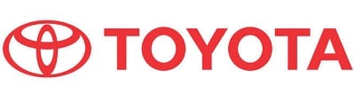
1. Toyota
The logo Toyota contains three ellipses of different sizes which represent three hearts i.e. the heart of the product, heart of the customer and the heart of the progress in the arena of technology.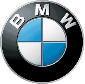
2. BMW
A name so known and easily identified, but what does its logo really signifies? Turning the pages of history, you will find that BMW had a strong connection with the aviation industry and therefore so does its logo. The white sectors represent a motioning propeller and the blue portion represents the sky peeking from behind. Moreover, BMW was a creator of aircraft planes of the German military during the II world war.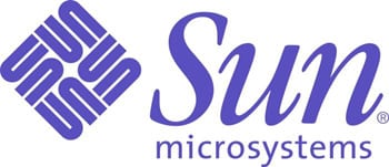
3. Sun Microsystems
The impressive logo of sun Microsystems was created by a computer science professor, Vaughan Pratt. Though technically not a designer, he came up with an ingenious design of Sun. The Sun Microsystems logo is a typographic design that spells the same from all directions. The graphics are so designed to be able to read the word 'SUN' from every twist and turn.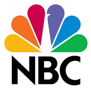
4. NBC
Due to its unique peacock shaped logo, NBC was formerly known as peacock network in 1956. The peacock logo contains six colored wings (marks the era of colored televisions), each color representing specific departments which are, News, Entertainment, Sports, Network, Stations and Productions in no particular order. Also, you will see a cut in the purple wing facing towards the right which represents its forward-looking future.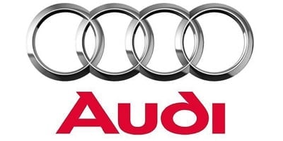
5. Audi
The four hoops in the logo of Audi represent the four founding companies namely DKW, Wanderer, Horch, and Audi.
6. Facebook places
Facebook Places was once considered to be a competitor of Foursquare. The logo contains a rectangular yellow box which depicts the map and a red color mark over it to represent the position.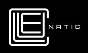
7. Cluenatic
Cluenatic is a name of the puzzle game. Shouldn’t a logo of the game be in a puzzle form too? Well, that’s what a logo is about. Looking closely you will find the word 'Clue' is designed in a way to make it look like a maze. The mystery does not end here. Looking at the whole logo, you will find a key out of it. Isn't this interesting?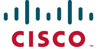
8. Cisco
Cisco is a manufacturing, designing and network selling equipment. It is, therefore, logical to represent their logo with the digital signals. Not only this, the logo is shaped like Gold Gate bridge of San Francisco.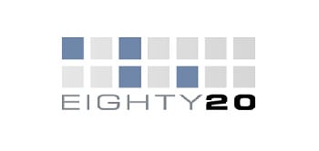
9. Eighty 20
Though looks simple, the logo of eight 20 is an interesting thing to figure out. The logo contains two rows of square boxes with blue and white colors. The squares are not random but binary numbers 1010000 and 0010100 which are the form of 80 and 20 respectively.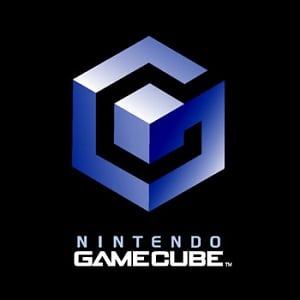
10. Nintendo GameCube
The logo is shaped in a way to represent G in a blue color and the inner side thus forms a C. It also has a cube in between. These is the part 4 of our "Clever Logos with Hidden Meanings" article. If you missed Part 1 and Part 2, you can see the links below. Part 1: https://www.simpliowebstudio.com/clever-logos-with-hidden-meanings/ Part 2: https://www.simpliowebstudio.com/clever-logos-with-hidden-meanings-part-2/--------------------------------------------------------------------------------
Post Content
The Logo
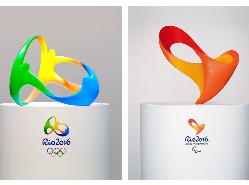
When Frederico Gelli, the creative director of Tatil Design learnt that there were about 138 agencies contending to get the bid to develop the Olympic logo, he first thought of giving up. Because the Olympic committee needed an almost completed logo for submission, which is as tough to do without even getting the client feedback for once. But he went on to take a chance and over the period of next couple of months, each employee at the agency was encouraged to pour in their ideas and thoughts, and the end result is what we see as the Rio Olympics 2016 logo. Gelli says that the logo wasn't designed just for the designers but for each person in the world, and also says the logo represents the energy of Brazil and how they receive other people. The hardest part, for him, was to keep their idea a secret during those four months when it was selected and when the design committee officially announced it. Only ten of them in the firm knew and others were convinced upon a fake project. The inspiration for the logo comes from the mountains in Rio Del Janeiro. Every curve in the logo represents a mountain curve in Rio. Gelli wanted a 3D representation of the logo in its 2D format and that is how the 3D graphical representation got into the picture. Even the color patterns had relevance to nature, beaches and warm temperature that Rio has got.The Font
About 18 months after the logo was designed by Tatil Design, Dalton Maag was prompted to design the entire font. Their meeting was conducted with Spy style secrecy. Fabio Haag, the Company's creative director that he was talking about a project of some corporate design, only to learn at the table about the actual project for the upcoming Olympics. Their prompt was to have a precise replica of those letters designed in the logo. It was a challenge for them since it was a reverse process. Usually, it is the font first and then the logo. Dalton Maag only had three letters from the logo, RIO, and four numerical figures, 2016, to begin with. After that, they moved onto design alphabets and special characters which were about 500 in total. And that is the brief on how the successful logo and font of the Rio Olympics 2016 were created.--------------------------------------------------------------------------------
Post Content
Discovering logos for their hidden meaning is always fun! We covered a lot such logos in previous posts, you can check out the links to them below. In this post, we are going to unveil some more logos with hidden meanings that you would not have expected for sure! Check them out below.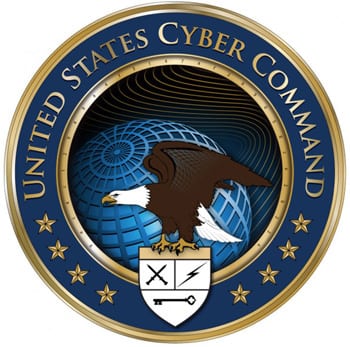
US Cyber Command
You might be wondering what this logo is doing here. Doesn't it look familiar to you? Yes, it seems like any other common blah logo of the government. But don't be surprised as that is exactly what the US cyber command expects you to think. Take a closer look at the golden ring on the inside part of the logo and you would certainly find Thirty Two characters. What these characters are trying to imply is a bad bit difficult to encode. Many people guessed that it is the mission statement of the Cyber command that is ciphered in the code comprising Thirty Two characters.
Microsoft XNA
We all know that XNA is a group of tools that Microsoft introduced for the development of games. The dashed line in orange color which makes for one of the strokes of X is basically a Morse code that spells out XNA. _.._ is the letter X, _. is the letter N, and ._ is the letter A.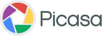
Picasa
You would be amazed to know that the site for Google's image sharing as well as editing does not only depict the shutter of a camera. It certainly doesn't. The name Picasa is a word play on the idea that this website is an abode for your images. In Spanish, Casa is translated to be a home. Now take a look. Do you see a home in the center of the vivid colorful shutters?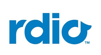
Rdio
You might be perplexed as to why this name lacks the letter A.Yes, though the word does not contain the letter A, it is the services for radio streaming just like its name tells us. The logo prettily utilizes the spaces inside the letter D and the letter O to depict musical notes. These note in the letter D is basically a music note known as Semibreve and the note is the letter O is a music note known as Crochet.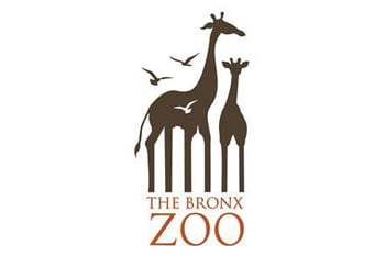
The Bronx Zoo
For those who don't know where this is situated, The Bronx Zoo is located in the city of New York. Basically, since it is a zoo, they would certainly make use of animals (In this logo, it there are birds and giraffes) in the logo design of their zoo. But is that all? Nope. Observe closely and look at the legs of the giraffes. You can find the city line of New York artistically included between the spaces that are situated at the legs of the giraffes. Were not these hidden meanings mind blowing? Stay tuned for more such interesting posts! If you missed our previous Clever Logos with Hidden Meanings posts, check them out below:- https://www.simpliowebstudio.com/clever-logos-with-hidden-meanings
- https://www.simpliowebstudio.com/clever-logos-with-hidden-meanings-part-2/
- https://www.simpliowebstudio.com/clever-logos-with-hidden-meanings-part-3
--------------------------------------------------------------------------------
Post Content
Logo design – Find the best one for your requirements:
While creating a logo for the company, an individual has to choose a professional designer. An expert will able to create a high-end logo with ease. Therefore, before making a Final decision, it is your responsibility to check the portfolio, Experience, and skills of the designer. All you need to choose a trustworthy logo design service in Miami that can provide you, professional designs. Here is the perfect way to choose the best logo Designer?
Hiring a Logo designer can be a daunting experience because an individual has to check everything. If you are able to pick the perfect company, then you may get top-notch logo design for your business. It can pretty confusing task about which company is best. An individual cannot pick a company that can provide logo design at discounted worth. Here are a few things that an individual needs to take into consideration while searching for logo designer such as-
- Check the portfolio
- Avoid Beginners
- Grab white and Black Logo
- Scalable
--------------------------------------------------------------------------------
Post Content
This article takes a look at ten elements of corporate branding. Although most people only consider the name and visual elements, branding goes way beyond those factors. It includes elements that appeal to the entire senses, including taste and smell. To fully grasp how to use these elements for branding, we’ve included examples of leading companies that used these elements to develop their brand identity.The Brand Name
The words or phrases used to represent a company, concept, or service is called the brand name. Getting a name for your brand looks simple, but it's not easy to coin an outstanding name. Consider iconic names such as Coca Cola, Target, Chevy, and Amazon, among many others. These brands have become household names. These names are worth fortunes because consumers would gladly pay more to purchase products from these legendary brands.
The Logo
The logo is the combination of visual elements used for identifying a brand. Nike’s swoosh is the most outstanding example of a successful logo. The swoosh has become an insignia of “Nike” even without the brand name appearing beside it. A computer with an illuminated apple behind it symbolizes an Apple computer without controversy. The Morton Salt Girl is another brand logo that has been well-known since 1914, even after restyling it several times. The visual nature of the logo makes it one of the most outstanding elements of a brand. It's arguably the embodiment of a brand that can be recognized anywhere instantly. And it’s the most common avenue through which people associate with their favorite brand.The Theme Line
This refers to the catchphrase of a brand such as KFC’s “It's finger-lickin' good,” Verizon’s “Can you hear me now?” and Nike’s “Just do it.”. The catchphrase allows a brand to state its proposition is a memorable way. Successful catchphrases become known with a brand and such brands simply stick to it. For instance, “15 minutes could save you 15% or more on car insurance” has been a mainstay of Geico Insurance ads over the years. The theme line also serves as a foundation for brand communicators to create unique themes to achieve various objectives.The Shape
The uniqueness of the physical appearance of products such as the bottle of Coca-Cola or the Volkswagen Beetle are integrated elements of branding. In fact, product shape is part of the trademark of those two brands. Other instances include Dyson’s vacuum cleaner that has a unique ball for controlling the device and the chunky Ugg boot which has become a symbol of fashion. Airstream’s silver bullet trailers that feature rounded edges set it apart from couches from other vendors.The Graphics
Graphics is a crucial element of branding that catches the attention of the viewer. For instance, the dynamic ribbon is an integral aspect of the Coca-Cola brand, the company even trademarked it. For Coach, it’s the unique way of writing the letter “C” that makes their products outstanding. Louis Vuitton uses a uniquely styled flower on all its products to distinguish the brand’s merchandise. Burberry coats incorporate red and tan plaid lining that makes it look exquisite compared to other coats. The function of graphics is similar to the logo, it allows the public to recognize a brand at a glance.The Color
UPS brands all their aircraft, vehicles, and staff uniform with the unique brown color. The color has become symbolic of the brand. When you see pink-colored fiberglass insulation, Owens Corning readily comes to mind. Also, the cashiers at Sephora always wear a black glove for handling and delivering products to their customers. When properly used as a brand symbol, color can make it easy for consumers to identify a brand easily. A company like Tiffany & Co. knows the significance of color in branding, that is why they trademarked their blue robin egg.The Sound
The sound factor in branding takes the form of a unique set of notes that identifies a brand. Advertorials and jingles are the prominent avenues for implementing sound-based branding techniques. For instance, sports fans can easily recognize ESPN’s SportsCenter introduction with the first few notes. Other examples that readily come to mind are “Um um good” for Campbells and “Liberty, Liberty, Liberty, Liberty” for Liberty Mutual Assurance.The Movement
Movements have been used by certain brands to make their products unique. It might seem like an abstract branding element, but it remains useful for promoting brand recognition. For instance, Lamborghini car doors open upwards, and they have trademarked it. The multi-finger gesture for changing the shape of images was typical to Apple iPhone and iPod. Dyson’s bagless vacuums stand apart from competitor products with the revolving motion inside its suction chamber.The Smell
The use of smell as a branding element is especially important in scent, perfumes, and other products that have fragrances. For instance, Chanel’s Rose Jasmine Musk is trademarked.The Taste
Companies that make edible products have been using taste to differentiate their company and products. The special fried chicken recipe consisting of 11 herbs and spice for has been trademarked by KFC. McDonald's is popular for its french fries. Fans of carbonated drinks can tell the difference between Pepsi and Coke without looking at the label. Given the above examples, you would realize that it takes more than a single element to create an outstanding brand identity. Companies should use a combination of several branding elements to create a rich brand experience for their customers. That is how to brand a brand that stands out from the crowd.--------------------------------------------------------------------------------
Post Content
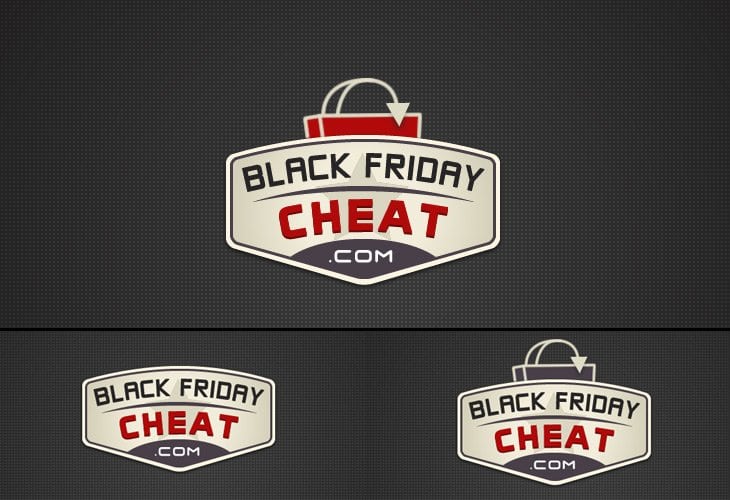
Black Friday Cheat commissioned Simplio Web Studio to make them a logo design.--------------------------------------------------------------------------------
Post Content
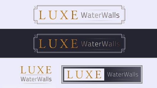
Luxe Water Walls offers the best indoor water features for your home and office. The client want to have a Proffesional logo that define the Premium product that they offer.--------------------------------------------------------------------------------
Post Content
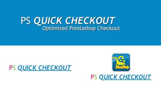
PS Quick Checkout makes it easy for both business and customers, reducing abandonment and increasing conversions. We made this logo to look more approachable and have use a simple font as what the product is, simple yet effective.--------------------------------------------------------------------------------

Post Content
Kosher Route is a directory of Kosher restaurant and more on California and different parts of USA. The idea here is to incorporate the hebrew word and also the pin use in mobile map.--------------------------------------------------------------------------------
Post Content
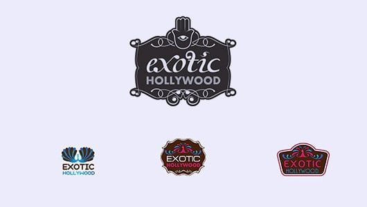
Exotic Hollywood specialized in jewelry and accessory. The logo that we made reflect the product of Exotic Hollywood and made them stand out in the field of jewelry in California.--------------------------------------------------------------------------------
Post Content
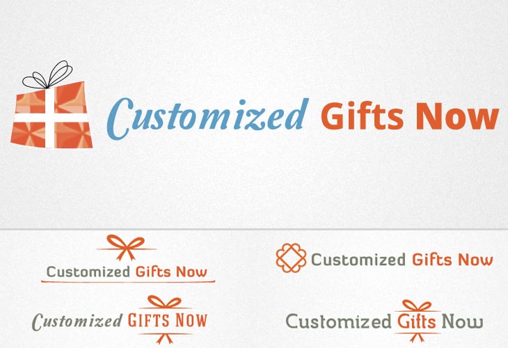
Customized Gift Now approach on the logo is fun, exciting and honest to the brand.--------------------------------------------------------------------------------
Post Content
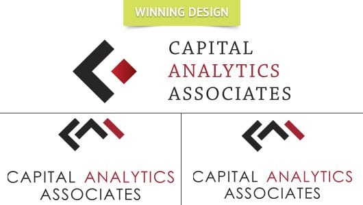
Capital Analytics Associates deliver accurate insight on your business and by this, we have developed a trustworthy logo that reflect the quality of work they could offer.--------------------------------------------------------------------------------
